Play game
Beeknighted Demo (32-Bit Game Jam)'s itch.io pageResults
Criteria | Rank | Score* | Raw Score |
90's | #1 | 5.000 | 5.000 |
Fun | #5 | 4.267 | 4.267 |
Overall | #6 | 4.400 | 4.400 |
Most improved | #9 | 3.933 | 3.933 |
Ranked from 15 ratings. Score is adjusted from raw score by the median number of ratings per game in the jam.
Link to pre-jam game
http://Same as submission (prototype file)
Leave a comment
Log in with itch.io to leave a comment.
Comments
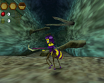
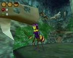
Fantastic demo! The gameplay, art style, sound design and music capture the 90s aesthetic pretty much perfectly!
The beginning sequence of the game sets up everything really well, both in terms of story and gameplay. I like how you introduce the mechanics of the game one at a time, making sure the player can get used to each aspect of the gameplay before moving on to the next.
The platforming is nice, but I think it would be better if you could grab onto vines while falling/flying. It kinda feels weird to me that you can only grab onto vines when you're on the ground, and if you try to walk into them while flying or falling, nothing happens.
The combat is pretty solid. I love the note progression that play when you strike an enemy with the sword multiple times, really creative idea. I'd love to see more of that kind of stuff.
During the boss fight, the boss would sometimes get stuck because he wouldn't go around the holes in the arena.
Probably my biggest complaint about the game is this: during the beginning of the game, I was a bit confused by the items I was collecting. Since I hadn't yet gotten the bombs from Louis, I had no idea what those green things were, or why I was picking them up, and this is true of many of the items in the game. I'm not sure what's the best way to go about fixing this, but I think the player shouldn't be collecting items if they have no idea what those items are until a later point.
It's cool that the world is semi-open and you can freely explore each area. The doorways that transition you to new locations all look more or less the same, which could make things a bit confusing. It would be nice if approaching one of these doorways will pop up some text that tells you where the door leads to. For example "ENTER SHROOM HALL" or something to that effect. This would make navigating easier, and it could also add another level of world-building to the story.
Speaking of story, I really like what you've got going so far! It reminds me of the Redwall novels by Brian Jacques. The character designs are interesting and the little sounds they make during dialogue are a nice touch.
Besides the addition of a cool intro cutscene, I couldn't really find much difference between this version and the pre-jam version.
Great work! This game is incredibly well done!
Improvements: I haven’t made it to the puzzle room. But I liked the intro cutscene. I did find that the first time I was reading the text in the cutscene I read it and after the cutscene I didn’t remember what I had read… Yeah, I’m not a big fan of text that shows for a certain amount of time and has to be read while it’s still on screen.
Fun: I found the boss fight somewhat confusing, but I liked the platforming and exploring. I also like the art and music.
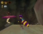
90’s: I haven’t played N64 games myself, but it looked to me like it could be one. Low-resolution textures (I think I even saw the same textures with multiple palettes). And I saw different places in the game use the same assets, like branches, doors and repeated enemies like toothworms and those small red beetles. And the use of text rather than voice acting but sometimes with short bit of audio that are used for several pieces of text. I have played a PC game that did some of those things although that one was from the early 2000s and had somewhat higher texture resolutions.
Fonts: The font in the intro cutscene is easy to read yet manages to also help setting the tone so that before the animations start I feel like it’s going to be in the middle ages. And both that and the fonts that are used in other parts of the game look like they could work in a game from the nineties.
And if you’re wondering, the reason I decided to write about fonts in every game I review from this jam was because one game had some unreadable text and I think another one had another issue and then I added this category to all the written reviews.
This looks and sounds like it could have been a real game of the era.
The guys popping out of the ground, the worm/snake-thing, reminded me of Super Star Wars, and when one popped out of the side of the wall, I LOL'd because I was not expecting that.
My only suggestion would be to maybe have some optional tutorial text about controls at the beginning for picking things up and for getting through the first door. Also, at the beginning, I threw the seeds over the edge, they broke open, and the inside kind of just lay stuck at the bottom of the screen amongst the black shadows. If possible, maybe items should delete when they're in the black shadows like that.
The improvements you made to the game over time are pretty impressive ! The world you are creating is very appealing and begs to be expanded. Big plus for the cutscenes and the audio are great, very polished stuff. Congrats on this !
Maybe if had one point to tweek a bit it would be the overall speed of the main character, on foot, on air and while climbing. Slight augmentation could add some dynamics and wouldn't be too off knowing how fast can be the bees at times :)
Keep it up !
That game ist amazing. Keep working and create a masterpiece
Oh my god. I cannot believe that this isn't just an N64 cartridge found in someone's uncle's attic. The quality of it is superb. The music is exactly matching, the blurry textures are all perfect, even the grunting voice acting has the same exact voice quality from that era. This was a blast, and it feels so authentic. Excellent job.
Great fun! Loved the cut scenes and level design. I'm really impressed by how far this game has come since I first played the original 32 bit jam version. Music is great too.
Disappointingly the game suddenly closed during the boss fight after I'd been fighting him for a fair while. But it didn't detract from the overall experience :)
Great little game you've got going and I;m looking forward to playing the next version.
This is *REALLY* good. I love the cutscene at the beginning, and the gameplay is stellar!
This is really impressive - looks and feels like a classic N64 game, with perfect 90s graphical style and really polished and era appropriate gameplay and level design.
Particularly loved the design of the levels. I initially assumed it was going to be a series of self contained rooms, so that moment when I realised I was looping back on myself and exploring old spaces from new angles was fantastic. In general, layouts felt really well considered, with a great use of vertical space.
The tentacle enemies are so, so 90s in the best way.
This is so amazing, it looks and plays just like an N64 title lost to time, even down to the cutscenes and music. The environments and level design is fantastic. As for critique I just wish there was a little more response on the boss fight, it wasn't clear to me why they were blocking some bombs but susceptible to others with the timing. But like, oh my word this looks like it must've been a lot of work and it's incredible