thats some well polished gameplay and visuals! great game, cant give much feedback i liked everything i saw
Play game
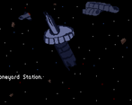
Boneyard Station's itch.io pageResults
| Criteria | Rank | Score* | Raw Score |
| Presentation | #102 | 4.273 | 4.273 |
| Overall | #155 | 3.727 | 3.727 |
| Gameplay | #195 | 3.364 | 3.364 |
| Originality | #260 | 3.545 | 3.545 |
Ranked from 11 ratings. Score is adjusted from raw score by the median number of ratings per game in the jam.
What do you like about your game?
It was thrilling to actually put my knowledge of manually writing vertex buffers to good use for once. I have worked with 3d for years and this is my first time actually publishing something with 3d.
Comments
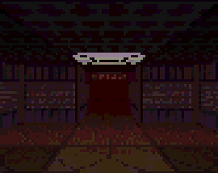
The ambience is great! As others have said, it was a little disorienting to navigate; I feel like the very low resolution contributed to that a bit, since it impacts visibility. Just the darkness, or the low rez, or the maziness of the levels on its own would probably be fine, but all three combined is a bit too much, I think.
I played it through 3 times and got 3 different endings. Two were obvious losses/deaths, so it makes sense that they ended abruptly. But I also got what appears to be the "good ending," and it also ended kinda abruptly and anticlimactically, without totally explaining everything. A bit more closure would be nice. But you did a good job of providing clues as to how to get there.
(Also, with a bit of backtracking I managed to get past the door that someone was hiding behind in the docked spaceship, and there was nothing in there. I assume this is a bug?)
Overall, I had fun! Nice classic dungeon crawler experience.
I find the premise very interesting! I agree with others saying it needs some sort of map/way to track progress. I did find it to be very interesting with a lot of potential!
Visually and presentation-wise this is exceptionally pleasing. The game definetly captures the essence of classic dungeon crawlers.
My feedback would be to have some sort of UI with an Map and status on objectives/progress, as it was hard to keep track of what was going on. Like, why was I shotting at those folks?
As a test / technical demo, this is quite nice. Well done!
Very cool game! I was especially impressed about the textures on the walls and the nice sizzling effects you made!
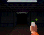
The arm with the weapon was a nice element of control in the dark corridors (wish it could also light up the place when I was shooting!)
Very cool you communicated the changes in location with different textures. I also agree with people, I got lost many times. Had to use the classic "keep left and you will find an exit" labyrinth advice, but I assume there were branching paths or I missed a corner somewhere. Also, upon entering the other ship, i might have missteped somewhere and all the rooms turned dark. Had to restart, worked fine. Got the big orange crystal thing, found a raving lunatic behind a door, but then couldn't get to anything else of importance, managed to get back to my ship, but nothing I could get done. Also, was very scared of the enemies, kept shooting at them from miles away hehe. Have to say their deaths didn't quite fit the game style you've build with such realism and scary sfx. (But the did make me piss myself from fear when i kept seeing them around the corner).
I enjoyed this a lot. Once I found the logs I felt so tense, not knowing what was going to happen or what I would find. The ambient noises of the spaceship being the only sound pretty much through the entire game created so much atmosphere, as did the incredible visuals.
The game reminded me a lot of the original Persona: Revelations and it’s dungeon crawling screens, although I must say I prefer the quick movement of your game compared to that of older ones in a similar style. I would’ve liked a better transition between angles though, because the sudden switches were somewhat offputting when moving through lots of tightly turning corridors, or places with a lot of intersections. However, considering there is no map I found it fairly easy to navigate, without getting lost (although a map would be nice).
Considering on the game page you’ve said this is more of a test than anything else, I think it’s really solid. Some cleaning up would be nice, but you got the eerie feel I think you were going for. Well done :).
Holy heck this was atmospheric. Presentation as a whole was on point. The overall atmosphere had me on the edge of my seat from the very beginning till ( what I'm assuming was ) the end
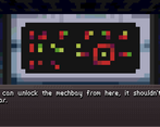
Loved the dirty look of the ship, the dialogue was cool as well. That moment after you read the captain's logs gave me chills and kinda made me run from then on lol.
The sounds ( or maybe lack of them at times lol ) also set the tone pretty damn well. Reminded me of the first SMT game in a way lol.
Unfortunately, I think the movement was kinda disorientating at times. Having the player snapping right to the next position didn't really feel too good. But I think one of the major reasons for this was that the game really needed a map which gets revealed as you explore more of the ship or something along those lines.
This was because I got pretty lost sometimes. The dark corridors definitely helped in setting the atmosphere, unfortunately they hamper your visibility a little too much. I think maybe just adding a little more lighting in general when the lights in the ship are off would help a lot. I also think that adding more to the levels like some of the decals and bloodstains would help alleviate the problem of getting lost, mostly because some of the rooms looked a little too similiar sometimes.
It was also a little annoying to find out that you need to be right next to an enemy for your gun to work. Still, seeing them come from the darkness and attack was pretty scary sometimes lol.
That head crab at the end also scared me good ngl lol. Nice little touch on having the game close as well.


Leave a comment
Log in with itch.io to leave a comment.