Indie game storeFree gamesFun gamesHorror games
Game developmentAssetsComics
SalesBundles
Jobs
TagsGame Engines

Zizaco

159
Posts
1
Topics
187
Followers
53
Following
A member registered Jan 20, 2019 · View creator page →

Creator of

Recent community posts

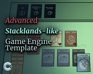
@Puipuipui12322 as described in the slot, you must place 10 "Knowledge" cards and the "You" card into the Invention slot.
This will generate an "Invention" card, which is the final card of the demo.

Thank you for your comment PresidentMystery!

I wish I had more time to continue working on this game.

Melkhiors Mansion 2 confirmed!

(/test project)

Hello everyone, 

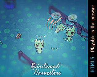
I just released a video detailing the "making of" my jam entry, Spiritwood Harvesters.
Check it out to see my process and the obstacles I encountered.

Let me know your thoughts : )

Your entry is great! Thanks for sharing this making of.

I love seeing how jam games are made. :)

Thanks for playing!

In my one-page GDD, I wrote that you lose if all the villagers are stunned. However, I didn't have the time to implement that. My idea was that all the aberrations would come after you, and the screen would fade to black. I may add that after the jam, tough. :)

This looks neat. I wish there was a linux build :,(

This is visually stunning. Well done!

I wonder if there is a way to fake the blending effects to achieve a similar result while less resource-intensive

Very nice take on the tower defence genre. Well done!

Very nice! This took the "There is no game" concept to a whole other level.

Well done!

You have to try this one: https://itch.io/jam/acerola-jam-0/rate/2578859

:D

"the little guys have their bread!" ^^

Thanks for the feedback. Noted! I should improve the collection of resources. There's a short timer before the resources are "available to pick up", and I should make it shorter or remove the timer entirely.

Thanks for playing

Thanks for playing, Ian! I'm glad you enjoyed it.

Indeed, that's the correct way to find which of them are aberrations in disguise.
Thanks for the feedback on the wheat text, I'll make it more readable after the jam.

(2 edits)

The gameplay is very smooth, simple and fun. I like it. Well done!

I wish that when I open the shop, it would pause the gameplay. Maybe adding a little bit more variety would make this even better.

edit: I nearly missed out on the "monster capture" feature. I wish it had been presented more clearly.


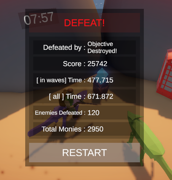
25742 Yay!

This is one of the most solid entries I've seen. Well done! 5/5 presentation-wise.

A basic sprint mechanic would be a great addition, you could even remove it in the last level since the character is already in bad shape.

This is very cool! I'm not a fan of rage platformers, but this is very well-made.

Well done!

I love the vibe and the whole idea of this. presentation-wise, this is amazing 5/5. Well done!

Gameplay-wise, I find it too punishing and too micro-intensive. This, coupled with seeing the same cutscenes every time, is not great. So perhaps this difficulty level is better suited for games with procgen/roguelike mechanics.

In case you want a break from the action and fancy a cozy game, here's my game. : )

https://itch.io/jam/acerola-jam-0/rate/2578859


The pixel art and the concept are very good. Well done! : )

However, I'm not a fan of the tank-like control scheme in this game. I think it would work better with a traditional twin-stick shooter control scheme.
And here's my two cents: I suggest working more on the polish and "juice"  (AKA: impact, flash, indicators of damage, contact, actions, etc) next time.

Interesting concept and presentation.

The fact that the maze changes to an unsolvable version detracts from the whole experience. What's the point of going through the maze if it's going to change at the end?

It's just that when objects get in front of it, it moves chaotically. But that's not a big deal. : )

The presentation and the parkour were very nice. Thanks for making this available on Linux :)

In my opinion, the battles were not fun. During battles, everything was useless (bite, convince, candy, kick), except for petting the animal; And petting was very repetitive and quickly got old.

Getting the game-breaking bug after the giraffe was not cool :/

Interesting concept. Well done!

However, I wish there were more variety in terms of enemies and body parts.
Also, there is no particular reason to change a build that's working.

I like the minimalist 1-bit style. I wish there was more to it in terms of gameplay

While I am not a huge fan of the main mechanic, the presentation is impeccable. Well done!

I couldn't get past level 7, tough

Thanks Gad! I'm glad you enjoyed it ^^

Visually impressive! Interesting mechanics.

Well done!

Very nice presentation, graphics and juice. Additionally, the combat mechanics was interesting.

I wish there was a bit more variety.

I managed to get it running smoothly on another PC with a better graphics card.

The atmosphere was quite  intriguing. One thing was quite challenging: the doors! Haha. They kept pushing my character around, leading to a few deaths!

Despite this, visually, the game is quite pleasing, although the character design leans towards a minimalist style.

My only minor gripe is that I wish the character could move a bit faster.

The presentation is impeccable, truly impressive! However, while the gameplay had its merits, I couldn't fully understand what was going on, and it was a bit clunky:
- The inability to move diagonally seems like a weird choice.
- The bean attack (mouse click) didn't damaged enemies. I don't know why.
- The radius of damage (white square) on enemies was so small that it harmed my character as well.
- The combination of using both keyboard 'X' and mouse for interaction felt a bit disjointed.
- Way too much dialogue. And the fact that's all unskipable made me quit after the first few attempts.

Still, pPresentation-wise, this is amazing.

Very cool! The plot twist at the end took me by surprise! Haha.

The simplistic and charming visuals remind me of Little Big Adventure. I'm not sure if the levels are procedurally generated, but I did encounter a minor hiccup on level 3 where some doors were closed in a way that trapped me. I appreciate the thoughtfulness of including the 'unstuck' button.

Well done!

Visually it's quite nice. Other than that I'm not sure there's much to it in terms of gameplay.

The doll made a few appearances, yet there were no meaningful interactions or significant events. Frustrated by the repetitious nature of navigating indistinguishable corridors, I had to quit on the 4th level.

Perhaps having some narrative, story, characters or objective would make it more engaging.

Visually and presentation-wise this is exceptionally pleasing. The game definetly captures the essence of classic dungeon crawlers.

My feedback would be to have some sort of UI with an Map and status on objectives/progress, as it was hard to keep track of what was going on. Like, why was I shotting at those folks?

As a test / technical demo, this is quite nice. Well done!

Interesting game overall. The implementation of a survival-like health bar was was great. However, during the dragon battle, I noticed a lack of feedback on what was going on. This made it challenging to discern if I was performing actions correctly. Despite reading your tips, I still struggled to understaind if I was doing things correctly.

Unfortunatelly, I couldn't defeat the dragon.

I really wanted to like this game. I was genuinely intrigued by the concept and artistic style of this game. However, my enthusiasm quickly waned due to its lack of clarity regarding gameplay mechanics. Understanding the dynamics became a frustrating challenge as everything was left way too vague.

Also, grabbing items was quite buggy. It seemed that I couldn't interact with any other item if one of them was  stuck due to another collision. So I had to search for buggy items, move them. So that I could go back to interacting with the other items. Having to troubleshoot these issues disrupted the flow and made it quite annoying to try to figure things out. 

My feedback is to have a more structured introduction for players in order for them to grasp at least the first few steps on how things work.

Unfortunatelly, I gave up without figuring out how to properly progress. Sorry.

Very well made for a game written in pure C. It's nice how minimalist and well made it is.

The screen transitions were a bit hard in vertical areas, and the boss fight was a bit too dificult.

This is an interesting concept, and the visuals were undeniably very good. Well done!

Here's some things that detracted the overall experience for me:
- The reverse time button wasfrustratingly unresponsive, making it difficult to halt properly and often resulting in unintentional rollbacks beyond what I intended. This was very annoying! xD
- The spike collisions felt very unfair. Frequently, my character would be impaled mid-air, appearing to be floating. This issue was particularly evident during the double spike  (celing and floor), where after about 80 attempts, I had to quit.

The artwork is exceptionally well-crafted.

Unfortunately, there was not much to it in terms of gameplay and mechanics. I found it challenging to fully comprehend the impact of the stats.

Perhaps incorporating some tips explaining the game's statistics  (at the end of each attempt ) would make it more acessible.