This is all still very useful and I think I can use most of your feedback to smooth the experience out. Stuff like the dash cooldown was much more painful than I thought and circle colliders for the player make it a lot easier to move around. Picking up the shuriken by walking into the enemy makes sense and I don't remember why I took that function out. I also see where I need to make it clear how the attack inputs work and I'll have to think about ways to make it not frustrating in the future. Maybe I should play with the inputs in the way you mentioned or find a way to simplify it to one button. On elements I see what you mean about it being boring by itself. I'll have to think of another way to salvage that system beyond weaknesses, maybe some debuffs would be useful if I had enemies that took more hits to kill.
Anyways thanks again for the playtest. It's the most I've learned about someone playing the game beyond them just not knowing about the rest of the moveset or finding the enemies too chunky to have fun with
Once I figured out the attack being seperate from the (transportation) ninja star throw, I had a lot of fun! You pay attention to a lot of small details in the combat (screen pause/shake/etc) and it pays off. Controller support is nice, overall awesome job! would love to see more of this
Cool game, weapon mechanics work good but moving is bit too floaty imo. Going against enemies is fun both with shiruken and secondary attack while shiruken is flying. For me UI scaling was broken on browser mode but I don't think I've encountered any other issues.
Attempting to play the game in the browser WebGL panel, I was able to get to the control display for shift and ctrl. The play AND quit buttons became greyed out and the menus stopped responding so I gave the downloadable version a try instead.
Music's on point. Good job on that.
The inability to slash while the shuriken is airborne is very strange to me. It sort of feels like you are forced to warp if you want to use spells. Maybe practicing at the game will make this feel more natural for players, but while I'm learning the controls it feels easier to just not use the shuriken in combat.
Putting dash on C meant that I simply wasn't able to use it while moving with WASD. Perhaps I am just baby idiot noob who needs to get good.
Z / X / C as default inputs is painful. I'd recommend putting them somewhere like Q, E, R, T, or F so that they're within easier spiderhands distance from WASD while moving, or assigning them to keys like J / K / L / ; so that players can move lefthanded and input righthanded (in addition to arrowkey input righthand and zxc lefthand)
Being able to shuriken out of the map is pretty OP. The doors seem to correctly block shuriken OOB glitch so hopefully the next demo treats walls that way too.
Enemies popping into existence as you enter a room is neat but could use a little bit more polish and fluff so they don't just immediately jump you.
I like the pointy screen transition on level exit, that's pretty neat.
Some SFX or manual-interact to open chests might make that a little more visceral. It seems that the item you get from the chest is dropped onto the ground in the same spot each time, too - it may be better to simply drop the item on the player and display the pickup over the player's head or something. Right now running into a chest then having to run a circuit around the chest to pick up what was presumably inside it feels a little raw.
The control /tutorial screen seems to be finnicky about which controls it shows based on whether or not you are using KBM or a controller.
Volume controls / options menu would be cool.
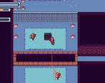
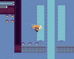
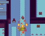
Visual clarity is pretty good but the brightness in some areas made it kinda' hard for me to tell what was what when it was all moving at once. I'd recommend taking screenshots of the game and reducing them to grayscale so you can see how bright things are relative to one another. It may help make the action more fluid in more difficult areas later.
Overall has promise, very fast paced though. Needs some kind of tutorial to familiarize with the movement mechanics and allow players to learn how to effectively move, because the current difficulty curve is "welcome to the real world" which might turn off a lot of players.
A lot of promise in this game, I feel. I can imagine the combat could get to be quite fun and involving. For now though, it's pretty buggy. I think someone mentioned it already, but you can clip through the entire game. It's also not immediately clear what the attacks do -- a more focused tutorial or short training area would be very helpful.
so i was able to get stuck in the pit things by pressing the teleport button when the shuriken was over them, using kb&m once also disables any further gamepad input, might want to look into that
these kinds of games need dash moves and very telegraphed enemy attacks, so that's something you could add, and also some form of health regen would be nice, like an estus flask equivalent
movement doesn't have any acceleration or momentum to it, which i think a lot of these games tend to have, even if you can also stop on a dime
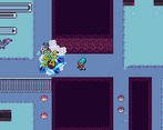
art seems like it's a mix of flat colours and stock rpgmaker assets, it's not obvious which kinds of enemies are weak to which element through colour coding, i think i saw grey enemies, blue enemies and green enemies, maybe just go with rbg enemies
overall it's pretty bare, i hope this feedback was helpful
Very good feedback that I can work on, particularly interested in giving a healing system a try. Could you go further into detail on examples of games that use acceleration momentum for movement?
I really like the combat system. hitting enemies to change up fireball spam is really fun. I am locked out a the first gate and I can do anything. No indication of what to do there. But the bats were fun to fight against and I like how it plays. Keep adding more to this.
EDIT:
With what the dev told me, I was able to get the first key and was able to beat the whole level/area. I really like the enemy variety, it's only slimes and bats but there are variations that has more HP and more attacks. I like getting the magic scrolls that changes the magic attack, although the fireball attack is objectively the best with it's range and the DPS. I do think there has to be a better tutorial for moving across gaps, but other than that the gameplay is solid. The music is pretty catchy and the graphics are well detailed and pretty great. I think this is a base to a really excellent game, the dev just has to make a lot more levels and enemies and this can be something he can make a lot of money with on Steam.
I should've included a better tutorial for this mechanic before the door but the left side gap can be crossed by throwing your shuriken at the dummy on the other side
Comments
This is all still very useful and I think I can use most of your feedback to smooth the experience out. Stuff like the dash cooldown was much more painful than I thought and circle colliders for the player make it a lot easier to move around. Picking up the shuriken by walking into the enemy makes sense and I don't remember why I took that function out. I also see where I need to make it clear how the attack inputs work and I'll have to think about ways to make it not frustrating in the future. Maybe I should play with the inputs in the way you mentioned or find a way to simplify it to one button. On elements I see what you mean about it being boring by itself. I'll have to think of another way to salvage that system beyond weaknesses, maybe some debuffs would be useful if I had enemies that took more hits to kill.
Anyways thanks again for the playtest. It's the most I've learned about someone playing the game beyond them just not knowing about the rest of the moveset or finding the enemies too chunky to have fun with
Once I figured out the attack being seperate from the (transportation) ninja star throw, I had a lot of fun! You pay attention to a lot of small details in the combat (screen pause/shake/etc) and it pays off. Controller support is nice, overall awesome job! would love to see more of this
Cool game, weapon mechanics work good but moving is bit too floaty imo. Going against enemies is fun both with shiruken and secondary attack while shiruken is flying. For me UI scaling was broken on browser mode but I don't think I've encountered any other issues.
cute gfx and the special attacks are fun a lot of potential
Attempting to play the game in the browser WebGL panel, I was able to get to the control display for shift and ctrl. The play AND quit buttons became greyed out and the menus stopped responding so I gave the downloadable version a try instead.
Music's on point. Good job on that.
The inability to slash while the shuriken is airborne is very strange to me. It sort of feels like you are forced to warp if you want to use spells. Maybe practicing at the game will make this feel more natural for players, but while I'm learning the controls it feels easier to just not use the shuriken in combat.
Putting dash on C meant that I simply wasn't able to use it while moving with WASD. Perhaps I am just baby idiot noob who needs to get good.
Z / X / C as default inputs is painful. I'd recommend putting them somewhere like Q, E, R, T, or F so that they're within easier spiderhands distance from WASD while moving, or assigning them to keys like J / K / L / ; so that players can move lefthanded and input righthanded (in addition to arrowkey input righthand and zxc lefthand)
Being able to shuriken out of the map is pretty OP. The doors seem to correctly block shuriken OOB glitch so hopefully the next demo treats walls that way too.
Enemies popping into existence as you enter a room is neat but could use a little bit more polish and fluff so they don't just immediately jump you.
I like the pointy screen transition on level exit, that's pretty neat.
Some SFX or manual-interact to open chests might make that a little more visceral. It seems that the item you get from the chest is dropped onto the ground in the same spot each time, too - it may be better to simply drop the item on the player and display the pickup over the player's head or something. Right now running into a chest then having to run a circuit around the chest to pick up what was presumably inside it feels a little raw.
The control /tutorial screen seems to be finnicky about which controls it shows based on whether or not you are using KBM or a controller.
Volume controls / options menu would be cool.
Visual clarity is pretty good but the brightness in some areas made it kinda' hard for me to tell what was what when it was all moving at once. I'd recommend taking screenshots of the game and reducing them to grayscale so you can see how bright things are relative to one another. It may help make the action more fluid in more difficult areas later.
Overall has promise, very fast paced though. Needs some kind of tutorial to familiarize with the movement mechanics and allow players to learn how to effectively move, because the current difficulty curve is "welcome to the real world" which might turn off a lot of players.
pretty cool, flying around with the shuriken is fun
i'd like it if there was more variety in the attacks, maybe on some number of consecutive hits it could do a bigger attack
A lot of promise in this game, I feel. I can imagine the combat could get to be quite fun and involving. For now though, it's pretty buggy. I think someone mentioned it already, but you can clip through the entire game. It's also not immediately clear what the attacks do -- a more focused tutorial or short training area would be very helpful.
I clipped trough every wall and out of the screen using the shuriken, is that suppose to be this way? Graphics are very nice and sfx too
so i was able to get stuck in the pit things by pressing the teleport button when the shuriken was over them, using kb&m once also disables any further gamepad input, might want to look into that
these kinds of games need dash moves and very telegraphed enemy attacks, so that's something you could add, and also some form of health regen would be nice, like an estus flask equivalent
movement doesn't have any acceleration or momentum to it, which i think a lot of these games tend to have, even if you can also stop on a dime
art seems like it's a mix of flat colours and stock rpgmaker assets, it's not obvious which kinds of enemies are weak to which element through colour coding, i think i saw grey enemies, blue enemies and green enemies, maybe just go with rbg enemies
overall it's pretty bare, i hope this feedback was helpful
Very good feedback that I can work on, particularly interested in giving a healing system a try. Could you go further into detail on examples of games that use acceleration momentum for movement?
I really like the combat system. hitting enemies to change up fireball spam is really fun. I am locked out a the first gate and I can do anything. No indication of what to do there. But the bats were fun to fight against and I like how it plays. Keep adding more to this.
EDIT:
With what the dev told me, I was able to get the first key and was able to beat the whole level/area. I really like the enemy variety, it's only slimes and bats but there are variations that has more HP and more attacks. I like getting the magic scrolls that changes the magic attack, although the fireball attack is objectively the best with it's range and the DPS. I do think there has to be a better tutorial for moving across gaps, but other than that the gameplay is solid. The music is pretty catchy and the graphics are well detailed and pretty great. I think this is a base to a really excellent game, the dev just has to make a lot more levels and enemies and this can be something he can make a lot of money with on Steam.
I should've included a better tutorial for this mechanic before the door but the left side gap can be crossed by throwing your shuriken at the dummy on the other side
I'll play more of the game with this in mind. Thanks