Play game
Chasm Climb's itch.io pageComments
You know how it goes, here's the DD52 folder with your video in there https://mega.nz/folder/WQ91HBxL#X4-j8Mj7H30Ai3aevWFEmA
I look forward to you getting back to me, ha ha. ADD GIRL!
I would really like if you increased the jump buffer when you're hooking, so you jump asap instead of having the jump input being eaten. Also it's not too clear what enemies are hookable and which ones aren't. Not a fan of the friction-less jump when you've got little air control in the first place.
Dunno if you still want input on that front, but this kind of levels are way better than the semi-open world.
Very nice polish overall with transitions and sound. New ant enemies are super fine, but remember to add animantion on hook/stun.
cute tutorial, strange decision on what you are explaining. you are half way into "I only give you controls, and gl" and, "let's explain everything".
Random notes:
- player should be layered above the sign posts
- guiding arrow in the tutorial should be pointing the exit, not the extra stuff (it's common vg sense)
- old stuff, it feels bad to rotate the cam everytime you move left/right. In heavy situation can give motion sickness.
- After you die, deactivate the player controller
- maybe hooking non metal enemies should stun them (ants, throwing ants etc); after that you implement enemies that can't be stunned by hooks
- it feels bad to be damaged by spikes on the edge of a platform you are standing on (right side of mines 3)
- on death is better to reload the level than to go on level select and wait for a load everytime. it's padding
- in pause menu you can put a retry button to skip loadtimes
- if you get hit after you die, you can lose a hat
- mine 3 exit bugged out on me, I couldn clear the level (I landed on the 1x1 block on the left)
- the first jump in cliffside 1 (with the spikes above your head) is maybe too much precision
Dunno if you still want input on that front, but this kind of levels are way better than the semi-open world.
I don' t really need it as I'm locked in to the linear ones but I appreciate hearing that others prefer them as well.
Very nice polish overall with transitions and sound. New ant enemies are super fine, but remember to add animantion on hook/stun.
They will get them. I'm just trying to figure out what I wanna do gameplay-wise when it comes to hook interaction with them, like the stun you proposed.
cute tutorial, strange decision on what you are explaining. you are half way into "I only give you controls, and gl" and, "let's explain everything".
I never really changed it much from the old game boy version. It'll get an overhaul soon though since I think I should stop taking the piss and actually make some levels mortals can beat. It'll go more in the former direction as I think with easier levels at the start and platformers generally not being a complicated genre that should be enough.
guiding arrow in the tutorial should be pointing the exit, not the extra stuff (it's common vg sense)
Collecting the egg is mandatory, that's why it points there. Not quite sure yet if I'm gonna keep it that way.
old stuff, it feels bad to rotate the cam everytime you move left/right. In heavy situation can give motion sickness.
Yeah, the camera needs work. Another thing that hasn't gotten any love since I moved away from the Game Boy look.
After you die, deactivate the player controller
if you get hit after you die, you can lose a hat
mine 3 exit bugged out on me, I couldn clear the level (I landed on the 1x1 block on the left)
The code of my player controller is an eldritch abomination and I have no clue how to fix these until I bite the bullet and refactor it. Eventually.
it feels bad to be damaged by spikes on the edge of a platform you are standing on (right side of mines 3)
I wanted to add directional collision to them but never got around to.
on death is better to reload the level than to go on level select and wait for a load everytime. it's padding
in pause menu you can put a retry button to skip loadtimes
I'll probably just make you respawn in the level on death and only go back to level select if you complete it. I don't think a retry option is necessary at that point as if you really want to there's plenty of options to just kill yourself quickly. I noticed this with myself when playing Su-Meru. You can press R to reset a puzzle but I'd never use it and instead would just walk into a pit even if that's slightly slower.
the first jump in cliffside 1 (with the spikes above your head) is maybe too much precision
Is that jump even possible normally? the intention was to get horizontal momentum with the hook so you can jump further without jumping high.
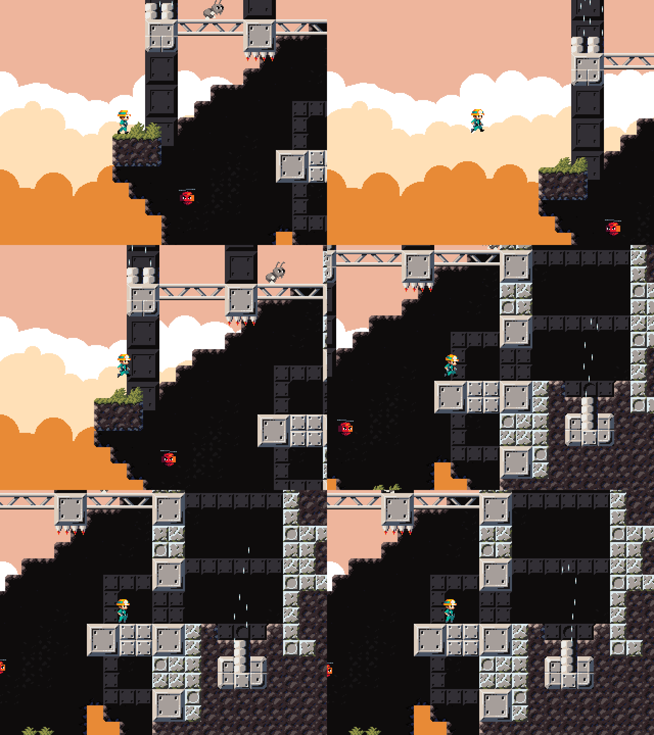
Considering you're talking about the cliffside level, how many levels did you beat? Most people got filtered by level 3 it seems.
Is that jump even possible normally? the intention was to get horizontal momentum with the hook so you can jump further without jumping high.

yes, that's the jump. I did it with a normal jump after 50 +/- tries. This kind of momentum interaction imo is not something you can infer by just playing.
I've completed all levels till cliffside. Lava filter me out, and the last part of frozen is doable but my hands still can't make it.
Tried it for 20 minutes.
Charming graphics, both the enemies and the player and the environs. You've come a long way since the first time I saw you in the threads.
This game has some fun mechanics but holy shit is the difficulty a barrier. I know it's hard to get into the mindset of a newbie when you've been playing your own game for months and months, but some less-punishing levels to get you acclimated to the mechanics would really help the difficulty curve.
I managed to beat the first level but the rest of them pounded me mercilessly into the dirt. It'd feel a lot better if you could go directly to restarting a level without going back to the level select and watching the falling down sequence first.
Please don't put slidey ice physics in platformers nobody likes them.
Oh and I can use enter to select all options in the menu until I get to the level select. That seems weird.
Like the other times I've played, it's really hard. Beat a couple of levels and left it at that. The gray metal guys at the very beginning of the lava area I could hook onto for some reason. Also, at several points I could jump over the level bounds. Primarily when at an exit and not having an orb to end the level. Speaking of, having the orbs stick with you now is much better visual design.
Very good game. I hate 2D games but this was fun because I love grappling hook mechanic's. Add 2 player local co-op. Usually hate 2D pixel art but the art thats here is appealing kinda reminds me of cave story's good art and not some nu-male pixel trash.
I tried but died and died. Cool concept, nice art and sounds. I find the overall movement mechanics and lack of progress saving to make the game incredibly hard for a newbie. I think this is going to hurt its appeal. The hookshot being only jumpable before you contact the wall makes things unreasonably challenging imo. Also I think that for starter levels you need to either make them easier, or add save points throughout the level. But I like the concept, its well done.
- The camera shouldn't switch sides until you've moved a certain distance or waited a certain amount of time. Having it switch immediately gets disorienting when you want to make small adjustments, especially in the air.
- Signs should be behind the character so that the text faces towards him instead of away from him.
- Why is there a sign with an arrow pointing towards a collectible in a dead end? My first assumption was that the arrow was pointing towards the exit and that the collectible was in the other direction.
- It took me a lot of tries to figure out how to get past the spike pit in the second level without taking damage. I thought you had to drop down and hook onto the dirt tile at the edge; make the metal go all the way up. You should also remove the spikes and the ant since it's the first time the player has to make that kind of jump.
- Spikes should hurt you from the sides, like for example if you walk off the tower above the collectible in the third level.
- I still hate these enemies that stick to walls and fly across to the opposite side. Getting past them feels like pure trial and error, at least with the way they're used, and if they end up on the wrong side, you're forced to take damage a lot of the time.
- Again there's an unnecessary ant after the above enemies. Introduce new mechanics and enemies on their own without any other obstacles.
- The death animation can put you in the goal area and it'll count as beating the level. The transition animation plays again once you're already back on the level select screen.
- On level 4 there's again some rushed level design pacing; the wall of alternating dirt and metal is introduced at the same time as having to hit a 1-tile ledge, and there's spikes and an ant as well. The shaft at the end that makes you do it again if you miss the next jump seems needlessly punishing, too.
- The sprite of the wall enemies should show if they're ready to fly across or not. I died because I tried to bait one too early.
- Broke the crate in the cliffside level and the helmet fell out of the level.
- That first part of the cliffisde level where you have to do two nearly pixel-perfect jumps to avoid hitting your head on first the enemy and then the dirt above it is incredibly obnoxious.
- It seems impossible to make it to the platform with the crate in the cliffside level without hooking onto the crate. What are you supposed to do if you fall down after breaking it?
- Why is the collision for the large fan the same width as for the small fan?
- The lack of input buffering for jumping before the hook has connected makes the game feel really unresponsive.
- What's the point of letting you drop down to the ant at the start of the mushroom level? The wall enemy makes it seem like there's something there, and you can't get back without taking damage.
- Making the helmet in the mushroom level inaccessible after you've broken the lantern is a very strange decision.
- The hitbox for the ants is a few pixels too wide. The one at the start of the frozen caves shouldn't be able to hit you if stand next to the edge of its platform.
- What in the hell are you supposed to do here? I don't see how there's any way you could get up there or break the lantern.
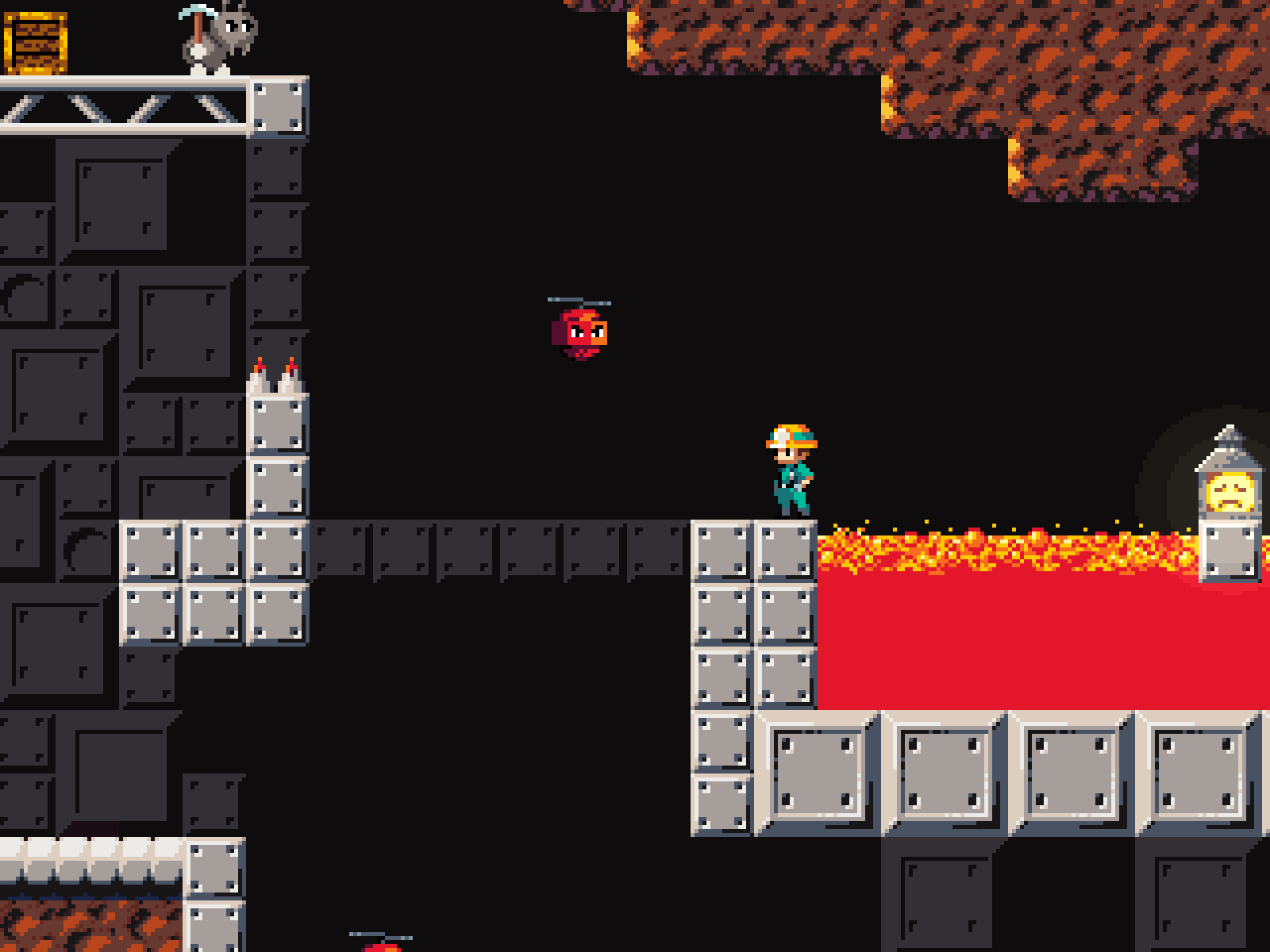
It took me a lot of tries to figure out how to get past the spike pit in the second level without taking damage. I thought you had to drop down and hook onto the dirt tile at the edge; make the metal go all the way up.
That is possible. You need to throw the hook shortly before even walking off the edge for it to work though.
I still hate these enemies that stick to walls and fly across to the opposite side. Getting past them feels like pure trial and error, at least with the way they're used, and if they end up on the wrong side, you're forced to take damage a lot of the time.
I tested getting past all of them with them on the wrong side. It is possible, just nonsensically hard for a lot of them :^)
The sprite of the wall enemies should show if they're ready to fly across or not. I died because I tried to bait one too early.
That would probably help. I wanted to add some animation frames to them for some time now. They look pretty static compared to the other enemies I have now.
I might just slow them down some.
The death animation can put you in the goal area and it'll count as beating the level. The transition animation plays again once you're already back on the level select screen.
That goes on the pile of the myriads of issues with the player controller. I'm amazed it works at all at this point.
Broke the crate in the cliffside level and the helmet fell out of the level.
That's an intentional troll for once. Gotta break it from the other side.
That first part of the cliffisde level where you have to do two nearly pixel-perfect jumps to avoid hitting your head on first the enemy and then the dirt above it is incredibly obnoxious.
See my reply to Vesuvius, that was never intended to be cleared by a normal jump. Maybe a bit advanced of a mechanic to introduce in the fifth level. There's actually a similar jump early in the volcanic level across lava, you can just take a shortcut to bypass it though.
It seems impossible to make it to the platform with the crate in the cliffside level without hooking onto the crate. What are you supposed to do if you fall down after breaking it?
Go to the right from the double-wide fan. There's a horizontal fan that'll push you left towards the lantern. Using the crate is a shortcut.
The lack of input buffering for jumping before the hook has connected makes the game feel really unresponsive.
There is some, I'll try playing with the length of it.
What's the point of letting you drop down to the ant at the start of the mushroom level? The wall enemy makes it seem like there's something there, and you can't get back without taking damage.
That part of the level used to be designed differently. You'd fall down there if you failed a tricky jump, not possible anymore of course.
What in the hell are you supposed to do here? I don't see how there's any way you could get up there or break the lantern.
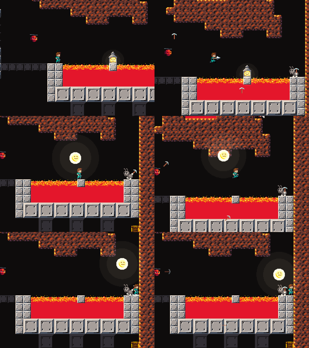
>See my reply to Vesuvius, that was never intended to be cleared by a normal jump. Maybe a bit advanced of a mechanic to introduce in the fifth level. There's actually a similar jump early in the volcanic level across lava, you can just take a shortcut to bypass it though.
I thought this was the only way to do it. I don't think there was any indication or opportunity to discover that you can preserve momentum like that.
>Go to the right from the double-wide fan. There's a horizontal fan that'll push you left towards the lantern. Using the crate is a shortcut.
I tried using the fan a few times, but I couldn't get it to work. It's the first time you come across a horizontal fan, and if you mess up the jump you either go all the way down or die.
>lava jump
The rest of the level was pretty easy, but that one jump is unreasonably hard, again mostly because it's the first time you have to do something like that without being given the chance to get a feel for it in a safe environment.
First off, the visuals are great, you got the values down so well, everything is really readable which is a must for this game. I think the core of the mechanics are great as well, I think the range of movement you can get with the grappling hook is awesome, I was struggling a little with getting verticality in some instances, maybe just needed some time to get used to the mechanics a bit more. Getting the grappling hook double jump was the biggest hurdle for me, tried to just practice getting the timing down but still was getting inconsistent executions. The biggest frustration was having to grapple off enemies, not sure of whether I was going to get the double jump input in intime which would lead to losing half my health or starting the whole level over. Maybe earlier levels could allow the player to grapple the environment predominantly to get around all obstacles and grappling off enemies is a more advanced movement strat that is optional but a fun challenge. Could you add a subtle animation cue to indicate when the window to input the second jump starts and ends? Could be an audio cue as well, maybe there was one and I missed it. It was definitely difficult too, mostly because of level length for me personally. I think smaller and simpler levels to start out would help players get into the game, just because as someone who loves these mechanic heavy movemnt games and who plays a bunch of them I got filtered a bit (I'm actually running into the same problem with my project, to a greater extent even). Again, I think the core mechanic is tons of fun, I love a grappling hook platformer, wish I could get more of a handle on it but it's definitely foundationally solid and something I would pick up.
Kind of a bad review but:
* I like the hook mechanic.
* The start of level 2 kinda filtered me but I still got over it. Didn't finish it but I rescued the light thing at least.
* Most levels filtered me except the first.
But the overall game seems solid.
I like the art style and I found that one charging enemy interesting.
Played again. Beat the first two levels, made attempts on the rest.
I like more this approach to the game than the open ended experiment. This leaves it as "finish the level" as the main objective and "free the spirit/sun/egg" as secondary/harder one.
The game is still brutally difficult. I think that most of the difficulty comes from executing the main trick of the game, which is the double jump. The window to do it is so tight and so easy to fail that it warps the entire game around it. Imo, you could try moving the ending of the time window from "hook dissapearing from the screen" to "player landed". This way it would let the player jump anytime after the hook connects. It would make the game a lot easier and remove the feeling of unresponsiveness from hitting a wall before jumping.
You should do more of the simple trick of shooting to get somwhere horizontally without needing to double jump. It feels like something basic that the game almost doesn't explore.
The moving enemies are very difficult. I dread finding them because Im almost certain I will take damage.
The camera moving quickly when the character turns around is a bit too disorienting for me, specially when I want to move back to get a better spot to jump from.
-I think bombs respawning isn't fun, I just kept dying to them
-it's possible to hook onto ground while falling, on the topside of the ground block, not the side(wall), dunno if that's intentional.
-the timing for the jumps along with carried momentum pushing you towards the wall makes it pretty difficult to wallclimb straight up. when enemies are on the ledges near where you need to land, it makes for an awkward jump with tight requirements.
-falling into the level animation should only play the first time you start a play session(load the game), not every time you die, since that will be a lot
-I wasn't able to beat level 1 or 2.
I dig the cave story looks, great design there! as well for the falling animation, menu, everything on the graphics department is great.
bug: (my screen is 1080p)

Some thoughts as I play:
- Charming look. I like the details of the guy falling to start the level. The look of the world and characters are pretty good.
- Inconsistent use of the buttons. Sometimes space does something, sometimes enter, sometimes A. I'd try and make any "activate" button the same as the jump button, from start to finish. Skipping cutscenes, selecting menu, etc...
- I personally don't feel that the jump is too floaty. I think it feels fine for what you're trying to do here. If it was less floaty, then it would make the other mechanics significantly more frustrating.
- I think you're trying to be way too clever with the camera. There are lots of articles online about a dozen different camera tricks, but honestly my opinion is that most of them are trash. Pushing the camera in front of the player, dead zones, etc... In my experience, the best thing by far is to keep is simple, and just lerp the camera towards the player. The best way is just to move the camera X% of the distance to its target every unit time. Adjust the % up or down for a snappier camera, down for a smoother camera. It's smooth, never noticed by the player, never gets in their way, never causes an issue. Perfect.
- It's extremely frustrating that if you're up against a wall and try to hit it with the hookshot, it fails and you just fall down.
- I'd try to give the player a little bit of a window from when they hit into a wall from their hook, to when they can jump. If hitting into the wall from hooking it caused you to bounce up a little, and during the ascent you could jump, it might make the game feel a lot more fluid.
Keep it up, it's definitely some great progress since I last tried.
Inconsistent use of the buttons. Sometimes space does something, sometimes enter, sometimes A. I'd try and make any "activate" button the same as the jump button, from start to finish. Skipping cutscenes, selecting menu, etc...
Yeah, UI in general needs an overhaul, it's very messy right now, especially the keybinds.
I personally don't feel that the jump is too floaty. I think it feels fine for what you're trying to do here. If it was less floaty, then it would make the other mechanics significantly more frustrating.
Someone who gets it. You need that floatiness to make the hook properly aimable. I 'm not planning to make any further changes to the player physics. I think I nailed them as is.
camera stuff
I do want to simplify the camera. The looking up and down thing will go as that's a bit of a leftover from when the game was running at 160x144 pixels so you couldn't see shit. I do want to keep the sideways lookahead but it could definitely do with some smoothing, or just make it manual, dunno.
There's code in there to lerp the camera but it's set up to just follow directly right now because I'm just not a huge fan of the camera lagging behind even a little giving you less view range in the direction you're going.
It's extremely frustrating that if you're up against a wall and try to hit it with the hookshot, it fails and you just fall down.
I'd try to give the player a little bit of a window from when they hit into a wall from their hook, to when they can jump. If hitting into the wall from hooking it caused you to bounce up a little, and during the ascent you could jump, it might make the game feel a lot more fluid.
There actually is some coyote time there it's just very tight, 0.07 seconds to be precise. I specifically want to discourage wallhugging which is why it's so tight. It's a hook jump not a wall jump after all. It's still possible, just needs precise timing. I do like the idea of a little bounce though. Gonna try that.
There seem to be quite a lot here so I am going to put this on my "play more tonight" list. Quick notes though: movement feels too floaty, make the guy fall faster and jump more sharply, it will improve the level of fun a lot. Hookjumping seems a bit wonky too, but I am not sure why. It does not always work.


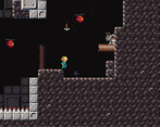
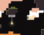
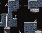
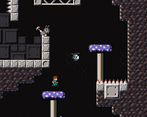
Leave a comment
Log in with itch.io to leave a comment.