Indie game storeFree gamesFun gamesHorror games
Game developmentAssetsComics
SalesBundles
Jobs
TagsGame Engines
A jam submission

Journey in AzurView game page

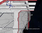
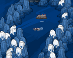
Travel with the last remnant of mankind in a world of endless blue sand.
Submitted by BlueSandDev — 2 days, 23 hours before the deadline
Add to collection

Play game

Journey in Azur's itch.io page

Leave a comment

Log in with itch.io to leave a comment.

Comments

-FPS counter in the menu is absolutely bizarre. Why not just have it at 30/60/90/120 instead of this weird "press up or type in to select"?
-Why the FUCK is scrolling back is zooming in, while scrolling up is zooming out? That's absolutely unhinged, anon

-Incomprehensible english narration
-Scratch that. Incomprehensible english in general
-You gain brouzouf.
-My legs are OK
-Battle animations don't exist
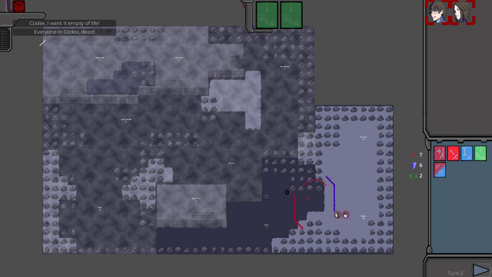
-Why do stats even mean. I have a red sword one and the green eye one. I can assume that red it my attack stat, but not what green does.
-Why do my characters have 10 next to them, but enemies have "1"? What does it mean?
-How does Overwatch work? It's only used in tutorial and I can't replicate it after.
-There is 0 explanation for the stats. I mean technically they're there but what do I get from reading "Murder: In combat, all wound are focused on the target with less wound remaining. If the target die, remaining wounds are distributed to another target"?
-What do numbers next to combat areas mean. Like what the hell is "Entry Point 85", why 85? Is it better than "High Ground 40"?
-You get map explanation/tutorial after you finish the first combat mission. Why?
-You actually get it after every combat encounter
-You are also forced to replay combat tutorial after finishing raider base for some reason
-You can accidentally enter the trader post after the first encounter and get softlocked there
-Something is very wrong with triggers in this game
-Cool lore I guess?


-Above average sprites, but too static ones. Absolutely no difference in expressions, most of the characters have either shit eating grin or resting bitch face
-Decent to good art otherwise.
-Providing tooltips for some in-universe stuff by highlighting words with your mouse is a neat touch, but I'm pretty sure you can stop doing this after the player actually reads them. Maybe make a glossary for later, or codex. Or whatever
-if a chatbox is especially long, it gets cut off at the bottom (noticeable in one of Marche dialogue options and the exchange in the ship after it)


-I hope that music is placeholder for now, it sounds like a royalty-free porn VN

First of all - I don't understand why you pulled the links from your page, it's not like it really matters when the game is so early in development. Seems to be a very story-driven project but Jesus Christ, the lack of proofreading and writing is not making it easy to follow. Combat system is extremely raw and I have no understanding how it works aside from just sending units towards the enemy and said enemy doing 0 damage. I personally got stuck after getting the fragment hunter person because whatever location that I needed didn't spawn.

The game is riddled with bugs related to triggers and has at least one location that can softlock you after visiting it (trader post). I suggest shifting your focus to making something playable and having less accent on the story for now. Prioritize making your text readable in english, fix the triggers. You're probably going to eventually decide whether having combat is even worth it or if you want a VN instead. The way combat looks now I'd suggest the latter, but I don't mind being pleasantly surprised by your competence later down the line

Submitted

I reached the point where the guy in Marche tells you to find Katrine and then I have no Idea what to do, I assume that's the end of the demo?

Anyway I really like the setting and the environment art isn't bad.
The tutorial battle has a horrible UI but gameplay-wise it's promising, I'd like to see more of the combat to get how a real battle flows.

The writing reminds me of E.Y.E: divine cybermancy (which I assume you're familiar with considering your main character is called Rimanah), you can tell what the characters mean but you're gonna need someone to just straighten out the dialogue so that it doesn't feel clunky and weird.

Also not a fan of the slowly panning map when you're moving and a button to speed up time when traveling would be nice.

Promising overall, I hope to see more of this.

Submitted

Played until it seemed I couldn't progress any further.

The intro actually got me really hyped. 

The art isn't the most technically proficient stuff, but it's got the aesthetics and composition going just right.

I love the hyperlinks in the dialogue. Good stuff.

I cannot hear the name Rimanah without thinking of EYE Divine Cybermancy. Might not be the best idea to have a name that makes English speaking players think of other games for your main character.

The English is broken, but the underlying writing and characters seem solid. 

In the combat screen, the scroll wheel zooms in and out opposite of what seems intuitive to me.

I had absolutely no idea what the game wanted me to do in the tutorial to start. 

As far as I can tell you're ONLY allowed to do the moves the game tells you to do,

but I don't think it ever told me to try clicking on the bottom left sector. 

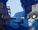
The background art in the dialogue scenes is nice, but it'd be even better if you got to click on stuff in the scenes instead of just having portraits in the upper right.

The nomad girl's body language doesn't match her dialogue at all. 

Like, I love girls stretching in skin tight outfits as much as the next guy, but come on.

The options screen in the overworld seems to display all audio at zero when I initially open it.

I can't figure out how to progress further after talking to the guy in Marche. 

I'm only prompted to leave the scene after he tells me to go to Katrine, but in the overworld, 

nothing happens whether I go back to Marche, Trader's Rest or Impact. 

The other comments mention a second combat mission but I'll be damned if I can figure out how to reach it.

Overall, the game's really rough but I think there's something worth pursuing in there. Keep it up.

Submitted

Story, ignoring typos and grammar, is a pretty good set up. Characters are a bit basic to start with, but have potential of course. I like the use of French for various details, different but reminiscent of Japanese in Alien's ship design.

Gameplay is alright, but it needs plenty of TLC to feel better. The end turn button lacks highlighting on hover, there seems to be missing UI info or at least I couldn't find it, and the time it takes for people to move is a bit long.

The art is really good, especially the backgrounds. Game looks promising, looking forward to how you improve upon it.

I really like the art style and the world building seems interesting.

The game is unfortunately full of typos, grammar mistakes, strange wording, and awkward conversation flow. I'm assuming english is not your first language, but generally I think this game could've been more enjoyable with a couple more passes of proofreading.

At first when I got to Marche it seemed there was no way forward. I tried replaying and picked some different dialogue which seemed to unlock another combat mission that wasn't available before. Unfortunately this new mission locked up on me, I think I selected to move into a section of the map at the same time enemies moved there which caused it to lock up? though I'm not entirely sure.

Generally, I think this game has some cool potential so keep at it.

Submitted

At the start of the game, I didn't know when the cutscene ended, or who I was.

i cant hold down left mouse to move around in the world map, i have to constantly click

zooming in is much/randomly  faster than zooming out, strange and annoying.

I have no idea how that first guy in the lower area disapeared, i just clicked on him, something orange happened, and pressed next turn, and then he was gone.

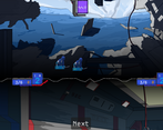
I have no idea what really anything means in the combat mode. Hovering over the 2 + 2 = 5 abilities doesn't do anything. I don't know if im in attach/movement mode. I don't know what the green cards on the top of the screen are. I don't know if the "next turn" button is disabled or enabled.

The hole inner culture thing could be a bit more subtle.

Multiple dialog options looks the same as a person saying two things in a row

I got stuck here. Clicking on anything doesn't do anything. All i can do is select/deselect my team members and move the camera around (painfully because of the zoom in/zoom out difference). Had to alt+f4

played a bit and encountered a bug  that prevented progress. restarted, only to encounter the same bug again. at that point i gave up, which is a shame because the characters and atmosphere interest me despite the poor writing. 

this is very clearly a franco-belgian-comic inspired setting, and i like that a lot. the nomad girl you meet in the town is my favorite, but the rest of the characters are good too. there's a nice mix of personalities. it's always strange how a small amount of humans will immediately break into factions, especially since it's not explained (up to the point i played) why that would occur, but it's presented in such a way where i can accept it and play along.

the bug i had was that on the 2nd combat mission, if the raiders are a tile away and it is their turn to move, they'll never take an action which essentially freezes the game. piggybacking off that, the combat is very confusing to read in terms of UI. the actions and turns make sense, but often times its unclear if it's my turn to move, or what available actions i have and so on. this is made clear to me once the bug occurs, since i can't tell if the game is bugged or if i didn't select something correctly, which is in my mind a bad position to be in. it needs more clear presentation - you can probably compare this to something like the newer XCOMs which are incredibly legible at all times.

otherwise, the art is good and the storyline engaging. some of the characters could use a bit more polishing on their faces, but it's nothing too serious. i hope you fix the bug /  issue i had since i am interested in playing more, but without saves i don't want to restart a 3rd time only to get softlocked again.

Submitted

Game looks very good visually. And the combat is also seems fairly unique. Unfortunately the dialogue is wonky, with many spelling errors. The UI, especially the clarity of the UI during combat, needs work. But all in all a good looking start to a game.

Some thoughts I had while playing:

  • Why are the menu options all the way at the top right? They really don't stand out.
  • Sound seems weird. Are you correctly using linear2db before applying the slider?
  • Please get someone to spellcheck your dialogue. The flow is often broken as well, with missing commas and the like.
  • There's some desync where the subtitles don't correspond to background changes which is really jarring when the background temporarily turns to black.
  • Amazing art btw.
  • Way to skip the intro please.
  • Red dialogue indicator arrow should follow me when I hover over a choice.
  • Even in the future people use French slang. Disgusting.
  • Consider starting with an action sequence before introducing the character dialogues. Combat should come way earlier in the game. Just like most Fire Emblem games will start with some combat to give the player a taste of the game before they get invested in the characters.
  • Amazing art btw.
  • Would be nice if characters had different facial expressions.
  • Driving is very slow.
  • What bothers me about the text is that it's as spoken. Like: "Radio contant. A moving one, kind of like a ship.From Impact's direction." Works fine as spoken dialogue but feels strange when purely written down.
  • Consider changing the outline of dialogues depending on the speaker.
  • Spread out your tutorial, don't expect me to remember an entire text without having been able to put it into practice. Even just splitting up the different parts for reference would be fine. Good that you can pop-up the tutorial everywhere though.
  • Amazing art btw.
  • Need a selection indicator on the map and not just in the top right.
  • The UI for the combat needs work. I had no idea what to do with the abilities in the middle right.
  • Right click to drag the map is a strange choice. At least allow me to use arrow keys or WASD.
  • Scroll on tutorial also scrolls the map.
  • Combat animations and clarity clearly needs some work.
  • After tutorial I got back to the scene after the Impact and before moving to Trader's Rest, so I assume the demo ends there.
  • Would be nice to have a way to close the game that isn't alt-F4.
  • Amazing art btw.
Submitted

Writing is not great which is pretty bad in such a dialogue heavy experience. The UI's not bad but it definitely needs a second pass, some buttons and the opening text box in particular still feel like stock engine assets. I have no idea how combat works and managed to accidentally trigger the tutorial fight a second time by going down again after the cutscene.