Indie game storeFree gamesFun gamesHorror games
Game developmentAssetsComics
SalesBundles
Jobs
TagsGame Engines
A jam submission

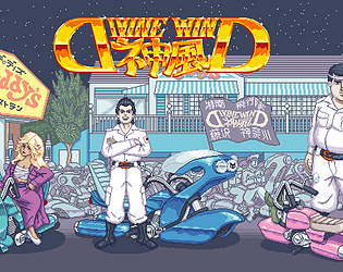
Divine WindView game page

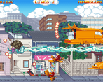
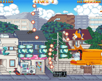
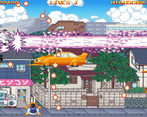
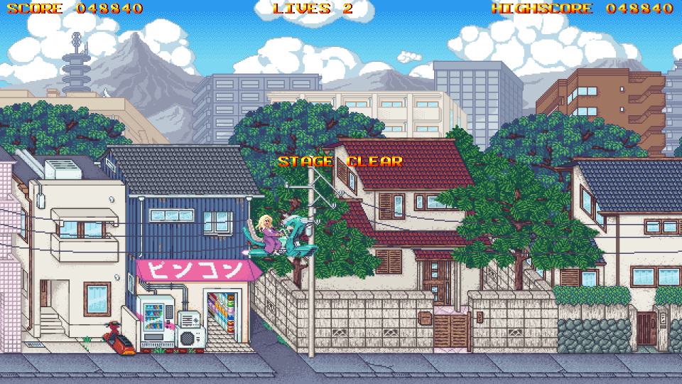
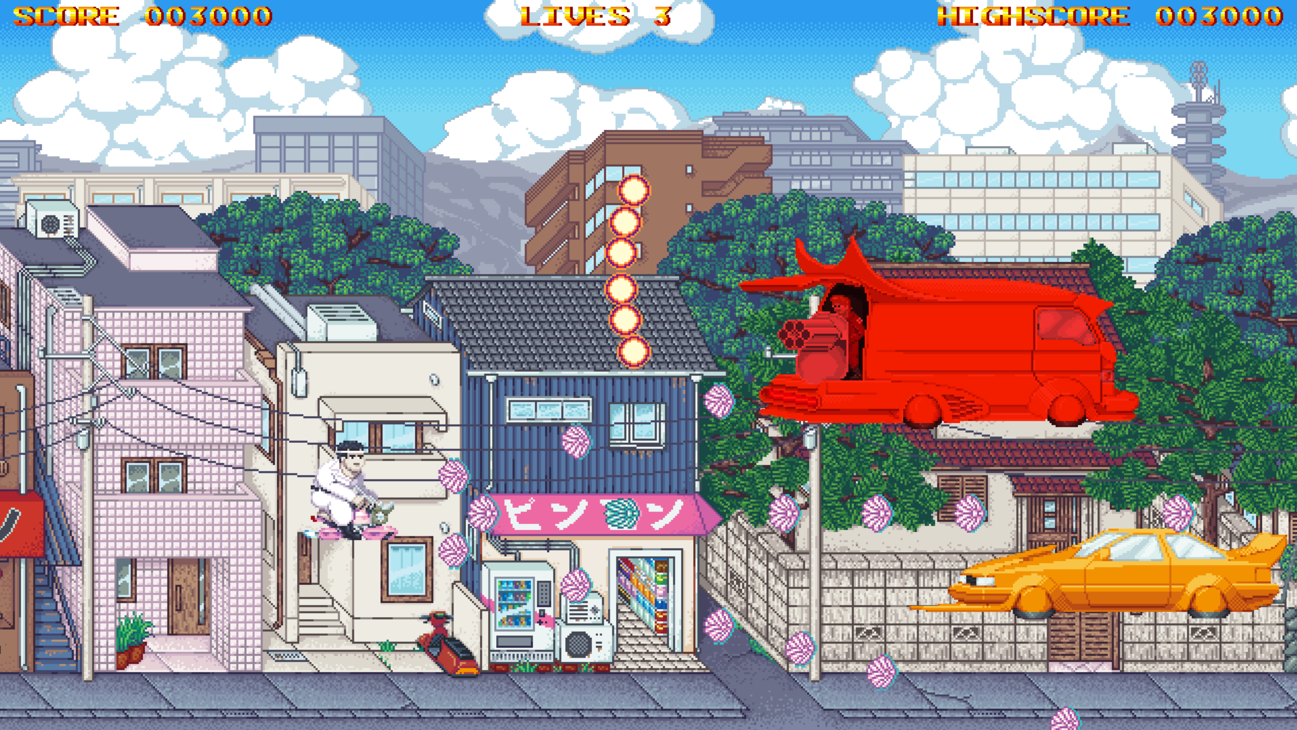
Retrofuturistc Bosozoku Shmup
Submitted by Sodeko — 2 days, 20 hours before the deadline
Add to collection

Play game

Divine Wind's itch.io page

Leave a comment

Log in with itch.io to leave a comment.

Comments

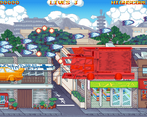
Very nice and feels very polished. A bit too much stuff on screen, but it's not annoying, so no complaints there. Very wacky bosses.

It's a bit less like a touhou shmup and more like a gladius shmup, which I assume is the inspiration. My only feedback would be - all characters feel the same - the only difference I found were the bullet patterns (which are not very distinguishable, and I found the beam consistently more useful), and a tiny speed change between the left guy and everybody else.

Developer(+1)

Thanks for your service. Watched the stream and it was pretty insightful for me on some stuff. About inspiration - it's more of Donpachi from Cave, so speed(and speed range), weapon patterns, laser mechanics - all was stolen from there.

Submitted

SOVL

Enemies feel too static, you may add at least some minor animation to them like reactive exhaust

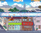
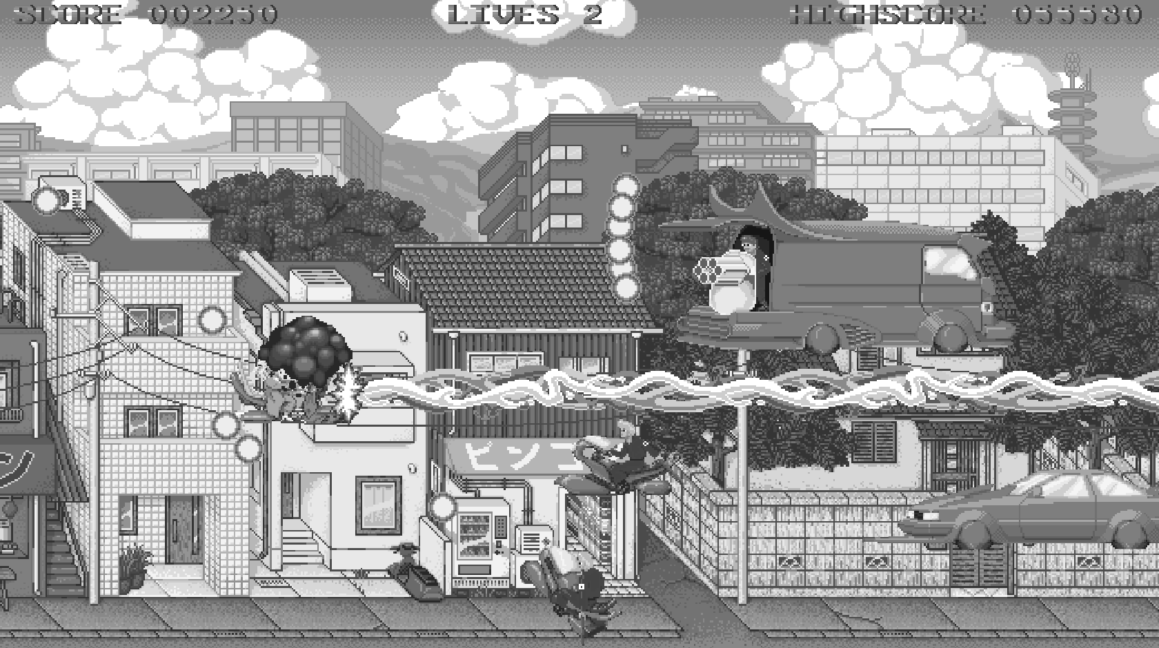
Everything blends in with the background, have you checked the screen in grayscale? Maybe make it less saturated

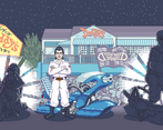
Players' projectiles look strange, maybe I miss some deep lore?

Developer

Thanks!
Additional animations planned for sure, especially for bosses.
Never tried to grayscale, but I realize it's can be hard on eyes.
Fat guy's projectiles are chrysanthemums, otherwise there's no really deep lore. It's just what looked fun.

Submitted

As an artist, you need to constantly use this simple trick.

The way your screen is readable under grayscale filter, so it will be in colors

Developer

I've heard about it, but never gave it any piece of thought. Thanks, it's really clear this way, what needs to be tweaked in terms of colors.

Submitted (1 edit)

Interesting, but a little rough, aesthetic. Very nice explosions, feels like they've been lifted from Metal Slug game. Managed to beat the main boss, the laser beam should be telegraphed a little better. Other than that scrolling was a little sluggish, game wasn't dynamic enough because of that ( I think). Long beam takes a litle time to travel to end of the screen but when I stop shooting it then it disappears instantly. Very odd.

Very detailed backgrounds, I can't imagine how much work went into them and animations of enemies. Shumps can be pretty demanding for artists, I hope you have a lot of perserverance. Keep up the good work!

Developer

Thanks, I really do spend most of my dev-time drawing, not coding. And explosions are stolen asset, yeah. I don't even remember, where did I get em' from. Gonna replace it with my own as soon as possible.

Submitted

Pretty basic. I wish it had a bit more speed and a bit more impact with the sound effects. Still a lot if nice little graphical details, funny theme and light likeable character designs.

Developer

Speed is based on game balance and references like Donpachi. Sounds are placeholders for now, wanna redo it for sure.

Submitted

I'm not sure why, my toaster ran this like a PAL game on an NTSC screen. Anyway, it's a good base for a game, but there's still a lot lacking. Particularly I'd like to see more variety in patterns. The first and second bosses don't feel much different from each other (they both have slow dodging patterns and move up and down, except one has a laser and another fires an object at your face). And this game has great art, but I find the background far too noisy for this sort of game; it draws too much attention to itself.

Developer

I'm impressed, that you struggled through all three characters despite the obvious freezes. If game starts to lag, I just reload it. Enemy bullets pattern are first iteration and rehaul is planned. And redrawing background to more bleak colors too. Maybe...