Thanks, fixing inertia seems my top priority
Spartizant
Creator of
Recent community posts
This game feels so much better than the previous one and I honestly see myself playing it for hours if you polish and fix it
The mission accepting process feels strange but I cannot say how to organize it better
The building progress bar should be reversed
Automatic pause off is annoying
I couldnt choose to orbit langragien untill reloaded the game and tried again and overall path selection with double click is not responsible somehow
I failed one mission and there were no available possible contracts after this despite mostly unlocked techonology tree and multiple ship combinations, shouldnt they randomly appear from time to time?
I like your ui design direction but looks like it stuck in a limbo between bronze and a paper and I cant tell which material is this, maybe it would be better to separate them and make more metallic outer parts and gears with old weared paper inside for a text?
Thanks!
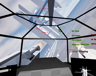
About unreliability do you mean the strange bend position? If that its a bug. Overwise when you hovering or grounded the chassis must always work. Whe legs are raycast suspension perpendicular to the body and they are preventing the body collider from hitting the ground always with the same force, so you can lend on the supersonic speed even as long as you move in parallel with the ground
The enemies indeed are tanky sometimes, it seems I forgot to make turrets to transmit damage to the main body, so they consume it full on themself until they break
Youre absolutely right, I think myself how to justify ground movement. One way is to use the engine while grounded and increase the max speed to around 500kmh. Or to build multilayer low-ceiling levels. Adding AA systems... Or maybe remade the physics and use grounding for fast direction changes
Yes I want to make it arcady but still physics based, so while the basic controls must be easy, I want it to have inertia and allow players to develop some piloting technique
Thanks! Your video is super useful, I had a rare bug when the mech gets stuck in the weird bend position but you was getting it constantly
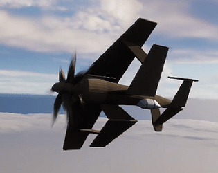
For flying even in this half-arcade way you need to know what pitch roll and yaw is and why planes fly this way
I do not simulate controling surfaces here so the rotation stays mostly the same regardless of the angle
Critical angle means the plane is stalling and the wings became useless, I just didnt make a tutorial ot maybe my ui is this bad still
For grounding and everything you could just hold space without W and you will fly like on jetpack, you used it once at the beginning but stoped and I dont know why
Definitely a great improvement, I had almost zero stutters
Walking and shooting feels nice, I think its time to work on the enemies, they are too slow and stupid and unfun to fight with
Dialogues before compain missions are strange, a kept pressing random buttons untill get that they are automatical and just delayed, you need to make them animated and/or wait player input to progress
Aslo sniper thing in one level are broken, it hits you every time despite the laser pointing in different direction
I like your idea of using a power shield
It gives the player some freedom for risk like WoT vs WT and without using hp at the same time, also making infantry riffles not useless as well
You need to make the glowing parts on the tank to show the energy level, the thing in the corner is too small
90mm cannon MUST be movable at least a little, you can make the ballistics much worse even, it has great potential to be fun but currently it feels needlessly annoying tbh
Also I broke module menu somehow
Dude thats amazing!
Besides all the readability and scaling stuff I felt like rotary cannon needs to have x2 ammo from the current one to make it worth choosing instead of autocannon
I like how you made the guiding system, but the rockets felt awkward against the maggots so I hope you will add another secodary weapon or allow to install cannons instead
I like the combat idea overall
The main problem is your ui has the same hue/saturation with map, blends in and ends up completely unreadable
The action options scale with the map and thats bad
Prebattle placement should be drag n drop I think
Also maybe you should add big ui sections on screens sides showing what is going on and summarising like This guy will use this action on this guys etc
Got random stutters while traveling the global map
Liked the dungeon section
Thanks!
Yeah switching from ground to hovering is the most rough part and I will keep experimenting on it
Your maneurability depends on speed, you can see it yourself on 1000+km/h, and when wings are folded it stays the same, but you trade all lifting force and x5 drag force on vertical axis
But on a big speed if you fold wings and decrease thrust to 0 you can fly backwards! Think of luftrausers
As for dynamics I still need to balance it. Currently it works on more of a realistic way and the mech has 1.5 thrust/mass ratio