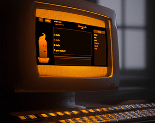
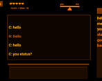
This is a really cool concept! I like the monochrome display graphics and the background music. Great job!
Play game
Compicactus: AI dating simulator's itch.io pageResults
| Criteria | Rank | Score* | Raw Score |
| Originality | #5 | 3.944 | 3.944 |
| Overall | #9 | 3.481 | 3.481 |
| Presentation | #13 | 3.611 | 3.611 |
| Fun | #16 | 2.889 | 2.889 |
Ranked from 18 ratings. Score is adjusted from raw score by the median number of ratings per game in the jam.
Comments
The look and sound is great and the idea is interesting. I wish there were more options to use when talking to the AI. I really liked the broken English weirdly enough. I will say it did feel slow to try to gain the last few hearts and became rather repetitive but otherwise great game!
Nice game, the atmosphere and music is good, the candle is so cute makes me want to befriend them. me like.
Cute game! After a while I seemed to get stuck because there weren't any new words being added, so I'm not quite sure if I reached "the end" or not, but it's a well-put together game. I think being able to remove words if you've made a mistake would help the player usability.
I read the article that you linked in the description, too. Thanks for the good read!


Leave a comment
Log in with itch.io to leave a comment.