Indie game storeFree gamesFun gamesHorror games
Game developmentAssetsComics
SalesBundles
Jobs
TagsGame Engines
A jam submission

City Death Kill 2View game page

A violent mashup of two violent games.
Submitted by Dog Folder (@DogFolder), Makhor (@jorge_makhor) — 25 minutes, 5 seconds before the deadline
Add to collection

Play game

City Death Kill 2's itch.io page

Results

CriteriaRankScore*Raw Score
Community Choice#353.0003.000

Ranked from 14 ratings. Score is adjusted from raw score by the median number of ratings per game in the jam.

Judge feedback

Judge feedback is anonymous.

  • I initially struggled with this game to figure out what I was supposed to be doing, but after a while I enjoyed it. I think there’s too much going on mechanically and it would be better with more focus. I also encountered some technical issues that multiplied some of my initial confusion.

    Liked

    • Refilling the slow-mo meter upon killing enemies is very satisfying
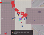
    • Good blood splatters

    Needs Work

    • Too many mechanics
    • Unclear goals
    • Some technical problems

    The biggest thing that threw me for a loop with CDK was not having defined goals for a stage - I’m still not sure entirely what they are, but I do know that after I kill enough people a guy tells me to get in his van. I initially thought I was supposed to kill certain people, and was confused when more of them spawned - but once I found out that killing refilled the slow-mo meter I was engrossed enough in that that I just kept doing it until the level ended.

    The technical problems I encountered were that the game slowed down after starting enough fights but not finishing them. Potentially related is also after a while my pistol wouldn’t shoot, and I thought that I had used up all the ammo (which -pistol has infinite of). After restarting the game and focusing more on killing, these problems didn’t show up anymore.

    To elaborate on “too many mechanics” - the dodge was extraneous with slow-mo, the skateboard was really fiddly (and I hurt myself more than the enemies when using it), I never used the throw gun function, and I also never didn’t want to pick up a gun when I walked over it - having to move my finger off a movement key in order to pick a gun up was distracting. I think CDK could stand on its own with just slow-mo and some updated level art/some more levels.

Elevator pitch
A mashup of the PS1 GTA games and Hotline Miami.

Describe how your game adheres to the theme
It acts as an overly violent sequel of two already violent games.

Leave a comment

Log in with itch.io to leave a comment.

Comments

Submitted(+1)

While not my type of game, I definitely appreciate the vaporwave-ish aesthetic. I also like how smooth the controls feel overall.

Submitted(+1)

This game hits you hard with the difficulty right off the bat. 

It plays well, the shooting itself feels good though enemies move around so erratically that combined with your relatively slow bullets it makes it really difficult to actually hit them. Combine that with the relative tankiness of the enemies and it ultimately made combat feel far harder than it perhaps should have. Like it didn't matter if I used the pistol, shotgun or the machinegun they all sort of felt equally ineffective against things.

Checking the other comment out it seems like I was meant to shoot specific people? If I was, it really was not clear at all but it seems like you're aware of that now.

I kind of hate the skateboard controls, particularly acceleration. Not really sure the spin was doing anything, either.

Overall, cool concept but it needs to be introduced and explained better. 

The level goals need to be clearer.

The difficulty of the first missions needs to be toned way the heck down to let the player get used to how the game works, imo. The first level is much too difficult as an intro!

I liked the gun sounds, the shooting itself, the blood effects were nicely done and I got a kick out of the utter chaos once enemies started shooting each other. :D

Developer(+1)

This game had a lot of problems but the main one is defenetily the "Whys". Why are you shooting people? Who are you supposed to shoot? What does the skateboard do? it was really stuff that needed to be addressed but that kinda fell back compared to making the main mechanics, which is very wrong. The tutorial was supposed to address a lot of stuff but it just simply wasn't enough, there was way too much stuff. The way tutorial text works wasn't the best either, you can actually dodge by pressing space bar on foot, but I changed a line of dialog which included the explanation, and the skateboard spin is actually a dodge, but it is very hard to notice. And while you can always playback conversations on the tutorial by pressing some red buttons, that also wasn't very clear. Overall, WAY too much shit for it's own good, scope should've been smaller and I agree with all your points. And there was also supposed to be another weapon variation called the "Super Shotgun" that didn't make the final cut, which was supposed to be a more powerful shotgun with less ammo, in order to make enemies more dangerous and give the player more power. And the difficulty was a mistake of pretty much 0  external playtesting, the game kinda got stuck on this box and thus, figuring out difficulty was pretty much impossible, which was another major mistake on my part. Thanks for playing the game, though! We appreciate the feedback and will definitely keep it in mind for our future projects!

Submitted(+1)
Pros:
  • Implemented solid mechanics and the use of skateboards was interesting
  • The repeated blur effect for the end credits was really nice. It's weird to point it out but hey, it was good.
  • Stunt-ing as a rewardable quality to play is interesting
Cons:
  • Details are a bit small and zoomed out, or the game moves faster than it should for the zoom
  • Feedback could use more oomph and be more useful to the player moment to moment
  • Quite short
Here & There:

I'm going to point out that we used almost exactly the same colour for our rank screen backgrounds. Cool. When I started playing the tutorial area I moved quicker than I was supposed to, and so some number of messages were jumbled over each other and lost in the mayhem. There are some nice little effects such as the breaking glass that help make the action feel more like it has consequences, but overall the game is pretty small and zoomed out so some components of the feedback are too hard to notice (hitting enemies, getting hit yourself, the reticle). The game doesn't really tell you who to attack so on the second level I just got on a skateboard and rode around for a while before I started shooting at random characters. It was smart not to include the collateral damage from NPCs on other NPCs in the scoring, because when I did start shooting I just ran around and let them trigger each other but it was to no avail. The connection to Hotline Miami seems underworked, because it is a mostly melee focused experience in tight quarters at high speed, and while this has speed it doesn't really show that influence very well. I would also have preferred the weapons shoot faster to match the movement speed. The mechanics are there for an interesting experience but as it stands it doesn't utilize them in a way as to encourage such an encounter.

Developer(+1)

Hey there! First of all, thanks for playing the game! Second of all, I agree with a lot of these points. You can actually replay tutorial messages by pressing F on the red buttons, if you get near them it'll say "Press 'F' to replay dialog". But up to these point, no one has actually used it, which means that it obviously wasn't clear enough what they do, so yeah that was a big mistake on my part. More HM style weapons were planned such as melee weapons, but they didn't make the cut, thus making the game seem more GTA than HM, but I think the HM style comes through with a lot of our effects/aesthetics. The weapon speed was actually slower on the original versions, but got upped before final release, and so far, it clearly wasn't fast enough. A hit indicator was also planned but again, time constraints, which obviously mean that the game was just too ambitious for it's own good, and that it should've had a smaller scope. Also, you can pretty much win the game by shooting everyone, and I know I said on a previous post that you're supposed to shoot the red/green NPCs, who are supposed to be gang members, but eventually the game just became a "shoot anyone that moves" game, and it should've been explained as such on the tutorial. Some really good criticism/feedback overall, and again, thanks for playing the game! We will defenetily keep this feedback in mind for our future projects or... maybe a more refined version of this game, who knows. ;)

Submitted(+2)

I'm digging the aesthetic and gameplay a lot here. Great approximation of the two games I think it's based on. 

A couple thoughts: It could use a more clear objective once the game level actually starts, as I wasn't sure who to shoot exactly. Which I think is the point, but might need to be stated more clearly. Also, giving the guns a little more impactful sounds and the shotgun more power would have made it seem more important to grab different weapons and more satisfying to shoot.

Overall, great job! 

Developer (2 edits) (+1)

First of all, thanks for playing the game! Second of all, I agree with a lot of the stuff you pointed out. I think just saying "shoot the green and red guys" would've been a lot more clear and better, it was one of those things that slipped out of the other stuff that we had to do, but the game can pretty much be played by shooting at everything, because even normal peds can be aggresive! I would say that the pistol and shotgun sounds are impactful on slow mo but you can barely hear them, bad sound balance on my part. And the more I heard the SMG sound, the more I hated it, but there was no time to change it. Overall, really good feedback you just gave us! We'll be sure to keep your points in mind for our future projects! And again, thanks for playing it, and cheers!