Play game
Thieving Hexe's itch.io pageResults
| Criteria | Rank | Score* | Raw Score |
| Art | #3 | 4.583 | 4.583 |
| Gameplay | #29 | 3.833 | 3.833 |
| Overall | #72 | 3.708 | 3.708 |
| Black and White | #79 | 4.667 | 4.667 |
| Music | #123 | 3.167 | 3.167 |
| Originality | #174 | 3.250 | 3.250 |
| Theme | #198 | 2.750 | 2.750 |
Ranked from 12 ratings. Score is adjusted from raw score by the median number of ratings per game in the jam.
Leave a comment
Log in with itch.io to leave a comment.




Comments
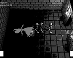
Great game! It looked and sounded fantastic and is overall well polished. The skeletons can be a bit intense though. Maybe have some ranged skeletons as well so you don't just have 4 skeletons all running at you at once?
Cool game. I really liked the way it played. I really liked the dithering. Really solid game overall.
Could you try out my game if you get the chance: https://itch.io/jam/black-and-white-jam-8/rate/148308
Great atmosphere! Love the camera angle. Agree that enemies seem a bit spongey, but not enough to stop me from playing! Got a genuine sense of exploration.
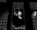
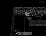
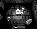
The visual effects were really nice! The use of dithering as lighting can be an effect of its own and works very well here. The music was also chilling and well composed. I personally found the game very challenging, maybe the character should be given a higher speed or more dashes? I also didn't think the torches really did anything. You could always see yourself and the skeletons, so I felt that the lighting/fov aspect of rougelikes/rougelites was a bit lacking.
Of course this being a game jam there was a bit constraint, but if you expanded this with more/better mechanics it would become classic.
Thank you!
Yeah, the torches and dashing were very late additions so I didn't have much time to balance them properly.
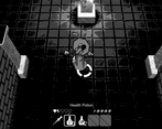
The point of the torches was to serve as a disposable item that you could drop anywhere and use to mark your way back if you wanted to, and as a melee weapon that's stronger than the wand but leaves you more vulnerable.
Great visual design. The dithering effect on the lighting looks especially great.
I like the concept of having to return to the beginning of the dungeon after you get the thing.
It seems really hard to avoid taking damage from the skeletons. They move faster than you, and each skeleton takes several hits to defeat. Plus, it seems like you can't even sprint away if a bunch are hitting you at once. I tried several times, but I wasn't able to complete even one dungeon.
Having an indicator of how long the sprint potion lasted would have been nice.
Thank you for the feedback - much appreciated!
The trick is to constantly move and strafe around the skeletons - they are faster but have slower acceleration, so strafing, tapping sprint and hitting them to knock them back is the trick (The torch can also hit multiple enemies at once and does more damage, but leaves you more vulnerable.)
And yeah, having too many skeletons hitting you at once effectively stun locks you.
I will definitely keep these things in mind for future updates - Balance adjustments and difficulty options are in the to-do list :)
Nice! a lot to do, random dungeon, and difficult enemies. as a Rogue like should have.
the dithering shader along with outlines on the skeletons? along with the hard normals, make for quite the art style, which i like. Well done!
Loved it ! I loved the atmosphere, the art and the gameplay is quite fun !
Great job !
Fun gameplay with great art!
It was quite fun to play! and i wish the skeleton sounds sounded a little better
A very well-rounded dungeon crawler experience! I loved the aesthetic of the low-poly style and the dithering filter! I do wish that you could've explored the theme more creatively and incorporated it into your game, but all-in all, a very good contender.