Play game
TubeWorld's itch.io pageResults
| Criteria | Rank | Score* | Raw Score |
| Black and White | #123 | 4.478 | 4.478 |
| Music | #137 | 3.087 | 3.087 |
| Art | #169 | 3.087 | 3.087 |
| Overall | #171 | 3.210 | 3.210 |
| Gameplay | #175 | 2.826 | 2.826 |
| Originality | #182 | 3.174 | 3.174 |
| Theme | #218 | 2.609 | 2.609 |
Ranked from 23 ratings. Score is adjusted from raw score by the median number of ratings per game in the jam.
Leave a comment
Log in with itch.io to leave a comment.



Comments
THE GOOD PARTS
The color palette is nice. I really enjoyed the colors you picked for the game; they feel easy on the eyes and it gives a nice touch to the game.
The music is OK. It conveys the intended emotions of the game well enough so that it complements what you’re going through when you’re playing.
The controls respond well too. I have no complaints when it comes down to the controls and that’s something to be thankful for in a jam entry.
THE BAD PARTS
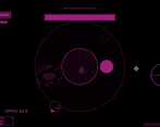
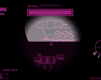
The boss is unfair. It took me a good couple of tries to finally defeat the boss and it was mainly because (unless it works with patterns and I couldn’t be bothered to try to learn them), there was no way of knowing where would the boss attack from, which resulted in deaths that feel somewhat cheap. The boss itself is fine for a jam entry, but its attack patterns make it more a fight based on luck than anything else.
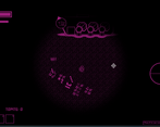
Huge map with nothing in it. The enemies you have to kill to get the topite [an in-game collectible] that allows you to progress in the story are right in front of you when you start the game; this is great since it allows you to quickly retry the unfair boss fight so the friction is highly mitigated there. With that being said, what would the purpose of a big map be if you’re not encouraging the player to explore it? It could be just a few squares in size and it would have had the same amount of impact as it does now. This issue is heightened by the fact that the boss traps you in the spot and doesn’t allow you to move freely when it spawns so the size of the map becomes irrelevant once again.
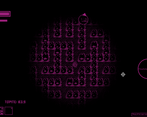
There’s no loop here. It seems that the interpretation of “loop” for this game was in the map layout, which is a bummer because the map becomes so irrelevant that is practically impossible to notice that if you walk in a straight line the map “loops” you to the other side of it. Although this is a valid interpretation, it’s so disconnected from the game itself that it could easily not be there and just a few people would notice (myself included, because I love to try to break games).
CONCLUSION
Give this one a go. It’s a decent jam entry with controls that won’t frustrate you and a boss that, in the words of the developer, is “easy”. To me, it turned out to be highly unpredictable, and I ended up dying more than I should have because of that. It’s OK, though, it’s easily attributable to the time we have to develop these games so it’s not such a huge deal.
Try to explore the map, kill a couple of enemies and THEN go for the boss, you’ll experience the whole game since it’s a bite-sized experience that leaves you with a good enough impression.
A nice game overall! Good job!
Thanks for the very detailed review!
To respond to your criticisms:
I will continue to work on this game though (I intend for this to be a long term project). You can consider the jam entry to be a very small teaser :)
Really cool and a great effort for a proof of concept. I loved the retro art style. I can't wait to see how this develops
Thanks for your comments. I will keep updating after the voting period ends, keep an eye out for new devlogs!
Great work! I liked the style and colors you chose. Controls were simple and easy to pick up. I liked another player's suggestion of adding an indicator for the boss to show which direction they were going to attack (maybe there was and I just didn't pick it up!). Otherwise, nice entry I had fun :)
Thanks for your comments. Yeah I've realized that the hardest part of game development is probably the UI haha.
The weapon energy that runs out is nice. It have storytelling elements, witch is good.
Instead of a minimap, you could just have an arrow in the GUI pointing to the closest enemy.
In regard of the boss, I just walked out of it, and killed from the outside xP
Anyway, nice concept!
Thanks for your comments. I'm actually thinking of having both a minimap and some sort of indicator on the screen in future updates.
And it's cool that you noticed the strategy of walking out of the boss! You should've been my playtester :D
Hahaha anytime! Just ask! :D
I quite liked the game. Loved the choice of black and magenta and the controls are simple and nice. Only real gripe I have is that the boss is bad lol. The attacks are way too unpredictable and quick and it just feels like it cheaps you out for health.
Also, it took me a while to find some of the bugs, so as other people said, you can put in a minimap.
Good job though!
Thanks for your comment!
Yes balancing is an issue, I plan on making the character a bit stronger after the jam is over. Minimap will be coming soon as well.
I recommend that you instead make the boss attack slower and also show which direction its gonna attack, so the player can react much better.
Very cool! I really like the idea of the boss that surrounds you. Only thing is I couldn't tell if I was just supposed to avoid the attacks and try to survive as long as possible, or if there was a way to damage the boss. Also might be nice to have a minimap that shows where enemies are.
Thanks for playing! As of now all you have to do to hit the boss is just aim at any part of the black mass. A minimap will be added very soon!
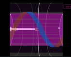
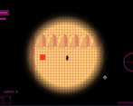
To be honnest when i saw the screenshots i wasn't sure how this would go, but it turned out that this was a good game actually ! You managed to give it a great atmosphere despite minimalists graphics, it feels like you are threatened by an overwhelming enemy that you still have to fight alone, and this is epic.
The only thing i would say is that the boss's attacks are too much unpredictable, you have not enough time to react, and i died a lot for that reason x)
Anyway that's a good work !!
Thanks for playing! Haha yeah screenshots are not my strong suit.
I'm very glad you could enjoy the atmosphere! I wanted it to be as creepy and full of despair as possible. The story idea was that everything you see is in the game is through an infrared camera (because the real TubeWorld is too dark for humans), I thought that doing this tied nicely to the two-color constraint of the jam and made the world more scary at the same time.
If you died too much don't worry, in future updates I will give the character more weapons to use!
I would love to see updates on that game !
Sweet 0xFF00FF you got there :-)
Like you said, it gets a little easy, but reguardless I managed to die.
I like the weapon energy mechanic, but i think it would be a good idea to require a certain amount of energy minimum to fire, to avoid click-spamming out of impatience.
wasnt sure how the theme applied to the game, walked around the world for quite a while.
kickass music tho
Thanks for playing!
Yeah I actually tried to discourage click spamming by having the energy drain really quickly, but maybe there's a better way to do it. The music was written by our amazing composer FidelDelgado.
As for the theme, if you walk around you'll see that the map is a wrap-around in both horizontal and vertical directions. So the level is actually equivalent to a donut shape, that's why I called this game TubeWorld ;) (I initially planned on having a minimap of a donut just to show where the player is but I ran out of time haha)
Thank you. It's quite easy to create dope music when the graphics/storyline is inspiring
Humans were not meant to live in tubeworld
Damn straight...
i liked the idea of the blob boss. I think making energy recovery faster and adding more simple enemies before the boss would make the game faster paced, killing those bugs to steal their resources was the best part of the experience. i think there's a bug with the boss as all my shoots caused damage even when i was aiming at the void, maybe trapping the player inside the monster could fix it
Yeah I definitely tinkered a lot with energy recovery. Thanks for catching the bug, my intention was for only the purple circle part of the boss to be hittable (that's supposed to be its heart).
So cool, loved the main idea and musics, one of my bests!
Thank you for your kind words!