Play game
Ghost Frame 1D's itch.io pageResults
| Criteria | Rank | Score* | Raw Score |
| INNOVATION | #11 | 4.205 | 4.205 |
| THEME | #42 | 4.000 | 4.000 |
| SOUNDS | #293 | 3.068 | 3.068 |
| OVERALL | #314 | 3.341 | 3.341 |
| DESIGN | #402 | 3.045 | 3.045 |
| VISUALS | #556 | 2.841 | 2.841 |
| MUSIC | #709 | 1.773 | 1.773 |
Ranked from 44 ratings. Score is adjusted from raw score by the median number of ratings per game in the jam.
Leave a comment
Log in with itch.io to leave a comment.


Comments
It's very simple, unique concept, also reminds me of brick games, more especially with the sound than the visuals. Also I appreciate the dual control scheme options. 👍 About the goal, was it there? Because I think I explored all areas and couldn't find anything else to do. But that's understandable, mine was unfinished and didn't really have any goal as well. That said, your game is a very unique entry, very minimal to the extreme!
There's a room where when you enter it will play a dialog, display "Enchess Ency", and restart. Reaching that room is winning. I realized upon reading another comment that because its not a happy ending, it was misinterpreted by some as another fail state.
Different i really liked it well done one of the most unique entries
Really cool idea. And sounds are also amazing, it was a bad idea to play on high volume though :)
This was very unique! Thank you for the experience! Find my video review below:
1:54:04 Ghost Frame
The 2nd 1D game I have played from this jam, and it is still fantastic and unique.
Theme:
Less is more, just like the other 1D game I played, you took a single dimension and turned it into an entire game, andddd you made it so it was an adventure game. So cool!
Visuals:
Based off the type of game this is, I will rate it in it's own "bubble" A single line of pixels and I was able to understand almost everything about the game. The only missing was a health indicator, which I think you could have the player character start off a green color, and slowly turn red with each hit taken. Indicating the players health!
Sounds/Music:
The sounds design was very well done in this game. Key tones/sound bites for each action and item in the game to help telegraph to the player the world you are trying to create. There was no music, which I think you could have gotten away with a low volume atmospheric tune to help give the ambient feel!
Overall:
A 1D action adventure horror game. Never thought I would combine those words together as a genre, but here it is, and it was done very well. This is a must try for it's unique take on the theme, and 1 dimensional design! Great work!
Streamed here, starts at minute 54:
This definitely was one of the more unique games that I've run into!
The one-dimensional aspect is an interesting design challenge. You've gone with the player being able to combat ghosts using the camera, but since the game is 1D aiming becomes a binary "are you pointing towards the ghost" situation. Judging range wasn't that hard either, since if you miss you have enough time to fire again before the ghosts get to you. Thus the only fail state that can occur is if ghosts appear both in front and behind the player at the same time. The design challenge then becomes how to make the camera mechanic a fun yet fair challenge.
Communicating locks, keys, and other genre staples through sound was a clever solution! Though the voice synthesizer you picked can be difficult to understand at times, especially if you're not a native speaker. (It also managed to spook me when I booted the game up. I had my volume up way too high).
There is potential here for full short game!
Very unique concept, although a bit confusing due to the lack of explanation. The voice you used especially was really hard to decipher, and having a simple bit of text showing up at the bottom to go along with it would've been great. Other than that, the amount of expression you've managed to reach with only a few pixels and sounds is great!
Criticism - The sound design is a bit weird as the voices are super loud and hard to understand. The combat was also a bit confusing as I never knew how much health I or the ghosts had.
Support - The idea is super innovative and is an amazing take on the theme.
Noted and thanks for the input. I think I could've had higher resolution and devoted 5 pixels on on side to be health bar and pixels on other side to be some helpful indicator for ghost. Maybe HP of closest one you are facing. For the voices, that's a bit of a stylistic choice I modeled after one of my favorite indie horror series, Faith. I realized a bit too late that the particular synthesizer I choose had a lot of trouble with very common sounds. I definitely could've toned down volume or had a menu to adjust volume of individual elements. That would've been a good idea.
Some rooms have like 3 ghost inside that trap you in a ghost sandwich, and it's almost impossible to not get hit. Also i can't recognize what the voices are saying, but other than that i liked the game very much!! :D
Very interesting concept and one of the more innovative entries for sure! I really like the approach and the minimalistic design. The atmosphere the game provides is great and with the sounds it's impressive how quickly you can immerse yourself in a game like this.
I agree with a few of the other comments about the sound effects, I thought they set the atmosphere perfectly and wouldn't want you to change them but having more textual feedback around the screen would make a huge difference. Displaying what is being said and providing textual prompts like 'you found a key!' or 'you open the door...' would keep the aesthetic while also helping players to understand, as at times I felt a bit lost even though I enjoyed the experience.
Considering the time constraints you did really well with this and it's an idea that has some serious potential! Nice work :)
Now this is thinking outside the box :) great effort.
A really cool concept, with great atmosphere, though more clarity-especially with the sounds- could have improved the experience a lot.
- My favorite part was recognizing the ghosts, and the tension of having to avoid them and use the camera in the 1D space. Was a great use of 1D.
A really nice take on the theme and concept that you made work well with this kind of fitting game/atmosphere.
- Honestly, the sounds were really hard to understand. I could understand trying to increase the atmosphere of the game, which was great, but the sounds were close to completely impossible to hear, short of guesswork based on the game you referenced. And after a few attempts and reading your responses to the comments below I worked out what it's saying when you get a key. I have no idea what its saying when you defeat the ghosts in an area. And the ending I reached twice over 6 attempts, because I barely understood it was the ending the first time. Thinking there might be a difference if I get there faster, I still couldn't understand what happened the second time.
I think you could have kept the atmosphere you wanted with the sounds as is, but with subtitles that gave complete clarity to what the voice was saying. That was the thing that pulled me away from the experience the most.
I think the keys could have been more clear, like a gold blinking instead-even if dull-as a more common identifier for them.
Thank you for the feedback. I agree with everything.
I decided I wanted an old-school synthesized voice, but voices were one of last things to go in. When I realized you couldn't understand them with the synthesizer I was using, I just tried to alter the dialogue as much as I could to make it work with the voice (I ended up making the dialog have nothing to do with Fatal Frame's actual plot as a result), but alas it's still not all understandable. Subtitles were considered and have a (admittedly bad) reason I didn't use them - they wouldn't work with the tiny resolution.
Obviously there's a readability issue in general, largely a result of the lighting. I don't regret doing lighting - out of everything it's the thing that in my mind most sets my game apart from other 1D experiences out there, at least that I've seen. But I could've done that better. I think making the key actually emit light instead of just blinking a lighter color, which is dulled by the shadows, would have helped a lot.
No worries.
Ahh all that makes a lot more sense, caught by the gotchas of a gamejam time frame etc. Well you mention trying it again so hopefully you get to improve the voice and/or subtitle resolution availability if you do go through with that.
Yeah I agree, the lighting gave it a great atmosphere, if you could improve the readability while keeping the lighting that would be ideal. It emitting light is definitely another good way to signify its importance without needing to connect it to the idea/color of a key. If you could possibly have the glow and the color light besides the locked doors match, to indicate what door is unlocked with it that could be even better.
Looks like you were already able to learn a lot from the experience making this, so best of luck giving it another go if you do.
Really interesting concept, i think i won, the gameplay is a bit simple but i think that's part of the joke of being 1-d, good job.
Amazing how much the game can tell with only 1 D, nice work and great concept!
You definitely did a lot with so little, it's amazing how much atmosphere and gameplay you were able to fit in! I intuitively knew everything too, so amazing use of sound and color there. Just great work overall.
Wow, this game takes minimalism to the next level! Its surprising how much gameplay you can squeeze with a few lines and sound effects.
Who knew a 1D game could be so terrifying! The sound effects really gave those 3px ghosts a bite. I liked your use of colour (green clearly marked being outside of the mansion)
I really liked the interpretation of the theme in 1D. It is really unique and creative, how many things can be represented with just points on a straight line. Although, there is still room for improvement but is really good for a proof of concept. One thing which I think can be improved is the color gradation (as it was quite hard to distinguish between objects) and a tutorial might have actually helped a bit to figure out things. Anyway, an amazing idea! I hope you take it to next level. All the best man!
Also, if you have some time, please play and review my game. Thanks!
Brilliant idea. I wish it had music and a little less robot like voice. But the sound was very elaborate on what to do even though you only had 1 pixel to work with. It took me a minute to figure out the things at the side and middle that are black are doors.
I don't get this at all, am I missing something?
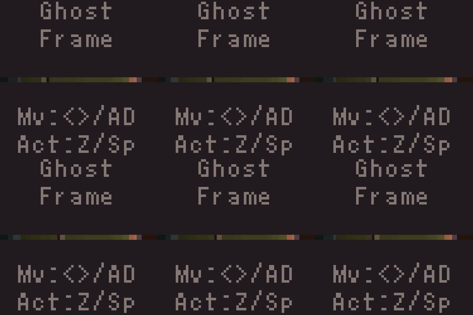
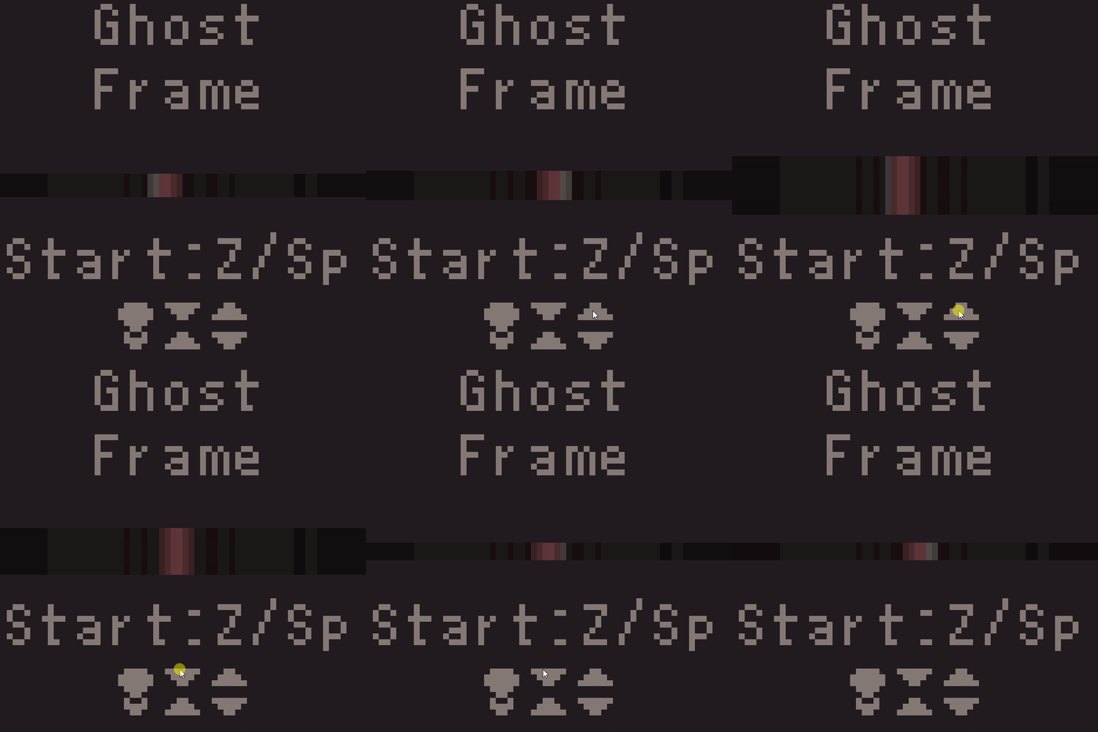
Basically it's an exploration game. Rooms have doors you can move through (I used a consistent 2 pixel wide dark purple for doors), a couple of which need keys to unlock (denoted by stationary blinking pixels). Along the way, ghosts can attack you (flashing, moving pixel masses). You can either run from the ghosts or defeat them by taking pictures of them with your camera, which does bonus damage and knockback when they are closer.
There were definitely a lot of places I could have improved on the clarity. I'm back and forth on if I want to expand on this. I appreciate the feedback, even negative.
I think your onto something with this, my small brain just doesn’t really understand what he’s seeing. I’ll try it again though.