Indie game storeFree gamesFun gamesHorror games
Game developmentAssetsComics
SalesBundles
Jobs
TagsGame Engines

Swift Illusion

187
Posts
2
Topics
48
Followers
12
Following
A member registered Jun 10, 2016 · View creator page →

Creator of

Recent community posts

Awesome gift :D .
Regrettably though I can't get this to work, even with the GLBExample-2-14-1 file. When ticking worker animation, the model doesn't show up.

Errors appear in console (they don't show if the F12 debug starts open)
"Uncaught ReferenceError: target is not defined
    at updateAnimation
    at updateAnimationPolygons
    at MessagePort.OnMessage"

I can get it to show if I click the 'pause' button, but can't get it to start playing any animations. Is there more setup required? (Made sure project worker mode was turned on too)

Thanks so much for that :) . Looking at it it seems everything by default for some reason is backfacing (you can see the text rendered, even if on a '2D' layer, disappears with back culling).

It'll be a bit awkward, and limiting/additional steps+triangles required (duplicated and normals flipped) to fix areas of a model you actually need to see both sides of. However for the scope of the game I'm wanting to make, this solution will allow me the end result I'm looking for so thank you very much for that. The trick required to finish the effect is having to flip all 3DObject normals before exporting, that way you can hide the 'front facing' faces (that are now back facing), and hide front-facing instead. This way regular construct objects (at least besides construct 3d shapes) will stay visible.

Thanks a lot for the thorough response.

Yeah I imagined it wouldn't be able to do much relative to blender materials, but I also imagined backface culling was about as regular as it gets to the point of expecting that be the default, so was surprised when I couldn't get it.

Yeah that CPU culling doesn't sound like a possible solution to be trading that much performance away. When you say force enabling of back face culling causes issues with non-3DObject objects, does that mean if your project just uses 3DObject's then, this could be an option? Or does your followup comment mean there'd also be further issues introduced if trying to take advantage of 3d located particle sprites too like in your 3DMeshPoint example?

I've got a blender, gltf, and minimal project (the model in it) here. Also a minor and not so minor thing, in the editor the 3d model textures are softened-but it does respect the nearest/point setting when you play the scene so it's not a big problem if that can't be resolved. However also, maybe a limitation of C3, possibly a rendering option though, but the softening of the texture also softens the alpha, and this causes that to pierce through other object as seen here (the left side has separated objects where as the right sides are merged so you can see it pierces per object).

Would be awesome if you could make some advancements with this as backface culling is an especially valuable technique when having to work with a more restrictively performant 3D environment, but I can understand if it might not be possible. Appreciate you're still willing to try and tackle it/have already made attempts.

This is an awesome thing to have exist, thanks so much for this.

However a limitation I've run into while experimenting with it to double check what it can achieve, is no matter what I can't seem to get 'backface culling' to work for it (so you can see through the back of something, e.g. to achieve targeted toon outline with black texture+backface culled). I've tested different material settings (using blender), editing the file itself with a text editor (""doubleSided" : true," exists which I thought my be the term required, but true or false changes nothing), all the blend modes, searched through here/the forum thread in-case, etc. 

Would appreciate knowing if this is a hard limitation, something I missed, or something that just needs to be parsed from the file in a possible update. Note that this worked without issues in the babylon.js sandbox.

Oh gosh haha :D that's a big grin you've put on my face, incredibly happy you were able to have that much fun with this game.

:) No worries at all, that's what I aim for when making my games. Thanks a lot for playing it and letting me know you got to experience all that :D.

That really means a lot to me, thanks a lot for coming back here to let me know.
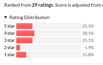
Regrettably looks like I was hit pretty hard with an estimated 7 anonymous votes giving all 1 stars that really distorted my results. Based on math here with 22 comments and 29 voters, leaving 7 anonymous votes that amount to that 1 star distribution.

Didn't make me feel better looking at my results though sitting here saying 'aha I did the maths though' like some lonely detective lol.
So sincerely thanks for reminding me people got to have fun with the game I made.

Thanks a lot for that.

(1 edit)

Thanks a lot for responding. That's weird. Could I ask please what operating system you are using (Just realized that might be silly with you playing the windows version, but you're not on Linux with chrome but using a virtual machine to play it on Windows?)
I couldn't see anything from searching like an immediate problem to point to from Unity, and it worked for me in the latest Chrome no problem, same volume. So if I can have more details then if it comes up again for anyone else I can have more known factors to cross reference I'd really appreciate.

Saw the edit, thanks a lot for taking the time to visit it again for the sound/music. Hoped to ask though, have you played with your individual application volumes and reduced your browser volume? I balance audio volume to be approximately average relative to for example youtube videos and the like. The webgl/windows build have the exact same volume for me, so I wondered if that might have been your issue.
Otherwise I'd like to know what browser you used in-case there might be some obscure Unity volume issue I'm not aware of.

No worries. Ahh yeah, that would all have helped more, good luck on any refinements you make to it :) .
Thanks for making it :) !

Was able to design a new step 3 I'm happy with:
https://i.gyazo.com/3f451e6252dec208513b909c650bd81b.png
And adjusted the final step as a result:
https://i.gyazo.com/a60f11e13a3e1e56f5080b0e40102bc3.png
Basically tried to design it so after destroying the arrows, move the fixation off that while giving players a chance to get more familiar with how the blocks move around with a more finite goal. Before the final step which is a bit looser, where they should hopefully be more comfortable after completing a specific goal, and thinking more broadly about how to approach lowering their score.
Also it allows the introduction of the score estimate, and final score calculation separately, to reduce the number of elements showing up at each stage.
Hope you think this would have helped you?

No worries, happy to hear it helpful.
Glad to hear you'll be refining it for a post-jam finished release, good luck with that :) .

:D just got to respond to your comment there now which I'd appreciate you getting to whenever you find time as it looks like you missed a few things. Though nothing could make me happier to hear the short experience you had on camera was enough for you to come back to it, glad I could provide a fun enough game for you to do so :) .

:D Thanks a lot.

- Glad the theme was felt throughout the gameplay.

- Wondering here, did you miss the menu, or was it that you didn't feel it matched up as closely with the block title screen? Not sure as you finished the video short of interacting with the menu. Glad you felt the rest of the polish though.

- Happy to hear you enjoyed the kind of puzzle and interactions created here :) .

- Not quite sure what you mean here?  I designed all the sounds. And found and chose the music I felt fit best to play in the background. I could even hear the music/sound though low in your stream. Based on your following comments, you must have had the volume down or missed them somehow?

- Real happy you had fun with the gameplay loop that was designed for the experience :) and the polish alongside it.
As above, you missed the sound/music, and possibly UI that you reach by dragging from left to right?
Working now on trying to design another tutorial step that can fit between 2 and 3 (the final step) to ease that in a bit for the post-jam update after this finishes. Just need to make sure to get the players attention so they don't mistake it as a level based puzzle game, and make sure the extra step doesn't lose value for the current 3rd step, I do think I've found a good solution for it now though.

Makes me smile absolutely to hear you continue to come back and play it after the stream too, I really hope though you'll play it another time though with volume etc checked so you get to experience the sound/music and can vote on those categories, as well as see the menu and additional options you'll find there. :D Thanks for playing it all the same already though.

:D no worries! Happy to hear it appreciated and potentially helpful.
Ahh that's a shame, could so see phoenix wright-like dialog being perfect for the setup of this concept, and has me liking the idea of it even more. Time can certainly catch up to you in a gamejam for sure.
Wow you got a lot out of it for that amount of time, nice work managing to cut what was needed to still end up with a nice submission as is. Hope if you/the team find the time and passion for it you'll be able to polish this up after the game jam, but real glad you still got a fun experience out of it all for what you were able to achieve :) , nice work.

(1 edit)

Fun take on the theme that totally makes sense, with a neat enough mini-game. Though more could also be done with the presentation as you're already aware of in the other comments, I was still happy to have played through it multiple times.

- My favorite part of this was the kind of corny game-show like transition into the seal the deal mini-game, it added a fun atmosphere to the experience. I can just imagine someone going into a shop, casually going to purchase something and a bunch of cameras and people jumping out to make a contest out of it.
The characters were pretty enjoyable to interact with and gave some nice pacing/build up between the mini-game moments, and of course their art is amazing. Nice music and fitting sound compliments the experience too.
It was a little thing but I liked the burst off the cube as you transitioned between the rows, that helped give that some more impact. The whole mini-game felt good though simple to interact with.

- I think the game would have benefited from a more over-arching observation point. Especially in the first playthrough, it's not clear what your budget is relative to how much you're wanting to/able to purchase. A price-tag beside each item would have really helped, so you could see that you didn't have enough, and that would also help you understand how much you may have saved through haggling. You would have felt the journey weigh on you, instead of just the individual conversations.
As great as the art is, I think for the characters that seemed to want different reactions, it would have been good to be able to have a different expression at least as they talked, for you to try and tell that you needed to change up your response. You could try and work it out intuitively and change it back if you saw an expression you recognized worked with a previous response. And having a more of an expressive/exaggerated character introduction/first sentence or two could help you feel out the initial responses to use too. Though you also don't want to just say 'hey use this response'.
On the note of responses, I think 'assertive' could have better represented the top option than aggressive. I felt hesitant to use that, but after seeing the some responses my character used for it, I think assertive would have worked much better and not felt like a potentially mean option. Sometimes it was mean, but on average it seemed closer to assertive, especially in the main conversation you use it.
For the mini-game, I think a different approach to based on the impact of the conversation, and some more clarity could have improved the stakes there. I double checked and having the best conversation with the first character, vs, the worst, just set your starting position/potential saving, you could pretty easily fill it and make the conversation you had lose value as a result and felt a bit anti-climactic.
It might be cooler depending on your goal, to have the conversation still set a starting potential instead, and require the player to gain the rest through a bonus. Sorry if this is a bit too much of a suggestion/feedback, but had an idea for it so ended up making a rough mockup of it.
Dodging all the dangers, gets you 70% of the score, any hits give you a penalty that extends from the right. Then the bonus, as a different kind of challenge and to change the pacing throughout the mini-game too, has you collecting yellow blocks. The yellow blocks are a multiplier based on how much you're missing, so that if you got each one exponentially you're haggling would make up for the lower deal you sealed. And if you miss a yellow block it's reset. So say you missed a yellow halfway, that would reset your exponential gain and you wouldn't be able to make it up, though you could still try and save as much as you could by not missing again.
That would create 2 angles of pressure. If you have a perfect conversation, then you still need to try and avoid hitting any blocks as that will reduce your possible savings. If you have a bad conversation, you'll need to dodge but also try and perfectly get all the yellow blocks that would increase the tension, and make you feel the weight of the conversation you completed.
Regarding the art, a few quick tricks you could use to at least bring it closer to the characters and not clash as much, is aligning the palette with the characters. Here's a quick example changing the red and blue borders. You can see it already blends in better on the sides than your original in the middle. Something to consider if you plan to refine the experience after the gamejam.

:D thanks, appreciate you trying it, and real happy you ended up enjoying it and felt the polish for it!
I do feel there could be room to fit a smaller challenge before the final intro board, so I'd really appreciate a response about why you felt that way:
- One concern was the player mistaking it for a level based puzzle game if I stepped forward too slowly. Do you think you would mistake it for that if there was another challenge closer to the first 2 steps of the tutorial?
- What was the main area you weren't sure about when you reached that introductory board? Was it the mirroring loop of blocks, or did you want some more time to be comfortable with the arrows and general group selection? Or are you after just a few less moving pieces than the introductory board, without introducing the scoring yet? Was there a level of intimidation because the board opened up more at the same time as the scoring was introduced, that could have been eased into?

An incredibly atmospheric take on the theme. Though it was held back by the bugs, a post-jam cleanup would really strengthen it, as it was still captivating for the time spent with it.

- My favorite part was the presentation of the concept, it was very clean and let you really just be enveloped by the atmosphere presented.
I liked how elaborate the menu's were, and sometimes they had flourishes/an unnatural cheeriness/casualness in their description that really had you like 'yup, these people are crazy'.
The letters were quite intense and well written, very matter-of-factly as if it's just another day at work for them, but descriptive enough for you to both regret the situation and wonder what other situations could exist, elevating the atmosphere more.

- Regrettably as atmospheric and captivating as it was, the bugs especially hurt this kind of goal and experience. Besides the common ones I've read in other comments, I had the letters seemingly completely ignore what my decision was, and frequently got the same letter as well. That quickly brought me out of the experience. However I still played through multiple times and reached the end once, reading the new letters I saw with interest to get invested in the atmosphere I imagined you were trying to achieve.
I think one of the questions for this game is, do you want a player to play it once, or play it through for different endings? If once, I think the hunger system works well (though as you're aware you need to change that first letter mentioning the bar). Because the player is aware they're getting more hungry, but they can't know how much is too much and the risk weights more heavily.
If however you want players to go through it multiple times, an option to keep the same atmosphere without a regular bar at the back indicating hunger, and in addition to the vignette have the  font images give/read/take be a tone of red filled equal to how hungry you are. That way you can feel it as you make the decision, and it's clear, but it doesn't disrupt the clean scene you have.
Some more sound design would elevate the experience too, instead of the kind of 'bing' sound when you make a decision, an eating sound when you choose to have the food or an elevator shaft like sound when you give it would have you feeling the impact of your choice more.

(1 edit)

Thanks so much for taking the time to really detail what you were meaning and how you interact with leaderboards yourself.
Appreciate your understanding that it's not always the right choice to add in every request to a game, but regardless I really wanted to understand your perspective better to take that consideration alongside what other opinions may arise. That way I could more thoroughly consider if some additions could improve the game for the majority of people or not, and see if I could design it to try and catch both sides.
For now I'm sorry to say it would be safest to assume it won't be added, but if it is I'll have been able to take all this into consideration.

No worries :) !
Yeah that was no doubt tricky, good like refining the experience. :) no worries at all, happy to hear it appreciated and potentially helpful.

Just trying to dig into your goal some more, I'm a bit confused. You're generally not motivated to top leaderboards, but you'd like to beat averages. Do you mean, a leaderboard that would average the daily scores, kind of like the zachtronic games, rather than trying to compare directly against the best outcome of a daily? So you'd be comparing against the average of those that submitted their score to the daily?

No worries :) hope it helps.
:D thought that might have been better, happy to hear it helps and the appreciation :) good luck fixing it.

^^!

Oh :D that's a super impressive score! Under 40% is like, showoff territory lol. Getting under a hundred is frame it on your wall moment haha so you were just short of that, nice :) . So happy to see you enjoying it enough to get down to that score.

Haha, happy to hear I was able to make a fun game for you to experience while you worked on another fun idea :) . Thanks a lot.

Yep :D that was the part of the core concept, glad you felt that weigh on your decisions. 1 of its layers of less is more, is definitely how the less left on the board, your next decision feels like it has even more impact, and the risk/reward/timings of what to lose and what you can afford to lose when builds. Happy to hear the games aesthetics game together to help just strengthen that experience for you :) .
:D thanks so much. And thanks again for trying the game.

No worries :) ! Glad to hear the feedback is valuable.
Was pretty happy with that score :D . Good luck evolving the scoring/gameplay options if you extend it more.

:) , thanks for checking mine out.

(4 edits)

Thanks, glad you had fun with it :) .
For scoring, in the tutorial it brings up under 200, and even better getting below 50%. You'll also have effects come up when you get below those 2 targets to compliment you reaching them as good and great scores. For further reference, I like to set my goal as getting under 40% average for my last 3 boards, and this is one of my games I'm actually good at haha so take that for whatever it's worth. My best L3 of all time is 31% and I still can't believe I actually managed that, after the previous 33% I had I thought I wouldn't beat.
Generally I think it's better if you just try and improve at your own pace, and get a feel for how well you can do and how well you want to keep doing, knowing that there's a 'cap' for how well you can complete a level. Another option if possible is comparing with others. Today I managed to get 135/43% on the daily.

For leaderboards, I hope that I can explain why I don't think they'd work for my game.
- The goal here is to do your best at the puzzle and try to get the lowest score you can reach. There's a nice amount of variance and ways to reach lower scores and compete from potentially different angles, however boards naturally have a *best potential*. Unlike other action/strategy games with daily leaderboards that have a high score for people to try and reach that you want to compete with, having a score shown here would instead tell people 'this is the best score available, try and find this solution', which is counter to the feeling I'm aiming for. I'd rather people challenge themselves and/or others and go 'oh wow, I actually found a lower score!' Instead of feeling pressured to match what someone else discovered (assuming a large enough playerbase to to consider that solution discovered).
I recognize that different people engage with leaderboards in different ways, and sometimes personal goals aren't as motivating, but that's what seed's and daily's are here for-though they aren't leaderboards to easily access competing with others-they give you a way to tangibly compare scores when you do have someone to compare to. And the Last 3 boards average gives you a longterm goal to achieve and compare/compete for with yourself or others beyond single boards.
If you still think you'd desire a leaderboard with the above, and knowing if I could find a solution it may not be the leaderboard you imagine (there's no evident manageable cross-platform solution, and it'd likely be mobile, separate for android and IOS), honestly let me know. I could see a 'leaderboard' which if can be achieved just shows the best score achieved for the daily for you to compare against.
I'll consider it more if enough demand grows for it, but for now my most active player I know besides me specifically doesn't want a leaderboard. So the votes even out for now.
It will besides all that though be coming to mobile soon, though sorry IOS will be awhile off if you have that device as that's more complicated and will depend on when I'm in a position to go through the hurdles required for that.
EDIT: As a reference to my points above about the leaderboard, I was absolutely sure today's daily couldn't get below 43%, and the player I mentioned just came and showed off 126/40% and I had to do a double take, and they were over the moon when I was surprised about that, and I was real happy about that moment. You couldn't have moments like that with a leaderboard which could theoretically tell you the 'best score' for sure in a day.

No worries.

Ahh all that makes a lot more sense, caught by the gotchas of a gamejam time frame etc. Well you mention trying it again so hopefully you get to improve the voice and/or subtitle resolution availability if you do go through with that.

Yeah I agree, the lighting gave it a great atmosphere, if you could improve the readability while keeping the lighting that would be ideal. It emitting light is definitely another good way to signify its importance without needing to connect it to the idea/color of a key. If you could possibly have the glow and the color light besides the locked doors match, to indicate what door is unlocked with it that could be even better.

Looks like you were already able to learn a lot from the experience making this, so best of luck giving it another go if you do.

A really cool concept, with great atmosphere, though more clarity-especially with the sounds- could have improved the experience a lot.

- My favorite part was recognizing the ghosts, and the tension of having to avoid them and use the camera in the 1D space. Was a great use of 1D.
A really nice take on the theme and concept that you made work well with this kind of fitting game/atmosphere.

- Honestly, the sounds were really hard to understand. I could understand trying to increase the atmosphere of the game, which was great, but the sounds were close to completely impossible to hear, short of guesswork based on the game you referenced. And after a few attempts and reading your responses to the comments below I worked out what it's saying when you get a key. I have no idea what its saying when you defeat the ghosts in an area. And the ending I reached twice over 6 attempts, because I barely understood it was the ending the first time. Thinking there might be a difference if I get there faster, I still couldn't understand what happened the second time.
I think you could have kept the atmosphere you wanted with the sounds as is, but with subtitles that gave complete clarity to what the voice was saying. That was the thing that pulled me away from the experience the most.
I think the keys could have been more clear, like a gold blinking instead-even if dull-as a more common identifier for them.

Thanks :D ! That few but important moves was part of the goal so I'm glad you felt that way, and real happy you had fun enough to want to play more :) !

Insanely charming combination of golf and dungeon crawling, in an enjoyable polished package that was so fun to complete multiple times. A favorite without any doubt.

- My favorite part is having to defeat the enemies before going into the hole, and those moments where you can defeat the last and get into the hole are magical. It adds some more puzzly strategy to it all, especially with the inclusion of the bow.
The art, sound and music direction is so charming and fun, even the sound/visuals of rolling through the bushes, and the bouncy enemy, and flourish of the character landing into the hole, it's just a lovely package. All the UI elements are smart and smooth too.
The general concept is great and executed really well.

- It would be nice when you're given the tip for the arrow, if when selecting the arrow you also got another tip "Arrows go full distance, bouncing once". Also it would be helpful if it didn't auto-switch you back to the move selected, as I was trying to time an enemy after I missed them with an arrow and tried to quickly shoot again before realizing I was moving instead.
As fun and cute as the shop is within the world, giving it more roguelike flavor, I think it ends up a bit counter to some of the design, especially when you earn gold after going past the shop.
This is a relatively large suggestion/change so it might not be part of your goal for the game, but I think it would be nice if instead of the arrow count, that was changed to a gold cost. That way you could then question 'do I think spending gold here would get me to a lower shot count, or should I save it'. It would create more consistent tension in that decision, and make it feel like a persistent option.
Then also show remaining gold at the score card, so players that may get competitive can have tie breakers with remaining gold if they get the same shot count, trying to further increase efficiency with their gold/arrows.
Personally I find falling in the water sending you all the way to the start quite punishing, it would be nice if it instead just dropped you back to where you had been instead. Happening on the last level that's at least 3 shots you lose, in addition to the shot lost falling into the water.

- A bug? I found. Getting pushed by an enemy to the left is fine, but when you're pushed to the top you end up being popped off the end. https://gyazo.com/d885294114ffedaf20e5e25810616761

:) no worries at all! Glad the feedback helps. Good luck working on refining it :) .

Fun little diversion with cute choice of art/theme, but would feel more fair with some more fine tuned spawning.

- My favorite thing is the different speeds of the penguins, it creates more diversity as you try to dodge through them to keep your combo, which keeps it more engaging.
I liked the penguin variety, the bumper penguin especially for example means you're not just losing your combo but being bounced into a possibly even worse situation.
I think it was a good decision to have you fail at the edges, meaning you need to keep through the center and not just hug the wall, so things stay more intense.

- Because you need to focus on your penguin and dodging, it could really benefit from sound to indicate that your score multiplier has increased so you don't have to see it. And a sound when you lost your score multiplier by bumping into an enemy, different to normal bumping into an enemy, to create more of an impact for that loss.
Also the golden snitch penguin, and feeling of fairness in the game would be improved greatly if it came at a consistent pace instead of random like it does. I had a game where I only saw it a few times, then another where it came out multiple times frequently and I ended up with my highest score easily thanks to that. If you also had a flashing indicator at the top of the screen where the golden penguin would drop down from, that would be even better to give the game some pacing where you have a target location to get through/penguins to dodge so you can be able to catch the snitch.

Did you go through the how to play game?

Yep it's a whole genre of design itself haha. Happy to hear this all helps you :) .
The wealth of GDC talks is definitely a great resource to have access to when trying to fine tune design and reference what others have discovered/helped them :D . Good luck with it.

Thanks :) !
Do you recall what you struggled to understand at first?

A neat sliding puzzle game that cleanly introduces how its mechanics work, keeping it engaging all the way to the end even if the presentation could be improved. I enjoyed completing it.

- My favorite part was how immediately it was understood/reinforced in the second level that the switches were one way, making the visual construction of the switch more clear. That was well designed. Same for the teleporter introduction.
I liked the construction of the puzzles and how they could use, and sometimes trap the player because of the 1 directional switches, that made for some more enjoyable/interesting solutions and steps.

- It would be nice if the background color of the switch was darker before it got 'activated' to make it even more clear it was on, and give you a better feeling of progression as you switched each on.
A simple addition that could liven up the later levels would be to make those teleporters spin.
It would also be nice to have your action count shown next to the restart level button.
Level 6 could have been more complicated, it felt a bit too easy/similar to level 5 in execution.
I'm not sure level 1 was necessary at all, having level 2 would have gotten the player to the 'aha this is how it works' moment with the switch faster. You're not really taught anything in level 1, more than the expected less actions = better score.

No worries :) !
Yeah, out of the way works, but swapping them around would be more natural and for the priority of what the player needs to see, grouping the important information closer together. Glad to hear the feedback valuable, good luck on any final changes you might make :) .

:D , thanks for making it!

Absolutely adorable game that finished off a comfortably lengthed set of levels for the mechanics available with the best final screen, had a lot of fun playing through this, a favorite.

- My favorite thing about this was the more meaningful use of integrating the theme with the jumping. It wasn't just limited jumps, but you really built an engaging puzzle with a charming theme around jumping the right way as it changed to get to the end of a level.
Also worth repeating, best final screen, and reaching the end of the level is extra satisfying thanks to the purring animated cat and z's .
The controls felt snappy and engaging enough for the puzzle and having to repeat levels was no issue, they were nice bite sized layouts that even if you were just accidentally short of getting back to the box, it didn't feel bad to control or frustrating when you had to replay the level.

- A small thing, but I think because of the layout of the level, and with you looking towards the ground each time to find your bearings and wear the cat is, I think it could be better to have the 'jumps left' centered and below the ground. Then you can find your cat and how much jumps you have for the level at the same time. And move the level name to the center top to feel more like a title. Though centered might not work for the jump count on
Otherwise short of small unnecessary things like a tweened bounce for when the box opens at the end of a level, for the nature and goals of the game, it's just great, nice work.

:D thanks a lot! Real happy you had a fun time with it and the polish showed :) .

Nice controls and platform spacing had the moment to moment experience feeling nice, but regrettably the goal and limitation of jumps ended up making it a bit awkward in the end, though I did keep playing until I was able to reach the end after 10 or so attempts, enough I stopped counting.

- My favorite part was the environment bit I won't spoil, but it added more spice to the experience which was a nice inclusion.
The general presentation and sound/music fitted well, wrapped in a simple but clear little story.
Played with a controller, and it felt good to control, and moving onto/off platforms didn't have any of the awkwardness many do. It was nice to move about, and when you got the spacing and timing right for like when you had to jump multiple platforms at a time it felt satisfying.

- I think it would be better to cut that first floating platform. The game with its length, and not visible jump limit+no checkpoints with that mechanic, made it long enough already. Having to wait around for that first slow platform, that you couldn't jump off at the end to speed things up because you needed to save them, made the restarts feel more draining/time consuming.
You might have wanted to keep the HUD empty because of the visual presentation of the game. However seeing as you already have the glowing robot, it would be nice and on story if you had a sequence of lights that would shut off on the robot after each jump. That way you'd still have a more visible idea of how much you could afford to jump. It would also make you really feel the limitation and make the game more tense, than just having its lights occasionally change and then uncomfortably running out of jumps.
Though not having checkpoints makes sense because you might not want a checkpoint when you had used more jumps than could get you to the end already, I think what could really help and make the game less punishing is having a checkpoint after each floating platform section at least. Then a restart button. That way players could practice the sections they reached more often, not having to start all the way back, and make more progressive steps until they needed to restart and try a run at it all in one go. It would then feel closer to levels within a level, that you could then keep improving and getting past more levels until you completed it all in one go.