Play game
Minimalist Monk's itch.io pageResults
| Criteria | Rank | Score* | Raw Score |
| THEME | #276 | 3.308 | 3.308 |
| SOUNDS | #331 | 2.974 | 2.974 |
| INNOVATION | #331 | 3.103 | 3.103 |
| MUSIC | #353 | 2.974 | 2.974 |
| DESIGN | #453 | 2.949 | 2.949 |
| OVERALL | #491 | 2.974 | 2.974 |
| VISUALS | #660 | 2.538 | 2.538 |
Ranked from 39 ratings. Score is adjusted from raw score by the median number of ratings per game in the jam.
Leave a comment
Log in with itch.io to leave a comment.



Comments
I like the concept, and particularly enjoy the fact that you have to use different types of attacks at different moments. Everyone else has already mentioned that there's quite a bit of text so I won't repeat it, so instead I'll say that I quite liked the creativity of the concept.
The weapons not following the mouse could be a bit of a pain, and it got really hard for me really quickly, but maybe I just suck ahaha.
Glad you enjoyed the design! Pretty strange, but i didnt ever notice the mouse aim not being precise iny playtesting... Its probablh webgl doing weird stuff ig
Hmm yes that could just be WebGL, although downloading the game didn't actually fix it. Maybe it's resolution bound or something? I really don't know, sorry!
Thanks for testing it out natively! Then maybe i am jus seeing the aim accuracy from the wrong pov...
it got a little to hard to fast and the gun didn't always look at my mouse so that got annoying. Funny concept but could have been executed better sorry. keep making games don't let comments deter you from making good games.
Thanks for the constructive criticism!
Cool game! Some things I would change would be to minimize the amount of text, as the concept isn't all that complex, as well as making the difficulty ramp a bit slower. Nice job overall!
Thanks for the feedback!
Too much text. But overall good game
Please rate mine
Thanks for reviewing it! Will definitely review yours!
Pretty fun game, although the controls felt kinda strange at first. My biggest complaints is how much text there is to read at the beginning and perhaps the visuals could be improved. Other than that, pretty fun. Nice job!
Thanks for rating my game! Yeah i definitely will reduce the text that needs to be read for my next game jam:-)
This is a good game! Great art and gameplay! Good job!
Please check my game as well ;)
Glad you liked the game! Will definitely check your game and leave a rating:-)
The tutorial and button indicators were very nice additions. The theme was strangely charming! I enjoyed your twist on the "Less is More" concept, and I'm excited to see what you make next!
Thanks for rating my game! I am glad you enjoyed the experience!
cool game i liked it but i suck
Glad you liked it and i admit that it's kind of a hard game tbh
Hello.
I have some feedback about your game.
- Firstly, thanks for making the tutorial. I recommend you using fewer words next time tho.
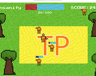
- Secondly, the enemies should be doing something after they get to the temple, not just standing there making nothing. Or at least have some kind of idle animation.
- Talking about graphics, the way you handled the gun is very weird. It is too small and the way it rotates is so weird. Besides that, animations for the player would be nice. If you can't make them, you can either search on YouTube, etc how to do so or team up with someone on next jams.
- Additionally, IMO the area of the temple is too big. I don't have enough time to even kill the enemies if they spawn on another side of the screen, and if too many enemies get to the Temple I must keep scaring them. My ideas on how to improve that are: have a smaller temple; make enemies slower; allow me to kill enemies inside the temple, but there is some kind of meter that restricts me for doing so too much.
Anyway, this is my high score:
Is that decent?
Thanks for the constructive criticism! I hope that even with all that you enjoyed the game:- ) Btw, yes your high score is decent😂
Nice job! I liked the overall mechanics and it was smart to spell everything out and add letter indicators under the buttons so even an idiot can pick it up. for improvements, i think better graphics could help for next time
Yeah, I definitely can improve on the visuals! Any tips on where I can learn good 2d art/animation skills?
Btw thanks for the nice and constructive review!
The song really grows on you quickly. The idea that you have to use the two bullet types with their different strengths is pretty neat too, especially because they have different effective ranges. I will say, though, that aiming at someone directly above or below you is really hard, because your character holds the gun to the side and doesn't flip to look in the direction you're pointing.
All in all, it was fun, the Tutorial especially was good
Thanks for the review! And yes i do agree that my music is quite annoyoing(my first music composition attemp tho). Also thanks for pointing out that bug
Oh, I meant that it grows on you.
Like, at first, I was like "man, I don't like this music". But then, once all the action started happening, it became an absolute bop, and I loved trying to time my shots to the beat. That's probably why I lost.
Ah sorry for misundetstandkng what you meant. I am glad that my music isnt that bad:-)