Play game
The Other Side of the Tomb's itch.io pageResults
| Criteria | Rank | Score* | Raw Score |
| Gameplay | #8 | 3.188 | 3.188 |
| Concept | #17 | 3.375 | 3.375 |
| Overall | #20 | 3.063 | 3.063 |
| Relevance to the Theme | #22 | 3.000 | 3.000 |
| Immersion | #22 | 2.875 | 2.875 |
| Presentation | #29 | 2.875 | 2.875 |
Ranked from 16 ratings. Score is adjusted from raw score by the median number of ratings per game in the jam.
Credits
Mega Funky Unihorns
External Credits
Mixamo Animation
Background Music
How did you/your team interpret the theme?
We as an explorer will change ourselves to better fit in the environment and eventually find the secret of nature.
How was your/your team's experience in this jam?
Overall it is very enjoyable and inspiring. We were too inspired to lock down main features in the early stages but our dedication helps us catching up with the time.
Content Warnings
his is a work of fiction. Names, characters, organizations, events and incidents are the products of the author's imagination. Any resemblance to actual persons, living or dead, or actual events is purely coincidental.
Leave a comment
Log in with itch.io to leave a comment.


Comments
Yeah like others have said its not really a pixel art game, it just has a filter. But the art does look nice. My only real complaint with the gameplay is that the player feels very slidy and moves way too fast.
Concept is very nice, reminds me of Castlevania Aria of Sorrow. However I wish this game jam wasn't a pixel gamejam because the art looks quite nice from what I see aside from the filter
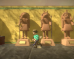
Cool game! I really liked the Egyptian setting as well. Reminded me of the Indiana Jones movies. Good job!
Really cool concept if you ask me.. I loved the egyptian setting! Although not really a pixel-art work I liked what you tried to put together with that post-processing. Ups and Downs as other mentioned but overall a solid start for a good game. Keep it up!!
Though it is not really a pixel art game, it was a solid game. Great mechanics and variety. I enjoyed it quite a bit!
As others have said, the WebGL Pixilation needs some tweaking and the music loop could be better.
Great job!
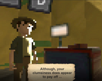
The pixelated post processing effect that's being put on doesn't work very well, the button prompts are unreadable and the shifting edges make the visuals very sloppy. Otherwise it's pretty good.
It looked much better before the WebGL build, but the decrease in resolution made the pixelation a lot harder on the eyes haha
Wow, I am not used to people making whole metroidvanias in game jams. I like this game "like a chad".
Haha, really appreciate you giving it a try!
What a fun game! I liked the concept and the 3d pixelated art, the world feels alive and immersive. I think it would have been better to reduce some Bloom because I couldn't see anything in the clouds because it was too bright. Interesting take on the theme. Great Work!
Thanks!! if we can do another pass we definitely will do a decrease on the bloom. thanks so much for giving it a try
Cool, I liked the 3d pixel art. While the descrition "lets you jump like a chad" is cool, it would have helped to know it's a wall jump 😋
I think changing the sounds from the chiptune ones would be an important step, since it does not fit the graphic style you chose well.
Woops! "jump like a chad" was template text while building out the UI. Looks like we forgot to replace that xD
Thanks for playing!
I could have sworn that was intentional 😂
Great!