Play game
The Kingdom's in Ruin's itch.io pageResults
| Criteria | Rank | Score* | Raw Score |
| Sounds and Music | #5 | 3.556 | 3.556 |
| Graphics | #6 | 4.000 | 4.000 |
| Boss Design | #9 | 3.333 | 3.333 |
| Gameplay | #10 | 3.333 | 3.333 |
| Overall (Primary Criteria) | #10 | 3.556 | 3.556 |
| Creativity | #16 | 3.333 | 3.333 |
Ranked from 9 ratings. Score is adjusted from raw score by the median number of ratings per game in the jam.
Were any of your assets made before the jam? If so, what were they?
All sound effects (sword hits, footsteps, etc.) and the speaker/music note icon in the top right.
Leave a comment
Log in with itch.io to leave a comment.


Comments
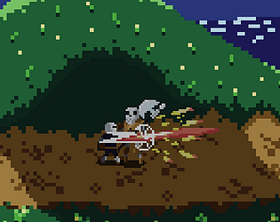
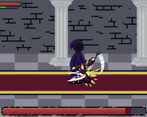
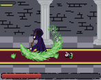
I agree with the others about the difficulty, had to give up fighting against the sorcerer (and even beating the skelly took some studying of his moveset). I think the problem is that in 2d animations look less distinctive so its harder to recognise them, especially in time to dodge. Maybe using more colourful trails could help alert the player to which attack/combo they are up against? The sorcerer just felt unfair, I'd say he's waay too spongey and his summon flame attack felt like it was a 50/50 chance I'd pick the right side to dodge (and if you get it wrong, massive amount of damage, which I'm ok with, but the boss himself just has a ridiculous amount of health, I only ever managed to get him down to about 70% health).
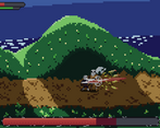
I enjoyed the sound effects and lofi graphical style. Especially the main character and his animations turned out great, and the skelly too. The sorcerer artwork could have maybe been a bit more detailed, especially considering his size. The music seemed good but I got a weird glitchting effect which made it sound totally distorted (as if its being played 10x on top of itself maybe?) every now and again, so I had to end up muting it, so I could concentrate :)
I really appreciate all the feedback! I think you're spot on with 2D animations looking less distinctive and will keep that in mind for the future. Thank you for playing!
I really liked the overall concept, but I couldn't even beat the first boss ;-; I think maybe the lack of warning when it attacks made it very difficult to dodge and the fact some of its attacks hit you when you were behind it combined with the stun lock meant it was very hard to avoid.
But overall good idea and I still enjoyed trying to beat it :)
I like your idea of providing a better warning. Thank you for the feedback and for playing!
I can't beat the first boss. I thought I could roll past them but can't then died. Then tried blocking and attacking then died from the first attacks. Then tried just blocking and ran out of stamina fast and died.
Making my games too hard is definitely something I struggle with. I appreciate the feedback and thanks for trying it out :D
I really like the pixel art and the movement of the player. I am not really good in this type of games and the first boss killed me several times.. But I see a lot of potential.
Great Job
Thanks! I don't see myself as an artist but I wanted to try putting a lot of effort into the art for this one so I'm glad you liked it! Thank you for playing