Play game
Doors Maze's itch.io pageResults
| Criteria | Rank | Score* | Raw Score |
| Graphics | #278 | 3.270 | 3.818 |
| Fun | #307 | 2.880 | 3.364 |
| Game Design | #344 | 2.880 | 3.364 |
| Overall | #356 | 2.829 | 3.303 |
| Innovation | #359 | 2.569 | 3.000 |
| Audio | #365 | 2.647 | 3.091 |
| Theme | #410 | 2.725 | 3.182 |
Ranked from 11 ratings. Score is adjusted from raw score by the median number of ratings per game in the jam.
How does your game fit the theme?
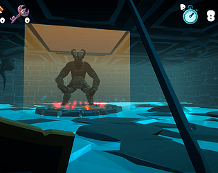
A maze with surprises behind each door.
Did you write all the code and made all the assets from scratch?
I wrote all the code. All assets used are properly described in the game credits.
Leave a comment
Log in with itch.io to leave a comment.


Comments
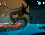
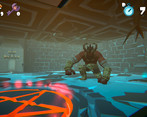
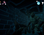
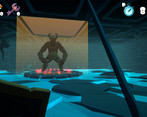
This game was pretty good! The overall aesthetic was pretty much perfect and it really fit the theme. I thought the bosses were cool too with their own attacks. The mouse movement was very disorienting, so I tried to press escape in the middle of a run to go to options but it closed out :( Other than those little things, I thought the game was fun! Good work all around.
Really good game! Great graphics and animations, fun to play and well made! Maybe the combat feels a little glitchy/confusing, but overall I really liked it!
Very good game, i accidently closed it about 10 times, because i wanted to an escape menu to change my sensitivity and fov, but nevertheless a very great game, that would be suited extremely for VR
The fact that you did this in just 7 days is insane this is great work, the animation and art are on point my dude
Great game!
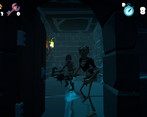
Good fights! Amazing skeletons and their animations!
The shield in front of face sometimes was a little distracting and the attack was disabled several times. But it didn't hurt.
Good, appropriate sounds.
A really big dungeon, cool!
A stylish game and very enjoyable. I love Synty assets and knight girls myself))))
A wonderful project! Congratulations!
A game where it is greater than the sum of its parts. Everything fits together very nicely!
Great music and graphics! Everything fits together perfectly.
As others have noted the movement feels very unusual. It has a quality of action movies and it's great, but also causes some kind of discomfort.
honestly one of the best games seen here only looking around was a bit hard idk just too smooth or something
This was a lot of fun! I managed to get out with just like 20 seconds left. It felt great to go around the dungeon killing things. The art looks really great! The enemies, room layouts, everything looks neat and fits together. Bosses have their own special attacks which is great as well. I like how as the time goes and poison kicks in you see the effects in your character. It really gives a sense of urgency.
Overall it was a great experience!
There are some things I'd like to note though:
Well done! Great audio and gameplay but the mouse moving to look around was too smooth.
Thanks for the feedback! I really appreciate your comment. I will try to adjust the mouse movement sensitivity for a future version.
I enjoyed and saw great potential. I like the enemies sound and the overall mechanics but I felt real dizzy after a bit I think it was the shield that kept covering the view. But overall I really like it!
Just played your game, It was a good time! I really love the art and assets and the stress of exploring and having to find the right way out. It really plays on the theme of "What's behind this door, omg is it a way out please" The timer is very stressful, in a good way.
For Criticism, I feel like the movement is very disorienting and caused me motion sickness, idk if the camera sensitivity is too high or the smoothing, it is something that effected my experience. Coupled with the music choice, it's very dizzying.
Overall, I love the colors, the style, and you crushed the theme of this game. You took on a challenge and given our time, you killed it. Fantastic work and I checked out your portfolio, I'm so impressed with everything I see and can't wait to see what you guys make next!
Thanks for the feedback! I think the rotation sensitivity due to mouse movement is really a problem. I will try to adjust this for a future version. But I really appreciate your comment.