Play game
City In Love's itch.io pageResults
| Criteria | Rank | Score* | Raw Score |
| Innovation | #88 | 3.185 | 3.185 |
| Game Design | #97 | 3.185 | 3.185 |
| Theme | #148 | 3.037 | 3.037 |
| Overall | #167 | 2.772 | 2.772 |
| Fun | #174 | 2.667 | 2.667 |
| Audio | #206 | 2.148 | 2.148 |
| Graphics | #208 | 2.407 | 2.407 |
Ranked from 27 ratings. Score is adjusted from raw score by the median number of ratings per game in the jam.
Link to the game
https://hadar185.itch.io/city-in-love
Leave a comment
Log in with itch.io to leave a comment.


Comments
I'm impressed how many gameplay mechanics you were able to fit into your game. I can't say I like the graphics though, music theme is funny and even with short loop doesn't get annoying. I certainly had fun playing it, well done!
Thank you!!
Interesting Game Concept. I Like so far, you got some Jobs to make People love you. The Idea with the Fishing is really cool that you have to type some Letters in. Maybe you can adjust the difficulty of each Object to Fish.
Maybe a Selection for what kind of Fish you wanna Fish because Fishing 3 Time in a Row the Shark isnt helpful when you need a Tuna.... xD
The Planting is a bit weird. It felt like watering the Plants is a bit Luck, if you hit the right Position to give them Water.
The Graphic looks a bit like Paint and with nicer Graphics i think this will be a awesome Game Idea.
That repeating Audio is annoying after a while and makes me a little bit angry :/
I think if you work a bit around on the aesthetics for this Game you can make an really Awesome Game out of it. For now its okay, playable and have a nice Concept.
Good Work
Just finished playing your game and here is my feedback:
Overall I think that this game is an interesting and somewhat fun title that is a good entry for a game jam! Good luck with future Game Dev! I hope that the feedback is helpful :)
This is the best feedback I got!! You wrote about every single thing in the game, and I can see you really played it for a while. Thank you so much!!! This is really helpful :)
I'm going to play and rate your game tomorrow :)
Your welcome :) I do like to make my feedback as detailed as possible so it helps the developer out.
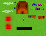
Fantastic idea and adaptation of the jams theme. Gameplay feels a bit slow. A inventory for farmin equipment like the water can would be nice. At the moment you have to walk to the table, pick up the can, walk back, put it down and so on... And in the start I felt a bit lost because I didnt now the hearts are some kind of portals. I followed the road and walked right off the screen. But thats just minor things that can be improved on later when there is more time :)
Thanks! I'm happy to hear you like it :). Also thank you for telling me about the things you want me to improve!
i liked your game. Its fun to play and engaging. Graphics can be improved. Good work keep it up :)
Thank you!
This was a good idea, and had fun playing this one. The music is also good. Here are some things i think could be improved:
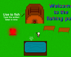
The graphics were a little rough. Especially the grass. When i tried to catch some fish, i approached the "pool" and i couldn't properly see the letters that i was supposed to write. The text on the floor isn't probably the best place, and the UI overall could be improved.
But i think that what you have achieved in one week is great and i enjoyed this one.
Thank you! About the graphics, maybe that because you played in the browser, or if you downloaded the game, maybe you played on low quality. Thanks for your time. I played you game and left a comment :)
Yes i did play in the browser. I didn't think it would make much difference, but i'll try downloading it ;).
Thanks! You shouldn't have any graphics problem with texts in the game so I hope it'll be fine :)
This concept of a different kind of city management was very interesting, but no matter how hard I tried I couldn't get the medicine together in time before someone died in my city. I think with some polish and some labels on the different ingredients so I know what I'm growing/fishing, this could be a great experience! Great work!
Thank you!! I'm happy to hear you like it! I rated your game and left a comment :)
Very like your pixel style art and the purchase/sell system. I can see your great efforts on this game. One more recommendation, if you can use one instruction instead of the long Text would be better. Even I know that the text also can introduce the game background. But any way, I like your game in many parts, also nice particle system and the level design. Lot innovation and the design on your game!
Thank you!! I hope you had fun :) I will play and rate your game tomorrow :)
Thanks Bro~
I can see the effort you put in the game, good job about it. Two things I believe that can be improved are: the heart portals are a bit confusing, I was not sure which one go to where, and I had some trouble picking and putting back the tools in the farm mini game.
Thanks! I hope you enjoyed playing it :)
Became confused because I didn't know what to do. Can't really say much about it, but
Goodbye friend :(
7/10
Edit: Played it again
8/10
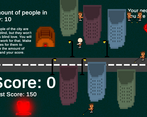
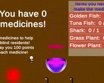
You need to read the instructions!!!! Enter the left house and then the other portals will be opened. Then you need to collect items to make medicines for the blind people. To do that grow plants in the farm and fish in the pool. That will make your people happy, and will make them love you more. When they really love you you'll see fireworks in the city. Please try playing it again, and you'll see you enjoy it, then rate me again :) I also liked the picture you sent ;)
Will do!
Thank you so much!! If you have suggestions to make it clearer, let me know. Have fun!
Have you tried it again?
Looks fine to me. Could be polished a little bit but still nice and funny. The music fits the theme.
Thanks :)
Nice Game! The Shark typing part is a bit difficult. I liked the plant growing part. A little confusing what to do and where to go in the beginning, but well done!
Thank you so much!! I hope you enjoyed :)
Some criticism:
1. Explanations for what the objects do and how to use them is good but it's unclear at first where are the example-objects and where are real gameplay objects. Easy fix: decide on some area for ui/tutorials, place all tutorial related info in there and add some semi-transparent background to this area (thus clear separation)
2. Map is confusing at first. Easy fix: different portal pairs should be different colors so if I remember that fishing pond screen had blue portal I immediately know that I need to enter blue portal to reach it.
3. You can't enter the house in pond-screen, but can enter the house in farm-screen. The last one is specifically unintuitive.
4. Goal is unclear from the start of the game until you reach medicine caldron screen. It might be better to put caldron in the first screen.
5. People who are not extremely fast typers gonna hate you:) Just know that it's hard. As a developer I type pretty well but I didn't manage to get a Shark in a few (5-7) tries. That's why I lost (and so will many other people).
6. Unnecessary waiting. Fishing requires waiting in real life, but in the game waiting is just boring (I am about "Looking for fish" for ~6 seconds), especially for hard challenges that you have to restart several times (and #5 - it's hard).
Thank you! Your suggestions are really good. I hope you enjoyed it anyway :)
Nice game. Simple graphics and seems simple game, but has different game play mechanics. Nice variation because of that. A fun game to play, good job in just 2 days. Keep going in the next jams!
Thank you! I have rated your game :)