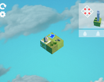
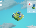
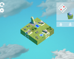
I absolutely love the artstyle and the pixel render texture! I had a lot of trouble understanding how the buildings and requirements work, but once i did the tutorial again it was very fun! I like the minimalistic design of everything. Nice job :)
Play game
re:colonize's itch.io pageResults
| Criteria | Rank | Score* | Raw Score |
| Innovation | #73 | 3.543 | 3.543 |
| Game Design | #76 | 3.671 | 3.671 |
| Graphics | #93 | 3.786 | 3.786 |
| Overall | #100 | 3.462 | 3.462 |
| Audio | #101 | 3.443 | 3.443 |
| Fun | #154 | 3.314 | 3.314 |
| Theme | #219 | 3.014 | 3.014 |
Ranked from 70 ratings. Score is adjusted from raw score by the median number of ratings per game in the jam.
How does your game fit the theme?
re:colonize is a puzzle city-builder about rebuilding after an apocalyptic event and, as such, fits the theme of "An End Is a New Beginning" quite well.
Did you write all the code and made all the assets from scratch?
All of the code was written by me. I also created the assets and textures. The sound effects are from a collection of asset packs I have accumulated over the years, and I hold all rights to use them in this project.
Comments
Really awesome concept and pretty well polished. As others have said 1) the iconography was a bit hard to decipher. 2) Knowing which buildings were coming up would have made things a bit more puzzly and less trial and error.
Great job - really enjoyable!
Really enjoyed the graphics and audio. Like others have said, I wish it would list what pieces I had in each level, instead of having to use trial and error to find out.
The game feel awesome and so calm. I really liked the experience. The water and forest button should be more clear, we should be able to see what are the next building and we should see what make us lose, why continuing building when you destroyed your building, it was not so clear. But wow this game look and sound so good. Could you please vote on my game?
Nice puzzle game. I wish it was easier to understand what stuff did and what was going on but once I got the hang of it it was pretty fun. It would be nice if you got a preview of the upcoming buildings you needed to place and if it automatically reset on failure. Some more feedback on where you could and couldn't place buildings would also help. Super cool concept and visuals.
Interesting game, the puzzles are well thought of, its clear that you invested a lot of time into this game!
Cool concept! A little unclear on the rules, however. Would recommend seeing which buildings were coming up next. Love the art style!
Conceptually, this game is great. The mechanics and puzzles on their own are interesting, and the tie-in to the theme is one of the most creative ones I've seen this jam. The game is also very nicely polished from a graphics and sound perspective, and they both compliment each other very nicely.
As a puzzle game, however, I do think there's a major flaw in the design: you are not told which set of buildings you'll be working with for the level. Instead it's up to you to guess, check, and remember their order and their specific quirks (i.e. placement requirements and affected squares). This doesn't really add anything meaningful to the puzzle design: it doesn't make the puzzles any more interesting or challenging. It only really adds more mental overhead.
It also stands perpendicular to the type of puzzles this game offers. Due to the forced order, they're inherently focused around working out a plan beforehand to set everything up. This currently isn't possible without running through the level blindly at least once.
The tutorialization of the mechanics themselves is great. The visualization in the top-right could be clearer: there's no obvious distrinction on the visualized grid between buildings that cover only the adjacent square versus buildings that cover a whole row or collumn. The difference between the gray and white tree/water symbol is also very subtle. Consider not displaying the icon at all when it doesn't restrict the movement instead.
I think overall, though, you've managed to make a very interesting, well-polished game given the time frame. Very well done!
I like the game... It took me some time to figure it out... It should be understandable with the tutorial, I was just to stupid... I really like the art and the sounds. Good Job!
Good graphics and dope about your sky box plz rate my game as well
Cool idea for a puzzle game. Took me a bit to beat it and understand what tiles the buildings could be placed on, but afterwards it went more smoothly. For some of the symbols, I would suggest making them more visual, maybe a different color and clearer picture? Otherwise, pretty solid game!
it was a fun and engaging puzzle game, puzzle is a little bit challenging as I had difficulty figuring out the meaning of some symbols while placing buildings. However, overall good game.
Going to need help with this one,.. got stuck on one of the first puzzles after the tutorial,..
The tower building will only go on the one square,.. then I've tried placing the 3 dome buildings in whatever options and configurations I can, but it always ends with a Try again.
I've just not understood what's going on and what I'm trying to do I'm afraid, which is a shame as I like a good puzzle game :), and this looks like it has a lot of potential.
Help me out and I'll try and play it again.


Leave a comment
Log in with itch.io to leave a comment.