Play game
Demon Fumes's itch.io pageResults
| Criteria | Rank | Score* | Raw Score |
| Theme | #206 | 3.053 | 3.053 |
| Audio | #252 | 3.000 | 3.000 |
| Fun | #311 | 2.842 | 2.842 |
| Overall | #321 | 2.851 | 2.851 |
| Graphics | #337 | 2.947 | 2.947 |
| Innovation | #369 | 2.526 | 2.526 |
| Game Design | #372 | 2.737 | 2.737 |
Ranked from 19 ratings. Score is adjusted from raw score by the median number of ratings per game in the jam.
How does your game fit the theme?
One soldiers death lets the other soldiers mission begin.
Did you write all the code and made all the assets from scratch?
No, some premade assets(code, art) has been used while music/sound effects were taken from pixabay
Leave a comment
Log in with itch.io to leave a comment.



Comments
Wow! Great atmosphere! Good choice of music! The aiming was a bit tricky, but I found a technique of running backwards forever and shooting! :-) I didn't notice any points though, so could be something to add.
It was fun running around shooting stuff! My only feedback was the aiming could be improved a bit, but it was still a lot of fun to play, I was impressed!
Thank You! I will try to improve the aiming if I further update this game
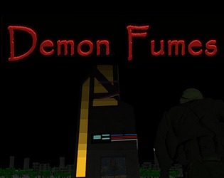
aiming didn't feel good, too sensitive maybe, but the opening art was dope, the zone to explore was pretty big (I thought I had to find guns at first so I explored probably more than most xD), and the game play was pretty fun. I liked trying out all of the different weapons.
aiming didn't feel good, too sensitive maybe, but the opening art was dope, the zone to explore was pretty big (I thought I had to find guns at first so I explored probably more than most xD), and the game play was pretty fun. I liked trying out all of the different weapons.
Thanks! I would have added a way to adjust sensitivity but sadly ran out of time so I wasn't able to make a settings menu
Music was just right for a zombie game. I thought it was neat that you had the graphic novel style opening; and then it was a little jarring that the graphics style of the game was so different. For a shooter, I think it really helpful to have a crosshair on screen to show where you are aiming. Mouse look camera control is probably also more common as it feels better.
I liked that the sniper rifle seemed like a one-shot-kill, however there wasn't a good chance to feel like a sniper. When I got the machine gun, that was pretty fun but ran out of ammo quickly (understandable).
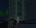
The zombies really were relentless, it was full-time danger.
Thanks for the feedback, I had actually added a pixelated main game screen but had to remove it in the build due to some unknown errors, I also regret not having a consistent art-style, the current camera controls were implemented by me to make the game just a bit more harder as chaotic.
Well I feel this could have been polished a lot more but it was an interesting zombie survival. Zombies did not seem to die and it felt a lot harder than it should probably.
Thanks for the feedback, I will definitely try to improve the feel once the jam is over
Cool concept for the theme. Wow you really got this in 47 seconds to the deadline? That's incredible!
Thanks, even I was surprised after submitting that I was able to submit the game 47 seconds before the deadline
Great game!
Thank you
Pretty cool game here! Love the RE/Doom controls. Zombies seemed a bit bullet spongey, but that could be me. Really good job!
Thanks for the feedback, I ran out of time or I would have made the impact a bit more impactful
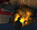
Ah, finally a zombie shooter! Cool variety of weapons and visuals overall, nice game!
Thanks
Love the Doom style camera / movement.
Thank You
I like it! If I may give feedback about two things: It would be great to aim /change direction with the mouse. And it would be great to have more visual feedback on hitting zombies.
I enjoyed the exploration and the different weapons, especially the machinegun! Good job!
Thank You
I don’t know why but it reminds me of doom. I love the visuals 5 star for all
Doom was an inspiration for this game, I had even added a pixelated screen but had to remove it in the build due to some unknown errors
Oh thats kind of disappointing
I don’t know why but it reminds me of doom. I love the visuals 5 star for all
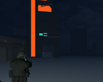
Nice game! It fit the theme good, and I think you've done a good job creating a world. If you want feedback, I would say that I would prefer if the facing of the player was controlled by the mouse. As it is right now, I think it's a bit snappy when turning, and it's a bit hard trying to shoot backwards whilst avoiding other enemies / obstacles. But that might have been what you were going for.
Thanks, creating the world took up most of my time so happy to hear that you liked it