Very cool concept with DNA and I liked all the changing rooms.
Play game
Deoxyribonucleic Adventure's itch.io pageResults
| Criteria | Rank | Score* | Raw Score |
| Polish | #17 | 3.643 | 3.643 |
| Overall | #25 | 3.571 | 3.571 |
| Overall | #26 | 3.439 | 3.439 |
| Visuals | #30 | 3.643 | 3.643 |
| Balance | #34 | 3.071 | 3.071 |
| Weirdness/Charm | #35 | 3.571 | 3.571 |
| Fun Factor | #36 | 3.357 | 3.357 |
| Music and Sound | #41 | 3.214 | 3.214 |
Ranked from 14 ratings. Score is adjusted from raw score by the median number of ratings per game in the jam.
Video url
https://youtu.be/QHBndRiy7yM
Comments
This is a really solid little rogue lite.
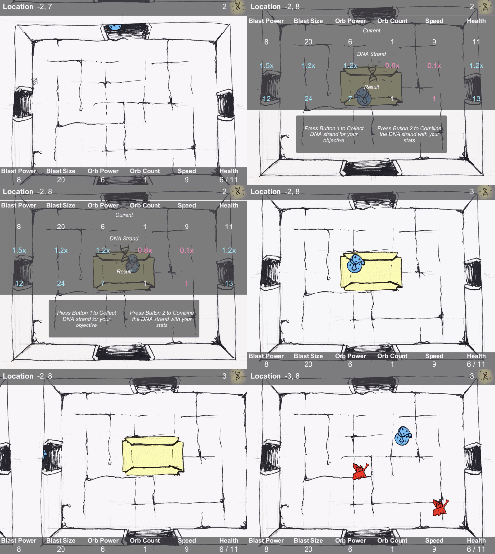
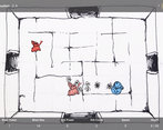
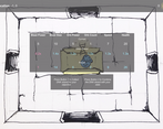
I love decision whether to increase your score or upgrade your abilities, made every point meaningful. I did find the collect/combine screen confusing at first, maybe a graphical representation of how much each skill goes up or down would help.
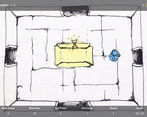
I also really loved the room transitions, made it feel really fluid.
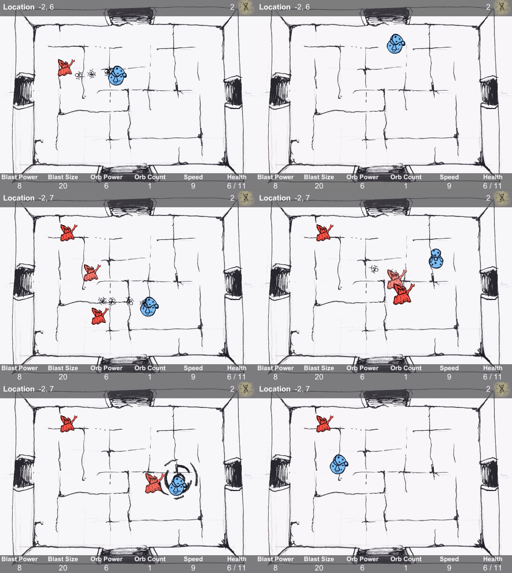
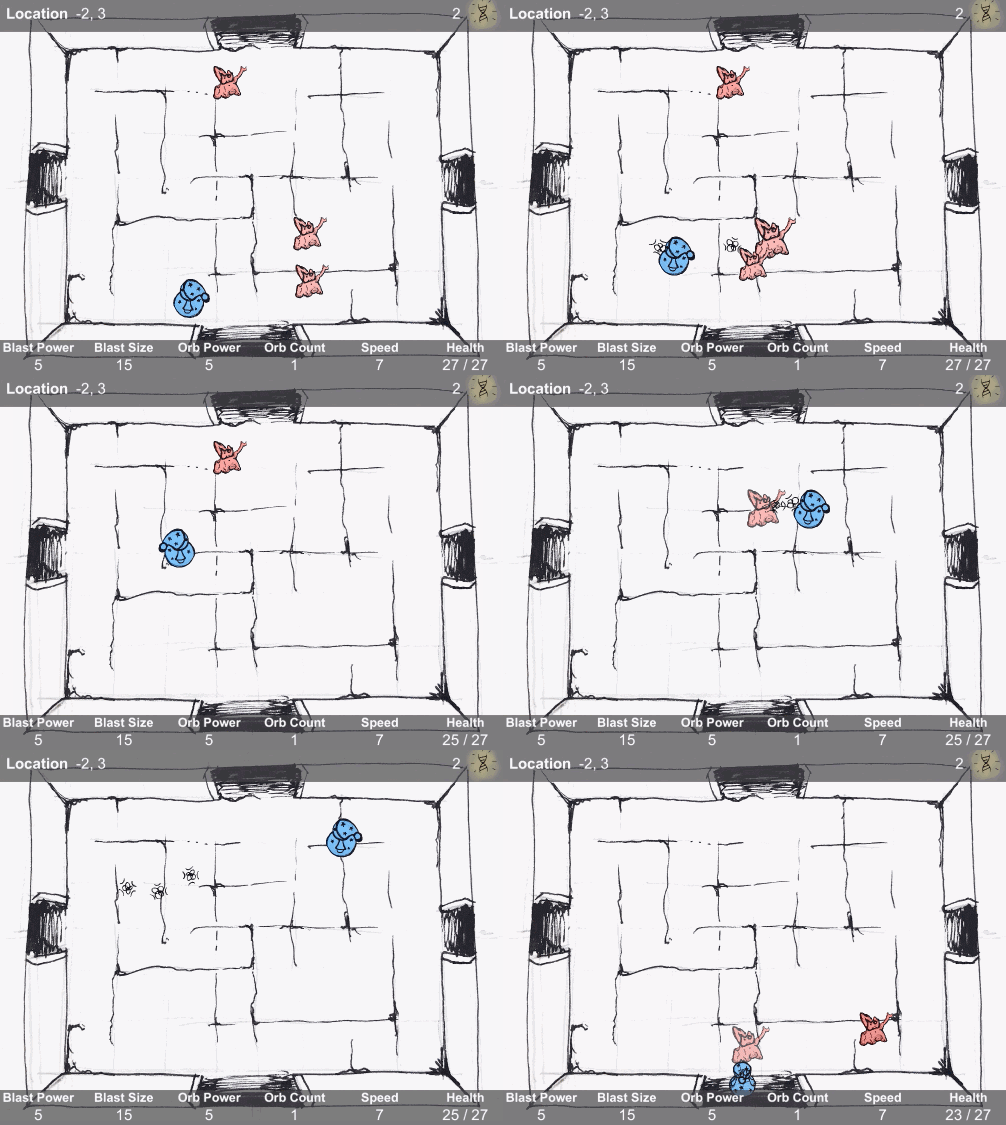
My main gripes were with the enemy hitboxes feeling bad, like I would take damage when I was sure I didn't touch them. Also while the room transition was really cool it did mean that sometimes enemies would hit you before your camera would be fully in the screen, especially if you had a lot of speed.
There's a lot to love about this game, and again, I really love the collect/combine choice with every DNA.
Thanks for the awesome feedback!
The interface for the DNA combining was definitely the part of the game I felt the least-good about! It needs design love. But some colouring was the best I could do in the time allotted. It looked a lot better in my head! It could be done a lot better if I were to re-do it.
The notes about hitboxes is great feedback, thanks. I had not considered what people's expectations might be. Enemies' damage radiuses are actually significantly larger than their body - they have a bit of a ranged attack, but there's nothing in the design that affords that! Good catch. The spawn point for the enemies could definitely use improving too haha, you get ganked by them as your transitioning quite often 😅
Thanks again for the feedback, I really appreciate the write up. Thanks for playing! 🙂
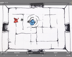
Neat art style and the room transitions are really cool. An indication when you're taking damage would have been nice. Overall a really solid entry, great job!
Fun game. Nice sketchy art style :) Smooth movement and room transitions.
This is a cute game with a cool rogue concept. I love the lil wizard guy a bunch. It would be cool to add more room types and enemy types! Also sometimes enemies spawn right outside doors which makes it rly difficult not to get hit. Very good tho!
Great game! I took me a bit to figure out how to improve by clicking left and right button of the mouse to get the dna upgrade (silly me). I loved it very well designed.


Leave a comment
Log in with itch.io to leave a comment.