Play game
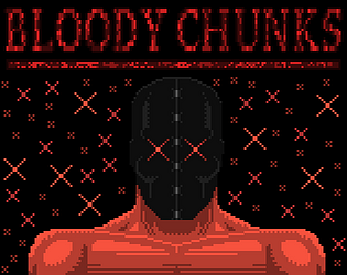
Bloody chunks (NSFW)'s itch.io pageResults
| Criteria | Rank | Score* | Raw Score |
| Visual | #23 | 4.316 | 4.316 |
| Theme | #94 | 3.000 | 3.000 |
| Audio | #112 | 3.158 | 3.158 |
| Overall | #170 | 2.895 | 2.895 |
| Fun | #245 | 2.368 | 2.368 |
Ranked from 19 ratings. Score is adjusted from raw score by the median number of ratings per game in the jam.
Are you using any third party assets?
I made everything during the jam
Are you using any AI generated assets?
nothing
Did you use BulletFury?
No
Leave a comment
Log in with itch.io to leave a comment.


Comments
I was not prepared for that intro (⊙ˍ⊙) You went all in and I respect that. Also, the mechanic of losing HP to deal damage is a real clever way to utilize the theme
Thanks for checking my entry out :)
very nice game man
Intro shocked me really :D But the art and gameplay was trully great, Got vibes from postal games.
This game has VERY solid character. Good job
That intro was amazing hahahahah Really liked the art, reminded me of the flash era
Lmao, wtf did I click on. Why am I slitting throats? Why did a pile of corpses summon some angelic entity? Why am I slitting my wrists to fight said entity?
these are the questions....
Holy crap that intro was insane, really interesting game! I like the unique direction.
Thanks so much 😀
Cool game, it's certainly weird (not in a bad way, but in the uniqueness way) The intro reminded me the Postal games, idk if you played them, if you haven't, I think you would like them
Thanks appreciate the play and the feedback. I have played Postal and enjoy unsurprisingly darker themes lol. Sometimes putting logic, pcness and reality on the back bench to allow black humour and gore.
I am making a horse game next lol...
Best SPLASH screen ever. This was a lot of fun for me. Will be back for a rematch against the boss. I took a little too much of the precious from the first meatbag...
Really great visuals and creative gimmick. Gameplay is a little confusing and repetitive.
Thanks for playing 👍🏽
My first reaction was "daaaaamn', my second one was "DAAAAAAAAMNNNNN" xD. The art is really impressive, loved the intro. I didn't really get how to progress in the game :( so it lacks explanations a bit. The performance in web is a thing too, as a lot of people already mentioned there. The take on the theme was pretty good, shooting your own blood, so loosing health after each shot - really creative. But in overall it's more than unique, I haven't thing anything like that before
Thank you!
The art is incredible, even if it's content is a bit unsavoury. I liked the implementation of the theme by having the attacks cost health. It would be nice to have more variety in the gameplay but what you've managed in the given time is great for having worked alone. Biggest issue for me was the performance, it slowed down to the point where there was huge input lag and I was having to wait minutes for the door to open.
Thanks for the feedback, I hadn't struck that in my tests but can understand it happening as I left many sprites to render that increased the messier you are and that only builds with time. Its also possible I did not "Kill" someof the sprites i meant to and they may have built up, I will take a look under the hood.
Hey, there are people as young as 13 joining this jam - please can you put [NSFW] in front of the game's name to make it clear that younger participants shouldn't play? Thank you!
Done, sorry I mention Mature in the description but I hear you not many read going in.
Thank you! It's an impressive intro for sure, but yeah nobody reads descriptions unfortunately 🫠
That's an artistic expression, i'll give you that! Pixel art is on point. Animation is wild.
The "theme and direction" is a little questionable. I hope it's just a phase :p