Play game
Martian Monopoly's itch.io pageResults
| Criteria | Rank | Score* | Raw Score |
| Sounds and Music | #32 | 2.778 | 2.778 |
| Theme | #42 | 2.333 | 2.333 |
| Overall | #52 | 2.333 | 2.333 |
| Graphics | #53 | 2.000 | 2.000 |
| Idea | #58 | 2.000 | 2.000 |
| Fun | #61 | 1.778 | 1.778 |
Ranked from 9 ratings. Score is adjusted from raw score by the median number of ratings per game in the jam.
Credits
Just Me
Leave a comment
Log in with itch.io to leave a comment.


Comments
The sounds and music are here and fit the theme pretty well.
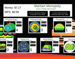
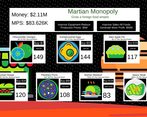
The graphics are some MS paint nightmare x) You need to at least properly export your images so that it doesn't have these white pixels, for that you can use the magic wand selection on most drawing softwares and make the selection go a few pixels over said selection. The colours are a bit everywhere it's too chaotic, i think it would have been better if the background wasn't an image like that but something more discrete.
As said by someone else this isn't a clicker game but an idle game, but beside that the progression is pretty well done and thought out. The rate at which you unlock things is very nice with the early game being very slow until it finally gets exponentialy bigger.
The idea is interesting but maybe instead of having earth based food with neon colours instead of the normal ones you could have gone a bit more alien, like a floating eye that's also a cake or perhaps a 4 dimensional loaf of bread.
There is a lot to say about mostly your design choices but the core game loop is solid although a bit out of the clicker theme.
Try to get your grubby hands on an artist next jam !
Also please rate my game if you have the time, it would mean a lot to me !
Thank you.
A bit too idle, but overall not a bad experience! I had a fun time playing
Game with a long gameplay and a unique style. A button to manually generate dollars in the game would be a good addition to speed up the gameplay. The graphics may not be for everyone, but the game has its own unique style which is cool. The music is chill and loops correctly, and the sound design is good. However, there is a bug with the display of MPS, which flashes between two values. Overall the game is worth checking out.👍
The auto-increment part goes very well, but the click part was missing. Also I didn't get to see the development of the theme of the jam.
What there is, works very well, my congratulations.
Since the theme was interdimensional, the first thought that came to mind was space, and subsequently came to the idea of a store/shop on another planet. I think I just ended up interpreting it in a basic way.
There's not much to say about this game. It is what it is. The developer set off to make it and they made it, not much else to it.
However, there's not much 'clickiness' going on, rather more idleness. Not just in terms of gameplay, but just as well as forcing the player to wait. Which is a cardinal sin in making any game, especially an incremental game. "Idle hands are the devil's tools" I believe the saying goes. In a gamer's case, they would rather be in hell than have to wait for the game to let them progress. If you're familiar as games used to be, every level transition required a rather long loading screen. Progress was seemedly being made, but all it was watching a meter fill before it lets you play the game again and offer some type of input in order to progress through the game more. Throughout the years, this process has been streamlined to make loading screens faster, load things more efficiently, and offer some form of interactive feature during a loading process so the player at least feels like they're offering some form of commitment aside from them simply wasting their time.
In this game's case, simply waiting out money to increment with no clear path ahead and no goal in mind other than to simply acquire more currency is it's own undoing. Much akin to the ultimate path to greed and a man's self destruction in feeling the need to focus their life entirely so.
The clipart used leaves much to be desired, as well, but at least it's functional!
Thanks for your feedback. Looking back, I agree that I probably should've added more active elements.
At first I was like "a-ha, this game is all about selling your business when it generated enough profit" but then it started to go way smoother after the second business purchase. Kinds defeats the purpose of "sell" button at that point.
I experimented and tried to make the sell button more useful, but it is either have a useless sell button, or a profitable and very exploitable sell button. The player could sell the businesses for quick money, but if the sell prices were higher there would be problems with instantly selling businesses.
I see. Maybe businesses could appreciate with time, getting more expensive to sell. It could solve both problems I think.
Fun game, would be better if there was more interactions possible to make it less idle. Rounding for prices was also very aggressive and caused the shown price to be very inaccurate
Thanks for your feedback. I agree that it was an aggressive choice but in my testing it was the best option to round the numbers. I have been getting comments about it so I think I'll make an update after the rating period of the jam has concluded.
strange color but nice :)
I made all the foods weird colors to really show the space theme. Thanks for the comment.