Play game
Omadi's Labyrinth's itch.io pageResults
| Criteria | Rank | Score* | Raw Score |
| Technical - Is there a technical achievement behind the making of this game? | #25 | 3.042 | 3.167 |
| Audio - Does the game have nice sfx and music? | #37 | 3.122 | 3.250 |
| Originality - Does the game innovate or try something new? | #39 | 2.722 | 2.833 |
| Overall | #40 | 2.930 | 3.050 |
| Graphics - Is the game aesthetically pleasing? | #43 | 3.363 | 3.500 |
| Gameplay - How fun is it to play? | #59 | 2.402 | 2.500 |
Ranked from 12 ratings. Score is adjusted from raw score by the median number of ratings per game in the jam.
Leave a comment
Log in with itch.io to leave a comment.



Comments
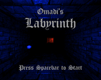
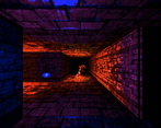
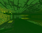
Very creepy, but kinda hard to "read" with the graphics style...well maybe that helped to make it so creepy. I wish the fireball had a lighting effect attached to it and try to increase the font size with the display resolution. I could not make out some of the text on my 4k screen.
Fireball has a light attached to it in the next version, and I'll look into the font size issue.
Here's the new lighting effect on the firebolt:
https://gyazo.com/0d772cef667a676b607b5631927e12fc
OK, I don't regret persevering and completing the game, it was fun enough to eventually manage to reach the end.
Is it possible that the parchments are not always on the tables or something? That confused me a couple of times when restarting.
It's been fixed in the next version (post-jam). Zombies ended up picking the pages themselves :D
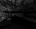
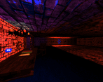
As others have mentioned the different rendering modes were neat. I did seem to settle on the "Doom" one as a nice combo of utility and aesthetics. The game seemed a bit difficult to me, but something that obviously is hard to tweak properly in a jam. Also just a minor thing in a jam context, but the lack of text scaling in the log was hard to read on my 4k monitor. Definitely a unique look and would be curious to see how you play with it.
Impressive choice of color palettes, but the idea with 1-bit graphics feels undercooked -- for example, I can't use a firebolt spell to light the tunnel, and since it's too damn dark, it's hard to orient yourself when there's little to no signposting. If there was a third spell that would allow me to place a rune on the ground or something, the navigation would feel much better.
I like the idea. I'm adding a lighting effect to the firebolt spell in the next version, and will try to decorate it more.
Really interesting entry, and nailed the ambience; it was creepy as hell!
i really like the different palettes i could give to the game.
olde english fonts are hard on my old eyes.
and the zombie killed me. and he didnt even have a knife.
I really enjoyed the atmosphere, and I love the rendering options :D
Great atmosphere! I got scared of my own shadow in the first room :D
Cool visual effects, interesting to have the render settings in a menu. Couldn't work out how to turn the camera at first, might have been nice to have a more obvious tutorial. A volume slider would have been nice, it's very loud by default. Couldn't work out how to get out of the first room. Trying to click on the 'pages' item in the inventory didn't seem to work, it highlighted a different cell. Sorry I couldn't get further in, but it's still nice to get a taste of what you made.
Thanks for the review! You can hit spacebar to get through doors if you have the page, but I'll put in that as a feature for a future update :)