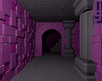
Nice presentation, the gameplay is very simple but the game still feels complete in the context, with hp regeneration allowing to play better or worse.
Play game
The Purple Tower's itch.io pageResults
| Criteria | Rank | Score* | Raw Score |
| Graphics - Is the game aesthetically pleasing? | #38 | 3.429 | 3.429 |
| Technical - Is there a technical achievement behind the making of this game? | #45 | 2.571 | 2.571 |
| Gameplay - How fun is it to play? | #54 | 2.524 | 2.524 |
| Overall | #60 | 2.400 | 2.400 |
| Originality - Does the game innovate or try something new? | #66 | 2.143 | 2.143 |
| Audio - Does the game have nice sfx and music? | #72 | 1.333 | 1.333 |
Ranked from 21 ratings. Score is adjusted from raw score by the median number of ratings per game in the jam.
Comments
i'd have gone with "lavender tower".
anyway, it was cool. the tweening of the movement took a little to get used to.
I think that straight light sight further down a hall to indicate available new tiles to go to would be good.
i wish those spiders would face me when i fight them.
I'll admit it got a bit repetitive, but the art style on this one might be my favourite look from all the entries I've played so far. Would have benefitted greatly from some sound effects though, even simple ones. Looks great, nice, simple controls and smooth movement. Good work.
Nice Spiders Cleaning Simulator Dungeon Crawler! I enjoyed the graphics and the easy mechanics of gameplay. The possibility to recover some health when walking on a new tile is a very good idea, I love this concept because you give a new interest to exploration and make us choose carefully the path to explore the dungeon. Oh and, good use of the tweening during combat and movement, but personnaly, I would prefer if it was a bit faster.
However, it have a big lack of musics and sound effect, but I suppose it was planned but not enough time to include them to the game.
Still, this is a good entry, and this game was made in 7 days! Congratulations :)
Very nice lighting effects on the walls! Unfortunately I had to stop at level 3; the up stairs appeared in a corner square, and there didn't seem to be any way to enter them?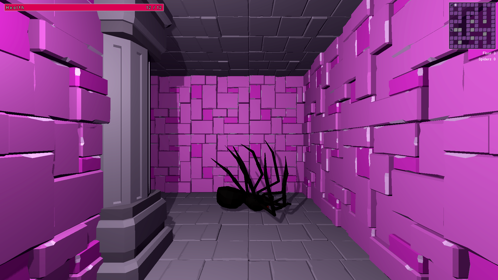
Still, the game was a pleasant experience, and I appreciated the presence of a web build even though the game is obviously stretching what the browser can cope with. Thanks for making it!
The style was what caught my eye originally, the pink walls and shadows have a light-hearted feel which suckered me in to this spider infested hell! I love the minimap, the use of colour to denote spaces you've 'explored' was a good touch. I also really, REALLY liked the fact that you rewarded exploration. Many games I've tried (my own included) have some form of stamina that serves to punish the player for a lack of item management or some such thing, but what it ends up doing is making exploration feel discouraged. Having the player GAIN health for moving around to new areas is really neat!
The gameplay itself wasn't particularly mind-blowing, but I felt the level design was decent and the little wiggling spiders were cool. Some good stuff here, well done :)
Interesting game! Camera/movement could be iterated on. I like the walls, overall aesthetic and the UI. The automapper is very handy and a nice technical achievement. Definitely worth updating after the jam.
I enjoyed this, though as pointed out by others the acceleration on the movement and turning makes it feel quite jerky. I think just linear movement would work better.
That said it is a really good looking game and the spiders lurking in the darkness really gave it a good dungeon crawl feel - I also liked the healing on exploration mechanic, it added a lot to the mapping out of the dungeon so you don't just end up walking around randomly.
It also worked well in the browser even if it felt a bit "heavy".
But a good solid submission to the jam! Well done!
I really like the presentation. The wall texture feels lovely, it just pops out visually.
A couple of points: sometimes spiders wouldn't even face me while attacking me (not a biggie, but looks strange), plus there's no actual fail state: the game over screen doesn't stop me from moving.
I like the graphical presentation. The UI and environment look quite nice. I don't like the way you've animated your movement and turning. The acceleration in the animation makes it susceptible to causing motion sickness for viewers. This is harder to notice when you're playing it or if you don't get motion sickness, but it's something I had to fix in mine.
I'm not a massive arachnophobe, but jeeze, the dead spiders looming out the dark is creepy as. Not necessarily a bad thing. Just creepy.
The combat is simple, but functional; obviously some audio or screen effects might make it feel a bit more satisfying. I love the exploration bonus for healing, it makes planning how you map out the maze a more interesting decision.
The game over screen is nice. I'll never know what the win screen was, because that creeps the heck out of me.
Overall, very complete feeling, well done!
Did some research and it seems like the best things I could do are 1) use a more gradual easing function (cubic maybe?). 2) Options to turn off / adjust movement speed. 3) Options to change POV.
I also saw a thread that suggested more static UI elements would help. I was going to do that already, but interesting if that helps. I also wonder if the option to use onscreen buttons instead of keyboard helps as well.
I'm no expert, I literally found it out by implementing it and having someone who was watching my stream go "OH THAT MAKES ME FEEL SICK STOP". I changed it so that the turning was just linear, which seem to fix it. Something about the speed up and slow down of the movement doesn't work well for some people, I guess.
Nice concept that forces you to get out of the 'comfort zone' (i.e. explored area), but the combat feels too simple to last for long. I hope this gets further development later, as this idea has potential.
I made it to floor 3 and the screen flashed red like I'd been hit and it froze. I really enjoy the graphics, especially the lighting and all the purple! I also really like the added strategy and incentive to explore with healing by walking on unexplored tiles. I think more could be made from that idea.
I think the game is bugged. It crashed on me just after I got to floor 2.
OK. I played the game four more times. I don't think it is a browser issue, it happened to me on Chrome and Microsoft Edge. I actually managed to complete Floor 2 on Edge but it happened again on Floor 3. All I know is that the screen flashes and stays red as soon as a I start it, and then no input from me will register.


Leave a comment
Log in with itch.io to leave a comment.