Play game
Escaping the Cosmic Abyss's itch.io pageResults
| Criteria | Rank | Score* | Raw Score |
| Overall fun and playability | #10 | 3.800 | 3.800 |
Ranked from 40 ratings. Score is adjusted from raw score by the median number of ratings per game in the jam.
Theme incorporation
**Please Read** there is a UI bug that may make the item and skill bars go away. If you encounter this, you can open the console with the Tilda Key ` and type the following:
show_widget("skill_bar_custom")
Cosmic Horror - takes place in space and there's monsters and events that fit this theme. This is apparent upon exploring the first planet, if not earlier.
Ancient Ruins - the player explores ancient ruins on the planets they land on throughout the game
infinite - the player is stuck in an infinite loop. this is apparent after the final boss is defeated and you go back to your cryochamber
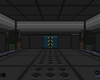
isolation - the player starts on a space ship, theres evidence that there is a crew but they are mysteriously gone. The player is alone and explores abandoned facilities and ancient, abandoned ruins....except for the whispers
Leave a comment
Log in with itch.io to leave a comment.


Comments
I loved the game's aesthetics, especially the way you did the cables. The UI and menus where nice and grabbed my attention. The game's scope surprised me, it felt massive for a jam title! The atmosphere, especially on the first planet, was fantastic. It got creepy at times too, which kept me on my toes. Flying between planets added a nice layer of immersion, and the story clearly shows a lot of effort was put into it. Overall, while i do think that some systems could of been refined a bit more, I still found myself really enjoying this entery! nicely done.
Thank you for the kind words!
**Please Read** there is a UI bug that may make the item and skill bars go away. If you encounter this, you can open the console with the Tilda Key ` and type the following:
show_widget("skill_bar_custom")
Wow, well certainly the scale on this game was impressive! The multiple planets with the different mechanics was cool, and the madness had some fun effects.
I also liked the little details like the optional weapon, using a photo of a cat to restore sanity, the moving star field outside the window, etc.
I found it interesting how it had the kinda cutesy pixel graphics at first, and then got creepier and more lovecraftian as it progressed. It got real eerie with some areas!
I do however have some issues with the game.
The most obvious to me, but is also the most subjective, is the controls. Having Q and E be strafe and A and D be turn messed me up the entire game. I know for a number of dungeon crawler fans that can be eprfectly fine, but as someone who has WASD basically hardwired into their brain I never fully adjusted to it.
The FOV for the camera I found a bit too claustrophobic. I don't think it needs to have half the tile underneath the player visible like some dungeon crawlers, but I think being able to see where the floor starts would be better for orientation. It made it hard to tell which square I was on sometimes. And combined with the fact that some interactions could be done from more than one tile away (while convenient) made it more confusing.
A recommendation I have for the game to avoid confusion though would be to have the player automatically return to ship after beating the boss enemy, or add a popup recommending the "return to ship" button. I wondered around for about 30 seconds thinking it wasn't dead yet or there was going to be a second phase until I remembered the return to ship button. So maybe add that for the slow people like me lol.
Also like other comments have mentioned, the combat is a bit odd. The rotating towards the enemy you're attacking can be disorienting, especially in the final boss fight I found. And the fact that enemies don't always face the player can sometimes make them hard to aim at.
Overall though I was very impressed with the game, you managed to stuff a LOT into it!
Great work!
Thanks for the feedback. You actually touched on a number of issues I ran into that I wasn't able to fully address.
-The FOV was one thing I struggled with, either the camera felt too low or it got a weird fisheye lens effect when I messed around. I tried to find a happy medium but it fell short for some.
-I'm not sure if you are in discord but it came up - I didn't even think twice about the strafe, it was so far off my radar I didn't even think to change it. It was as easy as flipping a switch in the engine lol.
- The enemies turning sideways was due to some bug I couldn't figure out, originally they were billboard sprites but for whatever reason collision was broken when I had them set to billboards and the flat 'cardboard' models the collision worked, so it was the only way to make combat actually possible. The bug even persists on the 'cardoard' models when you have a bit of madness and rest in the ship, a zombie spawns and the laser goes right through, yet fixes itself when you load out and load back in the map.
-That's a good point on the return to ship thing. I just thought it would be obvious, but it's obvious to me when I built it that way lol.
-the pointing to shoot is something I need do look into, at least getting it to snap back after a second or something, if not just change it to you have to face the enemy to shoot.
Not excuses but listing these out I can actually reference the comment later. I'm glad you had fun and thanks for the detailed response!
Ah no worries, I also like to provide detailed responses to feedback, and I had a number of known issues too.
Regarding the collision I did notice it on the spaceship zombies, didn’t mention it as I thought it was intentional (I had high madness and my vision had the VHS filter on so I thought it was scripted lol).
I am in the discord but since so much conversation happens on there while I’m either asleep or at work I missed it entirely lol. It’s definitely more a preference thing, so maybe for next year if you submit have it as a toggle option? There’s at least one other entry that has the same scheme in the jam, so different strokes for different folks I guess!
haha the zombie not being hit....definitely madness and not a bug!
Hey,
cool entry. I can see you had fun creating the game. The ideas are really cool with the spaceship moving to the planets grid based and the different themed planets. But I am on the edge here, the first planet was rather cool with some neat interactions. The last two and esp. the last felt just a little bland - nothing to do except move and fetch. Maybe just two planets would have been better for the time frame. Movement esp. in combination with the combat felt not smooth, I think because of the camera turning when you shoot and maybe also because I found the combat too arcade like duck hunting. I also got a bug where the boss fight did not end and I was trapped forever in the star vortex. Which was kinda funny. :D Even if it was not completely my cup of tea, I can see the appeal it could have too many. Esp. if you polish it up and make the combat more engaging.
So, even if it sounded hopefully not to negativ, nice job on that one. :)
Ahh you may have had the bug where the UI skill bar disappeared that had the "return to ship" skill on it. Either way, you were at the end and the game simply loops without much further (and is pretty buggy the second go around anyway). Thanks for the feedback, this is not too negative, as it's things that can be polished up post-jam and further down the road! Thanks!
5 stars from me on this. You've smashed it in so many ways considering the amount of time you had.
Nice and eerie, and I felt drawn in to the story. This one has an instant appeal. The movement is just right as well for me.
I'd say the inventory system needs some work. As it's a bit confusing how to move things around. But I totally get why that would be given the amount of time you have to put everything together!
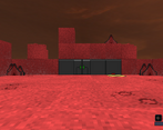
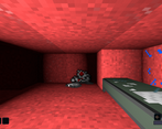
That maze on the red planet was a bit dark.
Overall though. What a really good game. VERY WELL DONE!
Awesome! I'm stoked you think my game is a 5 star! I really appreciate the feedback and glad you had so much fun! Yes I agree with the inventory, drag and drop is more intuitive vs click to pickup and click to drop, its a bit unnatural. Good point.
Hey look. You had to put this together in a week. You've done ! It's a full game and it looks great. Just... You know... Something to think about adding to the game once the ratings are over.
Impressive volume of a game for a jam! I like the space exploration part of the game and basicly 3 lvl being available, the envoirments were very good and the enemies cool, the final boss too! But I don't really dig the no ending type of ending, fells like incomplete, you know it's like everything I've done in the game is just straight up useless since I'm not really going anywhere, but still overall the game was good!
Thanks for the feedback and I'm happy you had fun with it! I agree about the ending in retrospect. In my head it was "trapped in an endless cycle of cosmic horror" but it ended up being just kind of a repeat without much else. Something to think about post-jam!
Really nice atmosphere I got a bit lost on the planet but loved every minute. Also impressive how much content you got together in the short amount of time!
Thanks for playing and for the kind words! I'm happy you enjoyed it so much even if you got lost !
This is really great, a super nice and straightforward jam game. I do really like that's it's quite linear and holds my hand so that I could just enjoy the submission.
The art is lovely, and the voxel planets worked really well for me. The entire vibe is lovely and consistent. The combat was nice, again I like that you kept it simple and not too punishing, I really think that's to the benefit of this format.
I did find the ending confusing at first as it hadn't clicked with me that it was the infinite theme. I completely understand and commend you for fitting all of the themes into your entry, but I think a more concrete ending that completes the narrative would have worked better for me.
So great though, loved it. Thank you.
Yeah the infinite loop outside of coming back to your bed if you get knocked out does feel unpolished/tacked on. I think there's definitely ways I could improve here but good feedback!
One of my favorite entries! The only real critique I have is that I would have preferred snappy and quick movement. Thanks for sharing this on my stream! You can find the full playthrough here: https://www.twitch.tv/videos/2108733841?t=03h38m37s
Thanks for playing and thanks for the feedback! I definitely realized after playing other entries I should have upped the speed a fair bit. I really enjoyed your stream and glad you enjoyed it! I'll be checking your entry out soon!
I loved the meshing of the story with the planet exploration. A narrative-oriented entry that captures the themes very very well. Good variety of planets, didn't overstay its welcome, played it to the end. Clearly well above average entry!
Would like to learn more about who the mysterious cloaked figures with guns were, what happened to your crewmates, etc.
I had planned the last day to be fleshing out more of the story a bit but unfortunately it was lost to time! The kind words are very much appreciated and I'm happy you enjoyed my entry.
Oh, a really nice one. Besides the bugs, which is normal in this timeframe, there is so much content here! The graphics make the most of the tileset, I especially like the voxellike wiring on the tiles. The atmosphere is very intense with the droning background sound. And then space travel do multiple planes, just crazy for one week. Thumbs up!
Thank you for the kind words. I'm glad everybody seems to be enjoying it! I'm very happy with how the 'planet exploration' turned out and thought it was a unique take rather than just clicking an icon on a map
PROS: Really love spaceship travel, good amount of content and world building.
CONS: Combat felt difficult and didn't mesh with world well. Game breaking bugat end. Wish the different zones were explored more in a meaningful way.
Thanks for playing! I watched your stream, thanks for all the feedback and I'm glad you enjoyed it!
Well done on the concept! I love the idea of moving around on a galactic map looking for planets to explore (Captive anyone?). The game has a varied set of locations and quite a bit of content and nice inventory management. Visually it holds up well. The controls were a bit awkward though and the perspective has too narrow fov making it hard to orient at times. All in all great job :)
The big man weighs in! Thanks Zooperdan for the feedback and playing. It's great hearing folks are enjoying my entry! I'm taking in all the feedback for future improvements.
This is quite fun - I like the low-res aesthetic, and exploration is enjoyable. I like how even traveling between planets is done on the grid, rather than being an 'overworld' UI. The combat is adequate, although the fact that your view angle doesn't automatically reset is slightly awkward. I did run into one small bug where the rune receptacle kept re-opening its UI every time I interacted with anything in the area, but it wasn't particularly impactful.
I never did find that other weapon part.
Here's a recording of my playthrough:
Thanks for playing! Yes, there's some UI issues and a few camera bugs. The camera moving on shooting is something I hadn't really paid attention to, due mostly to my playtesting being very rushed I may have just overlooked it. Good feedback, thanks for streaming and I'm glad you had fun!
The game is "finished" after you shoot the cosmic horror thing right? I think it is because everything works weird after that.
Anyway the game is cool, I prefer to have more control over movement speed but it movement feels decent, the atmosphere and plot are cool and the combat is fun.
Cool entry, thanks for sharing.
Thank you for the feed back! Yes. the game is "finished" after you defeat the cosmic horror the first time and this is where the infinite loop theme comes in. There's definitely some bugs after resetting the game, I tried to capture everything since there's some permanent world states when you play through that have to be reversed and may have missed some or it didn't reverse properly.
Nice and ambitious, but the perspective makes it harder to gauge how many steps you need to take. On the other hand, it makes the environment feel even more claustrophobic. The movement has a strange moment -- if I move right after turning, it looks like the camera starts jerking for a moment.
Perspective was definitely one of the things I struggled with on this one. In order to see the floor, I had some issues with getting a "fisheye" lens look if I made the FOV too large or the camera would practically sit on the floor, so I kind of abandoned seeing the square you are on for what is in now. Thank you for the feed back and I'm glad you enjoyed it!
It is incredibly ambitious, having a spaceship and traveling to different planet, I loved that!
Thank you! I'm really proud with how I handled that, I thought it was alot of fun and added a unique twist to the game.