Play game
Dragon Ruins [Jam Version]'s itch.io pageResults
| Criteria | Rank | Score* | Raw Score |
| Overall fun and playability | #42 | 3.242 | 3.242 |
Ranked from 33 ratings. Score is adjusted from raw score by the median number of ratings per game in the jam.
Theme incorporation
The game is set in ancient ruins. Monsters respawn each year, including the final boss, which creates a natural NG+, thus incorporating the Endless theme.
Leave a comment
Log in with itch.io to leave a comment.


Comments
Starting positively, I really like the visuals. You definitely had a certain vibe you were going for and you nailed it.
The game itself, though, didn't really capture me like it did others. Most of it is the auto-battles, which already aren't my thing (In other games, even if I'm just spamming Attack, at least it feels like I'm actively doing something. Definitely just a me thing), but there's also the lack of strafing and the long trek back whenever you need to go back to town, which you do a lot (I'm one to talk, my own entry has the same problem. Lol), though the fact that enemies are seemingly static encounters that don't respawn definitely helps. Side note, it's interesting that you can still move even while in combat.
Eventually, I stumbled into the wrong room, got party-wiped in an instant, and soft-locked. RIP.
All that being said, I still have the commercial version of this wishlisted, and I wish you success with it. :)
This is a really good game!
Simplistic look in black and white, took me some time to get used to.
The combat is perfect, short and shows respect to the player. The general gameplay loop is nice overall but there is some caveats. The leveling is a bit to slow.
Gathering gold to upgrade becomes the main game here but the increase in health and power is a bit to slow. Running back to the start just to save some money becomes necessary and especially if you want to increase the guild level.
The game would have had to be smaller, or have some towns further into the game as checkpoints. I would like to have the option to show the full scale map. Then it would be easier to know where to go next.
Movement is kinda ok but it lacks strafing and does not queue and it is a bit slow, especially at the doorways. This should be more snappy IMO if you force the player to run these distances.
Sound and music is fitting and nice!
Well done!
Pretty great. The Wireframe looks works really well and the autocombat is enjoyable. The focus is on the exploration and the map which I quite like. If you had a day more, I wish there was shortcuts, because a good chunk of my time went into backtracking by the same path. Really impressive what you did in a few days.
Oh I also quit once without paying attention (and lost my game ; - ; ), but I kept scaring myself quitting a bunch of other time on second playthrough. I don't know if it's a me issue or something in the menuing makes me want to quit.
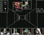
I am not a fan of fake retro shaders but this one worked quiet well, as the overall wireframe style matched the technical limitations what you would expect from an i.e. C64/Apple IIe style system.
The auto battle took away the constant "Attack", Attack", "Attack" loop that you have to click through on most turn based battles, which is a good thing in my book. I prefer this over an constant and mindless "Attack" spam any day. The downside of this is, that it limited user interaction to movement only (except the town of course).
Ended up looking at the minimap most of the time but I think that you are aware of that, I kind of expected something that would mess with that but did not played long enough to encounter it.
Some kind of "Scroll of Townportal" would be nice because backtracking gets old fast.
Nitpicking aside, a very solid jam entry.
Everything that is there works well and I did not encounter any bug (I wish I could say the same for my entry).
Very interesting entry! The backtracking got old after a while and it felt a bit slow and repetitive but it started out very fun. Also the presentation and audio were top notch. I would have liked knowing the difference between level up and equipment improvement as well as the difference between the classes so that I could make strategic decisions instead of picking things at random.
I am not a fan of auto-battles so I went into this with a touch of prejudice. A couple minutes in I'm still on the fence, but because of the polished retro look and interface I pushed on - and I'm glad I did! The auto-battle worked surprisingly well, and the tension and apprehension is still there. I wish there were more layers to it, and backtracking became more and more tedious. The further into the dungeon I got I ended up playing more and more using the automapper, which is unfortunate. I wish there was a way to turn it off completely.
All in all a great entry :)
This was pretty cool. I'll admit I thought the wireframe graphics were going to throw me off - a little *too* old school for me but it ended up being charming with how it appears 3d in wireframe if that makes sense.
The auto battles are a little jarring at first, but I can appreciate how it causes you to make decisions and adds a different type tactical decision making in the game. Should I fight the 6 kobolds or run and hope there's an easier battle to get through? Risk it for a little more gold or go back and level up?
I did make it to the dragon, however I died and when I went back, the dragon/pc's stopped attacking, so I think I encountered the only bug in my entire playthrough and could not finish. I think this title could have benefitted from a return home button or something. Backtracking became a slog, especially through the series of single-block rooms.
Satisfying, minimalist dungeon crawler. Made it to the end, took several years to do so. I sometimes debated if dying and losing part of my gold/xp is worth the time saved running back to the entrance. Sometimes it was, depending on how quickly they rescued you :D Could've used a town portal/teleport spell to go back, even if it would've been expensive.
I did notice that the mobs that killed you bugged out and became harmless when you came back, so that was a way to get rid of annoying mob packs.
The grind felt nice and not oppressive.
This gave me auto-battler vibes and the grind fits perfectly with that!
Well put together, everything felt smooth!
It was hard to resist the grind as well; savvy submission for a jam; kudos! :)
Really good presentation; it took me back to playing the first Wizardry. I liked the auto battles and that they didn’t “lock” you in position.
If there was some way the heal in the middle of the level, I missed it. The more of the map I explored, the longer it took me to get back into the action once I made the trip to town.
Pretty solid entry, as always.
Great job!
I love the aesthetic of this! Gameplay-wise, it had it's ups and downs... started out pretty strong, but then became quite a grind. I'm okay with the grind, and the lots of combat, but having to walk _so_ far from town to the nearest combat over and over and back got pretty annoying. I did play through to the end and killed the dragon twice, although I didn't quite explore the whole map. If there was _anything_ to find in the map (just some bonus gold), I think that would have been much more motivating. Though I like the simple aesthetic, I found myself "playing the minimap" for lots of the game, only a few areas (the "goblin city" I liked to call it ^_^) were recognizable enough that I could play the 3D view and (seemingly more efficiently) navigate it, mostly I was just watching the map to figure out which direction was the door out of the room I was in. Maybe just a change in color scheme in certain areas, or a few more open-ish areas that were quick to re-navigate with lots of side rooms to explore would have helped a lot.
This is great! I love the look and feel of it. Somehow the screenshots did not do it justice, but once I started playing I felt like the simple graphics were the right approach.
The auto combat is brilliant. Party based combat can feel tedious to me at times, but this was just a great balance.
I like how the map did not repopulate monsters, so you could incrementally get deeper into the dungeon with each visit. And it prevented you from exploiting the lower level monsters beyond a certain point.
I think the only thing I felt might be missing was some kind of indication as to how close the actual goal is. It would be nice to see a simple meter showing how far the dragon was (or whatever) and I think it would have kept me invested longer.
Beautifully made handdrawn artworks pulled me into the game. I like the Akalabeth style dungeon design. I don't like that you only see enemy portraits on battles.
Gameplay is too streamlined. You don't do anything in battles. It's like an Idle game. You see the town only as UI. You can't buy weapon or equipment, you just upgrade equipment when you raise enough golds.
The real problem of the game for me is the gameplay loop. You walk around dungeon, fight enemies, raise gold, upgrade or level up. Rinse and repeat over and over again. It becomes boring quickly.
I can see that you tried something different in this game but it just didn't work on me but good job anyway
Here's the recordings I did. The audio might be a bit off in places:
Dragon Ruins by Surt.R Pt1
Digging the Wizardy vibes!, not a lover of auto battles tho, great effort overall tho!
I like the art style in this one.
It appears that the battles are autobattles? I managed to pick up a glitched worm that did nothing to me on one run.
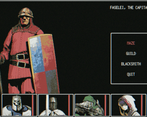
The menu would be helped with some context, like telling me somewhere on the screen that I'm at the guild or smith or whatever.
Good presentation, but the difficulty level was way too high for a beginner.
But good job. Thanks for entering.
Just like last years entry, your visuals are so striking. Really well done. Just so stylish and evocative of those earlier dungeon crawls. Really well done!
That end screen though. My emotions: "YES! FINNALY!.. ... .. NOOOOooooo...".
Still got mad gains, worth it.
One thing that was a bit annoying right until the end game was resting. I would return to town with nothing to gain from it, except rest. Made me run around a bit too much. Otherwise - had fun :) Will there be standalone too? ;)
I really enjoyed the simple design and control scheme, not needing a mouse. The fights were entertaining and it was nice being able to walk around with the monsters with the tactical twist that you could escape them by going through doors.
It made be a little uncertain about the combat rules though, if while engaged, there was a benefit of any kind to the monsters if I went on a stroll with them.
I found the economy a bit frustrating, in a quite good way. Having all characters ready to level up and not gaining any XP but only affording to level one or two up.
What I didn’t like so much though was the backtracking. It was a lot of it. And since the dungeon is rather intricate, there was a lot of key pressing to get back. And nothing ever happened to me on the way back. So ultimately that made me try dying instead. Which seems like a nicer strategy, though you loose a lot of coin.
And since the more you explore the further you need to go to have the fun (unless the dungeon is reset by new year’s), I think it would be nice to offer some teleport. My thinking would be a button, that when you press it, the game automatically backtracks you to the start through already visited locations using A* and then when re-entering the dungeon you can press the same key to go back to where you first triggered it. Having any input break the automation.
That would also assist in not needing to stare so much on the minimap when trying to find the way back and forth and just have it as a nice tool while exploring the fringes of the known areas.
All in all a really solid game.
I had a lot of fun with this. I played until I started seeing dwarfs. Also, I saw dwarfs in the game