Play game
Space engineer's itch.io pageResults
| Criteria | Rank | Score* | Raw Score |
| Overall fun and playability | #127 | 2.287 | 2.615 |
Ranked from 13 ratings. Score is adjusted from raw score by the median number of ratings per game in the jam.
Theme incorporation
cosmic horror
Leave a comment
Log in with itch.io to leave a comment.


Comments
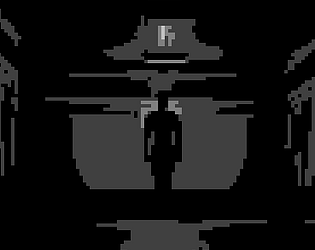
This has a cool aesthetic and strong atmosphere, but it can be kinda hard to navigate. I wandered around for a while trying to progress and ended up getting taken out by one of the enemies while rounding a corner.
The gun recoil/knockdown is kinda neat, though shooting doesn't seem to do anything?
I wasn't able to beat this sadly as I couldn't figure out the password puzzle even with trying seemingly every combination.
I enjoyed what I did play though, going through and fixing the lights made the progress feel more impactful. And the worldspace canvas interfaces were neat to use.
I also found the enemies to be pretty creepy, and the death screen is suitably haunting.
Good work!
Very cool aesthetic, but the grain filter is maybe a bit TOO much. The filter is much stronger than in the screenshots you posted. Game had a nice creepy atmosphere and the fact that your protag is very unskilled with a gun made it even better. Took a couple of tries to get to the end
The stylization of this game both looks good and really contributes to its atmosphere, as do its sound effects. The enemies are suitably imposing, although I think some sort of sound cure for them draining your health might be a nice addition. The small password puzzle was a good mix of exploration, environmental awareness, and a little bit of thinking.
Full playthrough here:
oh, I don’t know why, but in the video something is wrong with the graphics. I probably screwed up somewhere with the development and the filter was not applied correctly
and It's great that you made a video on the game, thank you
Game is a bit hard to understand how to play. But after a while I got it going. The hits you take when just standing next to the person isn't really easy to spot. Shooting into the dark seems to not work.
The game has a cool black and grey tone that works really well. Sound effects are great and gives a loot of the feeling of the game. Restarting from the beginning became a bit tedious after a while mostly because of the slow movement.
Great Submission!
Thanks for the comment, I'll try to fix the bugs soon
I went through block B.
The game is fun. You really nailed the atmosphere. I think the lightning is really perfect where your flashlight is turned off. I like the kickback effect when shooting (actually it's more than kickback, like you're falling and get back up?) and the overall immersive approach with the animation for taking your flashlight or even the slow movement, which feels adequate here as by the time it could become annoying you already completed the game. The puzzle was cool and appropriate for the context, the game isn't hard but difficulty is above trivial which is nice.
It's a bit weird that you need to be close to an enemy to be able to shoot him. Also lightning is alright yet a bit weird when the flashlight is on because of the central black circle.
The game is cool, thanks for sharing.
Thanks for your comment, it's great that you beat the game. (Yes, I made it so that the character seemed to lose consciousness after each shot. It goes well with the graphics)
When you turn on the flashlight, a black circle appears in the center due to the filter, I don’t know how to fix it yet(
You should realy point out that there is a flashlight and people should use it, other wise you get lost pretty easily and miss the hints and the majority of the content.
Very interessting choice with the light and the shading, I liked that for sure. Also liked the interaction with the terminals.
There are some caveats I like to point out as constructive critism.
This has potential, would not mind playing a post jam version.
Thanks for the comment. I made the movements and turns slow because I had never played games of this genre and thought that it would be difficult for the player to navigate. Also, after each shot, I wanted the character to seem to fall, but I forgot to add sound and animation.
I see, where you wanted to go with the lighting, but it is sooo dark. Very hard to make progress. I thought the lights would turn on with the control panel at the start, but nothing happened. Please add a bit more light, as the game seems to have potential. It is smooth and what I can see, looks good!
great moody monochrome artwork and style, great stuff!
Monochromatic is a cool look, but you probably need to use some dithering, it creates shapes that are a bit too abstract to read. Turning is very slow for a game like this.
I like the grey and white feeling, but unfortunately without map it's easy to get lost.