Play game
Polar Plunderers's itch.io pageResults
| Criteria | Rank | Score* | Raw Score |
| Art | #10 | 4.133 | 4.133 |
| Originality | #20 | 3.667 | 3.667 |
| Overall | #29 | 3.187 | 3.187 |
| Audio | #33 | 2.867 | 2.867 |
| Fun | #40 | 2.600 | 2.600 |
| Theme | #51 | 2.667 | 2.667 |
Ranked from 15 ratings. Score is adjusted from raw score by the median number of ratings per game in the jam.
Did your team create most/all of the graphics yourselves?
Yes
Did your team create most of/all the audio yourselves?
Yes
How did you incorporate the theme "FREEZE"?
You collect ice that melts overtime in a cold sea setting
Leave a comment
Log in with itch.io to leave a comment.


Comments
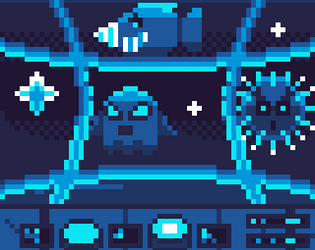
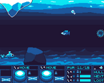
The art was really stunning in this game! The gameplay was decent, just feels weird playing a side scroller with such little control on the player character lol
I'm glad you enjoyed the art! Yes, the gameplay was very much experimental, so I'm glad to know it needs adjusting. Thank you for the feedback!
I love the blue color palette and that everything sticks to it! The scrolling backgrounds also look great, though from time to time there were some black bars that appeared in them when I was playing.
The mechanics are very creative, it's fun to change the position of your boat, and you always have important fast decisions to make while in the level. Unfortunately it was often frustrating for me because I had three actions that did nothing to solve my problem, maybe they are all "move right" when I'm already at the right side of the screen. I would suggest making the swapping a bit faster or the enemies less numerous lol.
It was also often frustrating how slow the sub moves. When you have to swap abilities and quickly press the right one, you don't have a lot of time, and this could be improved with faster movement or swapping I think.
The music felt a bit monotonous, but also kind of fitting for the atmosphere. Could have used some more instruments, or a longer melody maybe!
About the art by the way, I would suggest sticking to a single resolution for the pixel art sprites, that ties everything together even better! Maybe google "mixels" to see what to avoid. Ideally you would also make the text and UI elements pixel art, but with the small resolution I see why you went for a different approach. Also it's a lot of art to do for one person :D
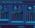
One thing that is unique about this game that I really loved were the crew members. There's so many different ones to choose from, and they have different abilities that really make a difference. Again nice work giving the player choices that matter. It's also nice that you can upgrade crew, though I wasn't sure what to do once I all upgraded them. Getting more money at that point is kinda pointless I guess? The designs of the crewmembers with their names and stuff are really cool though.
Overall a game that presents a nice unified experience that flows quite nicely. Especially impressive that you did this all yourself, including coding, graphics and audio. Very well done!
Wow, thank you for this in depth review!
Yes, I spent most of the time on the art and mechanics, so not much time went into audio or balance testing.
I agree that the card draws can be frustrating at times. I was thinking of instead allowing players to have a choice of direction for each card to eliminate this issue. Or perhaps just speed up swapping time like you suggested.
Thank you for the tips about the resolution! I'm guessing you mean the differences between the character screen and game screen? I googled "Mixels" but just found things about the lego sets, is that what you intended? I'm not sure how this applies to be honest, maybe I'm missing something?
I'm glad you enjoyed the crew members! That was something I really wanted to try out, but there isn't much to do with them after they've been upgraded to lvl 3 like you said.
Thank you so much for your feedback!
I'm sorry, I thought it would be easy to find out about mixels but I've been looking for like 20 minutes and I didn't even find a website or video that explains it! Basically the idea is not to mix resolutions. I read this in Michael Azzi's "Pixel Logic" book (page 21), you can find it on gumroad if you're interested. It says one should never mix resolutions. Basically all the pixel art should fit on the same "grid", there shouldn't be a sprite that looks like it was resized 2x, if that makes sense. Another way to say it is all the outlines of the pixel art should have the exact same thickness.
Ah, I see. Makes sense, thanks!
The art is absolutely lovely! Fantastic job! I only realized those were cards after reading the comments and then all made sense. I was thinking why the movement was controlled by those buttons and why they changed position each time, lol.
Thanks! Yes I think this would definitely benefit from a tutorial. It seems many are confused as to what's going on at the start of the game haha.
Pretty game!
Thank you!
Very nice art style! A little confused at first but once I got a hold of it, was pretty fun! Great job!
Thanks! Yes, I definitely would have included a tutorial had I more time.
Awesome game! Love the art and the music, really feels like im underwater in a submarine. Good job!
Thank you! I'm glad you like the aesthetic.
Hello, this is beyond spectacular! More feedback on the clicks would have been nice; the slight delays made it hard for me to control properly.
This is the most original game I've played for this jam so far as well, so kudos to you!
And of course, the design and sounds were amazing.
Thank you! Yes, perhaps the delays are a bit too much. I'm considering slowing down the enemy/obstacle speed if I continue this.
I love the art especially with how well you able to convey stuff with a few colors. The idea is solid, but I was struggling a bit as in some instances I had the worse cards for the situations in front of me, its probably me being unlucky. Awesome work on the game!
Thank you for the feedback! Yes, I think the card system would need revisiting if I decide to continue with this. Perhaps allowing the player to choose the card directions instead of having a direction linked to each card. I'm glad you liked the art!
The art implementation in this game is great! I love the parallax effect of the background which gives it a 2.5D look, the blue tone of the underwater levels, the music... I could feel the chillness. Great submission GreeGrenn!
Thank you! Working with a restricted palette like this was new for me. I'm glad it paid off!
Wow, that's impressive. Such a unique idea, a little hard to get used to but very novel. Also, great art!
Thanks! I do wish I had more time for playtesting.
Nice pixel art, I like your parallax a lot
Original concept too, I didn't see that anywhere before
The first character seems really weak tho ? You just don't get enough move card and when you get them they're sometimes useless because you can't go farther in their direction
Thanks! I didn't have much time to do extensive playtesting for balancing so you are probably right that some characters are weaker than others. The redraw mechanic is there to put cards at the bottom of their power deck for reuse later. But I do agree it seems often the card you get isn't something you can use.