Play game
Pretty Pyro's itch.io pageResults
| Criteria | Rank | Score* | Raw Score |
| Overall Fun | #27 | 3.667 | 3.667 |
| Sound/Music | #27 | 3.667 | 3.667 |
| Art / Graphics | #36 | 2.667 | 2.667 |
| Controls / UI | #42 | 2.000 | 2.000 |
Ranked from 3 ratings. Score is adjusted from raw score by the median number of ratings per game in the jam.
If you have competed before, how has your game changed?
It's a different game this time that I had first submitted to another jam and improved since then.
Game Genre
RPG
JRPG | CRPG | MMO| RPG
Genre #2
Strategy
Turn-based | Card Games | RTS | 4X
Leave a comment
Log in with itch.io to leave a comment.


Comments
TDLR:
A fun jam game. If you want it to be more than that, it need extra work.
What I like about this game:
-The absurdist humour
-The premise
-There are fairies in this game!
What this game need (in decreasing order of importance):
-Better animations. I was expecting something else than thunder/water/earth colour swaps for a magical girl game.
-More game mechanics. Currently, it can be resumed to a rock-paper-scissors between the five elements.
-Icons to clearly differentiate the five elements, as currently it isn't very intuitive. I always had to check the memos for every single fight and even at each enemy transformation.
-New SE, at least for the most common actions like select or cancel
PS: I don't know why my post was duplicated two times, so sorry for the extra notifs.
Thank you very much, that's pretty good advice! Also yay, fellow fairy fan!
Hello! Welcome to Feedback Quest 5!
Nice to see you with a different game, though still just as ridiculous as the last one. XD
So before I get into it, I assume you are making this as a highly comical game, what with the main character just turning her own dragon to ash, then wanting a pony and then the fairy stuff, right? It's important for me to establish this because the very first part of my feedback would change drastically depending on yes or no.
If yes, then it's absolutely perfect. Nothing wrong at all. I adore it to the end and can skip to gameplay stuff.
If not... oh... oh no. This... Listen, you gotta let me write this for you. Please. I beg.
Moving on to gameplay, I loved the amount of ways you could live up to the term of pyro. Fire, Flame, Burning, Heat, Plasma! Plasma really got me. However, with the set up between the different elements, I found myself unable to easily remember what was weak and strong to what. This is because when you read the description, you're being fed three different pieces of information about five different values. This makes it hard to properly remember what to use against what, especially so if it's not cyclical in nature. To explain what I mean, I made a chart in Excel, checking what was weak, resist and immune to what. In cyclical world, you would always have two weaks, two resists, an immune and a blank/normal. These would cycle through in an order like hands on a clock all moving together but pointing different ways. But you don't have this. Going in order of the mementos on my game, this is how things looked for when an element was attacking another:
Fire: 2 Resists, 2 Weakness, 1 Immune, 1 Blank. Flame: 3 Resists, 1 Weakness, 1 Immune, 1 Blank. Blaze: 2 Resists, 2 Weakness, 1 Immune, 1 Blank. Plasma: 2 Resists, 3 Weakness, 1 Immune, 0 Blank. Burning: 2 Resists, 2 Weakness, 1 Immune, 1 Blank. Heat: 1 Resist, 2 Weakness, 1 Immune, 2 Blank.
So from a gameplay level, it's much harder to figure out what to use against what. Then there's the utter abuse of Plasma, the shame of Flame, etc. I'd like to suggest making it cyclical. To go back to my clock metaphor...
Now to hope my logic works.
Start from Fire. It's the defending element, represented by green. The defending element will always resist itself. From here, the next element it's resistant to is flame, indicated by purple. It's also immune to blaze, represented by blue. Heat and Plasma, which are both pointed to in red, will deal more damage to fire, thus fire is weak to them. Burning deals normal damage, represented by no line. Next, you turn the dial so each line has moved to the next value. So the new starting element is Flame. Through this, you always maintain an equal number of strengths, weaknesses, immunes and normals. This, in turn, can make it easier to determine what to change to. since you can just focus on one element: one weakness. From there, the player will learn by memory and observation that, say, Burning is resistant to Heat and immune to Fire.
Along with this should be a matching of skills, where a type that is weak to another type will use effects that don't matter to that second type. So returning to Fire. It's immune to Blaze. Debuffs that Blaze can inflict don't affect Fire even when inflicted because the type of effects wouldn't affect how Fire is intended to be used. Say fire is meant to be high physical damage. Blaze would use effects that reduce magic. This means everything about Blaze is bad to put against Fire. In the end, you'll know to not remain blaze if against Fire.
Ok, now that I've explained this, I will also note this version of lines might be wrong to use. For example, it says Fire takes normal damage from Burning. However, if you turn the dial to Burning, it says that it's immune to Fire. It would be more optimal if something it was immune to was also weak against it, since you're using two weaknesses.
And that's all I got. Keep it up!
Yes, "highly comical game" was one of my main aims here, glad that it seems to have been achieved!
Also great to see the "fight fire with fire by other name!" elemental system also caught your attention!
But yeah, kinda hard to remember which kind of fire is strong/weak against each other, wasn't very sure on how to improve that, you offer an interesting solution, will try to implement that plan in the game. Probably will help if I add some better color coding for enemies since I'm at it, making a diagram like yours that shows up here and there in-game could help.
Thanks a lot for the critique and suggestions!
Well then, allow me to help with the colour thing! Along with red, orange and yellow (standard fire-related colours), you could do white (as fire gets hotter, it burns lighter until it's white), blue (when you light a gas burner, the flame starts blue), and green (This one is less a normal thing and more a "I have my own logic" thing. See, I've seen my father put together scuppers for rooftops intended to help get water down a drain pipe. These are usually made of metal and need to be soldered together. Part of the process is brushing a soldering paste (or muriatic acid mixed with bits of galvanized steel to kill the acid's strength) where you'll be soldering the solder. The idea is this stuff helps the solder grab hold of the metal. Anyway, after you solder a part, you gotta clean the iron off and then heat it up again. When you put a flame to it in this state, the gas will burn off any remaining debris from the paste with the flame turning green from the burn-offs. But legit, green flames are just a thing).
You now have six colours. Ensure that red, yellow and orange are never beside one of each other and it'll work great!
Yeah, fire can burn on different colors depending on chemicals, isn't that the basis of fireworks too now that I think about it?
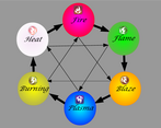
So following the advice (thanks once more!), here's what I came up with:
We've got red, green, orange, blue, yellow and white. The big thick arrows mean it deals double damage while being immune in reverse, thin arrows means it deals double damage and receives half damage. There's less relations to remember, and it forms a nice magic hexagram inside an hexagon. The icons should help remember their position in the diagram, clockwise you're always vulnerable to the two previous elements while having an advantage against the next two.
Looks fantastic! :D
Looks promising
Ouch, bad mistake on my part, thank you for pointing it out!
Uploaded a new version that should fix that problem!
-I like the spontaneous fire effects and how you used them to guide the player.
-Idk if it's a localization issue, but like 10% of the overall text had grammatical errors or typos.
-I like the style of everything (particularly how the music meshes with your visual designs), and there genuinely seems to be a strong foundation for something here.
-As much as I liked how you used the spontaneous fire to guide the player, the options when entering a building were VERY confusing.
-I love that you used that dragon as a main companion.
-I loved how when I interacted with things it said multiple different things every time I interacted with something, it was initially, surprisingly immersive.
-I would replace your UI with something less "stock" and replace all the stock sound effects.
-It was very confusing on who I was playing as, and what world I was in, I was clueless on the premise, but I didn't play extensively.
Final Verdict: Your intro was phenomenal and there is cool, stylish, charming visual and music chemistry here, the way you guide the player in an emergent way is cool! But the actual mechanics and the world you built are really unclear. Pretty Pyro has the potential to be a really charming IP imo, I would work on solidifying the foundations you've already built, clarifying some things to the player, and work on some original art. From what I played, the main character is actually well developed at first glance (narratively, basically), the rest of the "cast" needs work. I didn't play for very long, but I didn't encounter a single npc that reacted to my pyrokinesis. The NPCs I did encounter did feel like actual people and were charming, so kudos for that. Keep up the good work! I would tutorialize the options you have when you approach buildings and proof read everything. If this is a tech demo on using fire to guide a player emergently in RPG maker it would be GREAT! As a demo for a whole game right now, it needs a bit of work. Again, the dragon companion, intro sequence, and music are all really really charming and strong positives! Much love, respect, glad I got to try this out. :)
Thanks a lot for the critique, glad you enjoyed it!