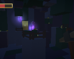
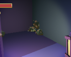
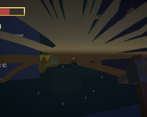
Play game
Gold Miner's itch.io pageResults
| Criteria | Rank | Score* | Raw Score |
| Gameplay | #55 | 2.546 | 3.600 |
| Mood | #69 | 2.263 | 3.200 |
| Overall | #72 | 2.180 | 3.083 |
| Audio | #73 | 1.886 | 2.667 |
| Visuals | #89 | 2.027 | 2.867 |
Ranked from 15 ratings. Score is adjusted from raw score by the median number of ratings per game in the jam.
Engine
Unity
URL
https://drive.google.com/file/d/1d2eNpfBoigDb744xratSZeotHvKOoL-q/view?usp=sharing
Leave a comment
Log in with itch.io to leave a comment.


Comments
Oh man, this game is excellent. Very well done! I was very happy to find the mouse sensitivity option in the menu. Loved the pixel aesthetic and voxels.
Also loved that last puzzle, took me a couple of mins to figure it out. I got 66/83 :) This is one of my faves from the jam, annoyed I stumbled across it so late in the review process!!
I had a similar idea in mind to your game's concept, but I think you executed yours well. The controls were responsive with jumps being a bit sluggish for me to miss the first jump a couple times in the game. Still, game feel was good after a bit of getting used to; I don't really play with mouse and keyboard. The idea of shining light on the gold is a great idea to help distinguish between real and fake, but even with the lamp, I was unable to tell which was fake, as all gold I shined gave off some particle effect that looked the same to me. Your use of sounds were nice though, the cave felt spooky to explore. As a suggestion, consider some sort of lamp light meter, similar to the Zombie FPS project from GameDev.tv, so that the lamp's use goes down each time it is pulled out, making it tougher to distinguish between the gold. Still, really great job here!
Wow, I'm impressed. Lots of good work, great level design, simple but satisfying mechanics. In terms of the theme, also one of the best implementations. I like it very much!
What didn't work for me? I missed the music plus a bit too dark for me (combined with blur, it tired my eyes quite quickly).
Good job!
The overall vibe of the game was really engaging. Kept me playing. Great level design and mechanics. The carefully placed text at just the right spots added to the sense of progress and continuity.
With just a bit of polish and music, you can take this game to a pretty high rank.
Updated my rating based on watching Metalstorm play it today. I failed at jumping but got to see a lot more of the game today. A lot of work involved, just needs some polish on things like text.
Adding to my collection and I will play it a lot more, but please try and do a new build that improves the text postJam.
Very cool game, I really like a lot of what you did here and the fact you made everything yourself is very impressive. I played it tonight on my livestream and you can check out the replay if you would like below. This is one of my favorites so far now. The feedback I left might not be relevent to how you did your text on the walls but that was the only thing I wasnt a huge fan of but everything else was absolutely awesome.
Thats awesome, that must have been a ton of work to get this all done in 2 weeks. nice job.
Okay so... Alot of good mechanics, the lamp with the fake gold and the destructable walls... and the gold access doorways.
The not so good... this gave me a headache!
The graphics were terrible as they were blury this made the writing was pretty much unreadable and I had to stop playing.
If you sort the visual you really could have a decent game here!
Good style and good game! I enjoyed it!
I can't even get across the first gap where the instructions are... what am I missing? Game is not playable for me at this stage :(
I like the pixelated style, but perhaps not so suitable for FPS because everything looks really blurry. The instructions on the walls are barely readable. Also... I would tone down the sensitivity of the mouse look (I admit I didn't check if there is a setting) because the look action is too fast and combined with the pixelated blurriness, it wasn't as pleasant.
But I don't want to give an unfair rating here, how do I move on past the first jump in the beginning? I want to start digging! :D
If clearing challenging jumps is not really the core theme of your gameplay, I would suggest maybe providing an updated version to make it a bit easier in the beginning, just to not put players off (like idiot me haha). You can increase the difficulty later...
Alright I may try again but no promises... dozens of games to rate still!!!
Ok, haha I managed to clear the jump. Not sure what I was doing wrong before. it helps pressing down spacebar for longer I think.
I like the gameplay idea, I thought the use of the lamp as a gameplay mechanic was great idea to identify 'true' gold. I wish there was a voting category for the theme, because I wanted to reward games like yours more than others.
My constructive feedback is still that you definitely need to work on the sensitivity on the mouse movement, not sure why it's sooooo sensitive. It makes it rather hard to enjoy in my case I'm afraid. You put in a lot of good effort in level design as well which I loved, but couldn't really get far and play more because frankly I was getting a bit dizzy haha ;D
Also, I know others liked it, but it's totally a personal preference, so not a huge fan of the pixelated look so much. It made identifying the real gold from the fake a bit more difficult (couldn't figure out all the time what particles are 'dense' or not), but my biggest concern was that I honestly couldn't read the text on the walls! I had to go up against them, and walk from left to right reading a few words at a time. I think if you made it slightly more detailed (not much) it might have been a bit better, otherwise it's slightly too 'blocky'. But personal preference.
Good little game, though, very nice effort, well done!
I really liked your game, you did a great job! The particles look pretty good and the sound effects improve the experience as well. Jumping felt a little bit off because of how slowly i fell, but maybe that was intended. All in all, well done!The retro low-res look was cool. On the third level where you need 25 gold to proceed, I found the room with lots of gold nuggets, but the lamp did not reveal whether they were good or bad, and I died taking my chances. Was there another way to figure out which were good/bad or was this a bug? Oh also maybe you should find a way to make the text more legible? It was difficult to read unless very, very close.
Overall, really well done. Best next step would be decorations to make the levels look more interesting.
While the Minecraft style visuals we cool, the overall game controls felt sluggish, unresponsive or to sensitive.
The other major issue is I couldn't really tell which were the good gold and which were the bad, so basically I felt like I was gambling.
Overall a lot of potential
I love the very unique art style! Did you manage that with a shader? I also blew my brains out on one of the gold nugets hahahaha
Thanks for the tutorial. Its an awesome effect! :D