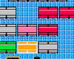
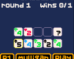
I like how this game combines different types of card games ( I love card games ) and probably not relevant for this jam but I like the visuals.
Play game
Lunch Gambit's itch.io pageResults
| Criteria | Rank | Score* | Raw Score |
| Fun gameplay | #8 | 3.382 | 3.600 |
| Blind-friendly and good use of audio | #17 | 3.444 | 3.667 |
| Setting, story, characters, and world | #17 | 2.755 | 2.933 |
Ranked from 15 ratings. Score is adjusted from raw score by the median number of ratings per game in the jam.
Comments
I love the visuals and the gameplay! Although I couldn't hear the game because I have no screen reader, I think the idea of appending an explanation to every situation is superb. As has been said, the idea of how minigames/rooms are explored is very cool.
Besides, PICO8 is amazing :) Never got into it but I've been following its development and the way people has been building functionality from the ground is very cool.
amazing how you combined pico8 with text description, nice music as well
Okay this is just such a fun and quirky little game! I kind of love it....
The fact that you guys managed to create a roguelike card game in a sea of roguelike card games that actually does something more unique by going back to completely traditional roots in terms of gameplay, while using an unlikely setting is both amusing and admirable. The fact that you managed to do this while also avoiding blindness stereotypes and cliches is worthy of a top 5 ranking in the jam, in my obviously correct opinion. 😂
I think the music is really catchy and I love the retro esthetic as well; a treat for the ears to be sure. The sounds fit well with the theme, though there aren't many.
The variety in minigames and inherent randomness between runs makes it highly replayable.
Screen reader support wasn't perfect, but it was still pretty solid, and the controls and UI made sense.
I liked how easy it was to access important information as well.
The verbosity when moving between cards in my hand was a bit unnecessary, and I'd rather have instructions placed in a single UI item for reference after hearing them for the first time, rather than seeing them every time personally, or have a key I could press for contextual help, like H.
The game crashed when I accidentally played a single card for my hand in poker.
I didn't see any info about how to play that game where you're supposed to not draw 2 clubs.
Honestly, great work, and I hope you will consider working on this game more. I also would love to see what you can cook up next year, so please do join again if you have the time!
Thank you very much for participating! :)
Thanks for the detailed feedback, it is much appreciated! We've been slowly working on the bugs, and we've since reduced a lot of the verbosity when moving around the different parts of the interface. This is actually our first real game project, and while we both are frontend devs, we don't have a lot of opportunities to do accessibility coding, so learning what is and isn't necessary in this jam has been super valuable!
We're definitely planning on working on this more (we have a whole laundry list of things we'd like to polish up after the jam ends), and we'll be excited to join for accessibility jams in the future!
That's really great news! I'm happy to hear that you intend to stick with this! I'm also really glad that we could make you feel welcome enough to want to come back next year. Just participating is appreciated, given how niche this community is, but you guys managed to make a pretty good game as well, which is just a bonus.
And yes, verbosity is becoming more of an issue in front end as well, so it's really nice to have some front end devs learning about this in a more fun way. Allot of unnecessary alerts and redundant phrasing in menus. I think it's a problem that comes out of the best intentions at least, but I can't tell you how many times I've been driven off a website entirely when browsing on my iPhone because of a "this ad will end in..." "this ad will end in..." "this ad will end in..." alert that popped up every second of an auto playing video to interrupt my screen reader, making me want to screech in outrage and throw my phone out a window.
Hi! Love the PICO8, love the art and really enjoyed the music!
It took me a while to understand the card system & the different games (there's some games I didn't understand, but on my behalf I'm not a card player), it would greatly help to have access to a small explanation when you launch a card game!
The idea to manage/buy cards is great!
Loved the music and art, but I needed an easier tutorial to understand the game because I got a bit lost.
Carrying a hand of cards through multiple different games is a really cool puzzle!


Leave a comment
Log in with itch.io to leave a comment.