
Here you have a documentary I really enjoyed :)
G. Carbonell
104
Posts
10
Topics
13
Followers
20
Following
A member registered Nov 15, 2017 · View creator page →
Creator of
Chose-your-own-adventure cyberpunk card game
Interactive Fiction
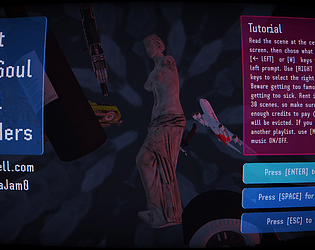
A small experience based on Philip K. Dick's 'Ubik' novel
Interactive Fiction
Drain a planet because you feel small, fighting dinosaurs and collecting exotic matter
Platformer
Recent community posts
Welcome!
We will not be many this time but I hope this jam gives you opportunity to shine and build some enticing portfolio ;)
I will try it to be relaxed enough so you can adapt it to the GGJ, or even go beyond the traditional idea of "videogame" and build an experience/demo/whatever.
Again, thanks and welcome!
Wow! This is quite challenging. Although I still have some difficult discerning when what will turn what (does only change what is behind, not at the sides?), its mechanic is quite original and it is able to elicit quite a lot of complexity from very simple rules. If feels like a very cohesive experience, and it accomplishes my "to-go" rule: would I like this to be packed in a GNU/Linux distro? Yes!
The visuals of this game are rad! I love the desktop at the beginning, as much as the brutalist looks overall. Good old times, the '90. It really sparkler my nostalgia.
Ignoring the performance issues, I think that not much can be say against the gameplay. Although it is odd and annoying, even corrupted, that was the intended feeling and it fits perfectly with the voice of the hero, who sounds pretty wasted (and careless, to the extent of ripping his heart off).
I ignore if the right mouse button could have been used to pick the objects (of course, cooking the grenade should have been change to holding the left button). This might have improved the way you use your heart. Anyway, this game got me by its looks and that brief moment I was transported to the past!
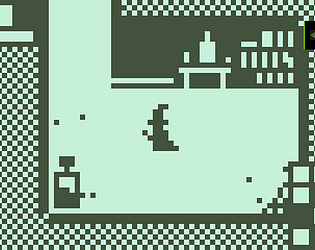
I think you tacked the visual aspect. Details like drawing the valley puts the player in context without noticing, and it is a good starting point for a platform such as a Game Boy, which nature didn't allow it to render very complex graphics.
The idea pretty clear, although I would have places the FISH button before the FIGHT button. As we usually read from left to right, users will be prone to hit the left button first. As it is to the interest of the player that Agros is as strong as possible, having a tendency to train it first instead of throwing it against the enemies seems coherent.
It took me a while to get the fishing mechanic. I though it was about luck, like a casino game. It would be better to change the way the player fishes to a more dynamic, visual output. Maybe one of those bars with a moving marker, which compel you to press the button when they are at a given stage of the line. Something like this, being << the moving marker:
[:::::::::::[HIT HERE]::::::::::::::::::::::<<::::::::::::]
While fighting, you would copy Pokemon and give some input about the result of the attacks. So if an attack fails, make the "You fail" redundant. When you hit, it could say how much damage you made. So the player has an idea of what is going on under the hood ;)
The idea of combining dynamic perks as cards seems promising, I like it, although I had some trouble regarding to the interface. Why not to use a few keys in a row (for example: 1, 2, 3, 4)? League of Legends style. I think this game would work best if something like that, combined with the arrow keys, was implemented. I just found myself a bit lost in between E, Z and K.
The aesthetic is good, so I think it is more about polishing the way you input commands than the gameplay on itself, which is simple and concise (dodge and hit when you can).
I would also add a bit more feedback to the interface, as it took me a while to learn that by pressing space I was going back to fight. It would be a great idea to add some kind of counter to the coldown cards, instead of waiting them to shine, so the player can use such information to anticipate his moves. Same with choosing cards; was I meant to chose them, or they were just displayed before the match? I think this idea has potential, it just needs a bit more polishing. But great work! It's eye candy.
I am quite unable to play horror games so that knock, knock... shivers!
I like the general low res style, as it gives an aesthetic that is able to hide the short time we had to develop while preserving certain identity. I think that giving less information, visually, also feeds the feeling for The Unknown to be out there, looking for us.
Including submechanics such as the Simon Says adds layers of interaction, which is always good if you strive for immersion; it makes the player feel that this world is alive, that is has its inner logic.
Pushing t he player to turn the light was also a great detail, same as letting the window and the TV at his back when doing so. It is all about pushing against what makes you feel safe. Good combination.
I also liked how you bravely used posters to point out what to do. It is as if the game wasn't trying to hide it is a game, stating that this is about getting scared on purpose.
This is another 5/5 candidate to me. The experience is fluent. The looks are good, without unintended glitches. And it is a twits on that game about switching adjacent squares on and off. As all the games I rate 5/5, I do it thinking that this is a game I would like to find pre installed in a GNU/Linux distro.
It also includes an quick tutorial, and can be included in the category of games that are "easy to get, hard to master". Perfect!
I had some trouble with the game lagging and the scaling interface, so my gaming experience was not optimal, although I think that the concept beneath is very interesting; I talk about crafting a creature and then controlling it to fight. Good premise, original.
For the menu, I would place a clear PLAY/START button, as it took me a while to realise that the screen was the target I should click to play.
Is the player meant to have any power from the beginning? I was able to just dash and hit with my sword. It might be useful to place a small tutorial and give the creature some basic powers, so the player starts getting acquainted to use keys 1, 2, 3 and 4. Would do the thing with the creation interface; although he shouldn't be able to pick the most powerful limbs from the start, it would be great to be able to chose in between slightly stronger or faster arms, for example.
It is a personal thing that I hardly stand whistling, so beware that could drive some players mad xD It happened in my proposal, my techno music gets to repetitive, so I added an M key to switch music ON/OFF.
Although I don't know about sound to this depth, I think this simulation can appeal to specialists. It is not something for the common public, IMO, but seems like a promising toy for sound professionals.
I think it could be improved with a small tutorial. In this sense, being able to see the wave real time was the greatest help I found.
The interface is clear and simple, nothing to object. As I say, I think this is for professionals. No pun intended, I just didn't know how to play because I lack of theoretical basis to handle it.
Couldn't rate it lower than 5/5. Translating kinetic movement into light physics results in a very original mechanic. Besides, not cluttering it with thousands of shaders gives it a 2000s vibe that I personally love (nostalgia wins).
Regarding gameplay, the game goes straight to the point, with automated move, so the player just has to care about aiming; pure darts game with a twits. It's arcade feel is amusing enough to empty your mind for a while. This is the kind of game I would like Windows or GNU/Linux distros to have preinstalled, so every now in a while you can get away from tasks han have some little, uncompromised fun.
The cowboy music makes it even funnier.
Okay, 5/5 to me. Maybe not for others, but I think that you mixed aesthetics and gameplay in a very cohesive and original experience.
The game is easy to use (just a mouse), invites you to learn how to solve each puzzle by experimenting, has re-playability as you can configure it from the beginning, sounds goes with the experience... I just feel it is a very solid proposal. Could even be one of those games that you find in GNU/Linux distros.
No friction. Clear. Relaxing. It just works.
Would definitely give it a try on LSD.
I like how minimalistic this is, with no clutter. It goes straight to its basic mechanics without hassle, and I think they are already quite complex por su a simple game (fishing, world travel, inventory management).
I found interesting that you used growing-and-disappearing squares to make the player feel that he's walking over water. It's such a small but meaningful detail... Also, onces the rod is being used, suddenly drawing the vertical depth was also a very comic-like way to resolve it; quite cool! Another detail I appreciated was to realise that fish had a given size, as you don't know this until the inventory shows up.
It is a chill, cozy, small game to get relaxed. The minigame with the rod combines sound with action, which multiplies the feeling of the actions. The deeper you go, the more you hear the thread going. Every time you try to catch it, the more clicks you listen. This might sound trivial but, as they taught me once, games must have sound or they render into lifeless moving images.
I kinda felt the game was trolling me, which is good. It might not be the game of a lifetime, but letting me shot for two minutes just to later say "just survive" was a good joke. Also, playing with wild hand-painted pixels, disproportionate furniture and terror music, overall, packed a chaotic-yet-cohesive trolling.
Phew! I got stressed easily! I like how much thrill you can get from such a simple mechanics. Kinda feel like the experience could be extended with a few more mechanics into a big game; because it is all about timing and location, i has a loot of room to build spatial-time puzzles.
I think that placing that 1st crocodile at the beginning accomplishes my (really mine?) 101 rule of interactivity, which is making learning progressive. That single pond sets the basis for everything that comes next.
Besides of that, I had to learn my myself that you could jump while in the water, which is an interesting micromechanic as well, as I realised I was slowly sinking.
Another interesting aspect is the cognitive dissonance you build (I think this is what makes it more thrilling/stressful): cute things, death. Yay!
I just love it. Didn't get what was going on after 30 seconds into the experiences, but then I was totally invested. I really liked the idea of frustrating the hero's plans.
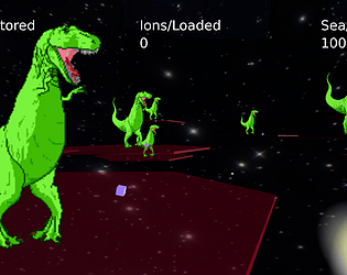
In the beginning, I just spawned basic mobs, until I realised that by combining them I could really be annoying. So I feel the game invites the player to experiment with different combinations.
Also, the idea of facing and AI with different AIs, being you who coordinates them, underlined that, in spite what I am looking at looks like a FPS, it is in fact a management game. Quite a great crossover!
The interface might look too big for the mobs that can be spawned, but I think that is secondary, as what matters the most is where you place them and how you build your army. The hero's view is just secondary to this end.
Personally, I like UI brutalism (like those webs from the 90s, stuffed with gifs and violent colorful backgrounds. So I really liked to see all that move, with an intentional low quality audio and tons of action. You made mechanics go beyond graphics, which (IMO) is what nowadays AAA industry lacks about; too much glitter but no compromised with handling things "under the hood". In this case, getting to be in the background was very ammusing!
Wow! I liked how you transition from one scene to another, seamless. This helps immersion as loading screens are also moments in which we invite the mind to disconnect for a while.
The art is great, you conveyed a lot of meaning with just a few polygons, and they are aesthetically pleasing. Did you use a color palette? Your minimalistic stage play looks very well balanced in terms of color, composition and proportions.
One thing that made me a bit mad was the sinusoid wave/ball phase. It works smoothly once you get the ball to get forwards, but I feel that it is too long, too much time without rewarding the player, so in spite is very good looking, it gets frustrating.
About the text, the cashier telling me to GTFO was a great surprise to stablish the theme. Although I would take care of hoy many dots (.) I used. More than three provoke too much noise. As Bukowski said, when you write is has to read "bang, bang, bang"; do not be afraid of using short, strong sentences that start with no dots and end with a single one ;)
Overall, quite a beautiful piece of art! You should develop it further. As I said, transitions made it really cool!
I really like how you implemented the Nuclear Throne-like mechanic. Weapons could give you some feedback on how long they will take to be reloaded, but the overall feel of movement, shooting sounds, particle effects and variety imprint intensity. So pushing the trigger feels beyond playing a sound and creating a bullet; it kinda made me relate to the character, feeling the heaviness of the tool and its recoil.
However, I had trouble advancing to the next stage. Was I meant to do something in particular? I kinda felt stuck and had no idea why; so the map might make this things more clear.
Anyway, they art is rad, and combining huge pixels with smoothness of moves makes it feel bold, I'd even say dirty as war is. So I'd say it has a great load of immersion and it is quite promising, if you want to extend it to a longer experience. I think you got the basis for a great game: fluent, good looking, action is felt not just shown...
The game stablishes a clear loop from the beginning, which is an invitation to wonder what will be the next tech you get. Also, stages are not too long so it doesn't get tedious.
Aesthetically, I feel the color palette elicits peacefulness, even if you are constantly killing. So the chill vibe of murder helps the player to stay more without feeling too violent.
In terms of balance, I think nature is noticeably more powerful than the protagonists, so after a while it gets overwhelming (even if you are using a rifle against unarmed creatures). It might help to make the weapons more powerful or add some mechanic that helps dodge creatures (dash/jump/shield).
The UFO leit motif is surprising the first time you hear it. Even without seen the UFO, the game is already telling "yep, ALIENS" which stablishes complicity with the viewer.
;)
I like how fluent the experience is. It feels like you cared for the micro mechanics; I'd even say that the hitbox is not a pure square. Gravity relates jumps to the size of the level, so it looks you had a lot into account (which results in coherent puzzles that do not feel improvised).
I find the main echo mechanic quite interesting, it gives a lot of room for puzzles and that is shown in a very small space (so I'd say your game has propositional density).
If I had to improve something, I might have put the echo button to be used by the right side on the keyboard, so you don't just play with one hand... But that's a minor thing. Overall, it is a very polished experience in terms of look and feel!
Acerola Jam 0 community · Replied to DiamondCore in Show me your games, and I’ll rate them! (Game Swap)
去次元第四壁 ~ Observer's Trap jam comments · Replied to LasagnaCake in 去次元第四壁 ~ Observer's Trap jam comments
Echo: Comet Coast (Jam Version) jam comments · Posted in Echo: Comet Coast (Jam Version) jam comments
It seems you know what you are doing! There are subtle details, like the passing of time, use of different colors and highlighting objects that make the experience more meaningless that merely walking by and hitting E.
The initial puzzle is easy to solve, and then it is followed by a greater one, so progression is there, which welcomes newcomers. A very interesting detail in this sense was to start with three horizontal scenes to immediately allow the player to go north as he solved the first puzzle.
Also, I found very interesting that the game status (including inventory objects, amount, hour, etc.) is all present at glance. As I say, you took care of smaller details and that makes your game greater.
If I could say something that I would change, I would make the music a bit less repetitive (it happened in my game as well, so I put an M key to switch music on/off). Also, in spite the pixel is very well cared, the viewport renders to a higher resolution than the arte, and this is noticeable; this would be great if you wanted to apply nowadays shaders on top of retro graphics, but if you want a real retro feeling, I would make it pixel perfect, so big pixels always match the grid of big pixels.
Best!
Oh one more thing. Following the idea of breaking the enemies' spawn point, I would put fire lamps here and there, so if you shot them down you create an explosion that damages several enemies. But for that you should be able to shot higher. Have you considered aiming and shooting with the mouse, so you can aim around aprox. 270 degrees, hold the arroz with left click, and then release? That would allow you shoot even behind the enemies, which could create a great dynamic if stronger enemies hid behind weaker enemies.
This game is visually pleasant, which make me want to play more. The water effect, combined with the fact that the big pixels are in fact high-res, builds a retro-yet-contemporary aesthetic that combines nostalgia with shader/fx eye-candy.
Related to gameplay, I think that it will help to improve user feedback prior to the actions. So for example, when you are standing next to the fire, show a"[Q] USE BONFIRE TO COOK" prompt on top of the player; if possible, even with an icon for the key. About dashing; the mechanic is good but instead dimming the icon, which doesn't tell much about when it will be ready, I would use a bar, even with seconds (and even tenth of seconds visible), and would make it pop somehow when 100% is reached. This might seem redundant, but remember that the player is not you, who created the game so, same as when we are learning something, we need things to be repeated several times before interiorizing them.
About enemy spawn; I would make it in slower pace, and would display something that let's me know than enemies are coming (maybe a sprite of an approaching enemy coming from the back, or raising from earth like a zombie?). This way the player can anticipate the moves, enemies don't just spawn in his face. Another good thing to do that would make the experiences richer is to make it possible to destroy the spawn point (maybe by shooting down some artifact at the top of a stick?) This would create a parallel mechanic: while you are being surrendered by enemies, yo have to chose either to kill them or to kill their origin.
Another good mechanic to add would be to shoot further, surely by holding the shoot key for longer time.
There is something with the controls that made me a bit confuse but can't recall what. I'd keep one hand for moving (ASDW, arrows) and another for shooting+action. Would also consider to fuse the cooking action with the eating one, so if you hit the action key next to a fire you always cook if possible (if not, eat), and if you hit the action key with no target you always eat (if possible), and if your are next to a character, you neither cook or eat, but talk. Does that make sense?
;) Good luck with your teacher!
As it has been already said, nice atmosphere! I liked how you turned a basic exploration into a terror surprise.
The scanning minigame is quiere amusing, simple but effective, although it can get a bit too much if it goes beyond 3 stages. Bear in mind that the rewards must be associated with difficulty, so unless you can give a lot, it is better not to make the player take a great effort without knowing what the rewards will be.
The rover got stuck once in the middle of the air, but that was a minor problem that I could fix by resetting it a few times. What is most important is that you paid attention to moon's conditions; I've never been there but felt as if the lower gravity made movement different than on Earth (where I've been living lately).
You went for humor and that's a plus. I couldn't expect that a homeless man would keep part of my reward for himself because "saving Europe".
When it comes to controls, have you used any automated library/framework? It seems there are some duplicities, such as E/Shift for the "action" key. Getting the mouse pointer to take part in the game is also risky. If it depended on me, I would used a more consistent control, so the player doesn't get surprised by new ways of procedure (maybe arrows & ASDW to move and Space to interact).
The idea of displaying several minigames in a map makes the minigames to multiply de depth of what you are showing. It wold get better if some minigames are interconnected, so you get to build subsystems that work underneath the main map; that would make the player wonder to what extent this game can push te limits.
Question! How did you get so high on this game?! Is there anything I can pick to have more time? It feels like one of those designs that is "easy to get, hard to master". I liked the music-time mechanic, as it allowed me to get beyond the initial spikes; but, after that, time was over.
The pixel art makes is very clean for a pixel perfect experience (even if the pixels from the art are in fact several pixels at the viewport). Then you get a smooth experience with a retro style, without losing accuracy due to the lack of in-between pixels during movement.
Verticality goes with the game mechanic and allows you to export to mobile platforms. Right choice, as having made it horizontal would feel like a double miss!
Quite an abstract bullet hell! I liked the minimalist approach, as it pushes the player to think in space rather than attempting to impress with graphics. This presentation makes hit boxes pretty clear.
What confused me is the fact that I couldn't find a way to discern when I was going to die, not what exactly happened when I used the bomb (where to appear). Overall, I think that it shouldn't be about pointing errors here and there, but just about working a bit more on user feedback. If the player can predict the consequences, then hes more prone to think that he can win (the opposite is to feel frustrated).
As I said to some other jammers, I think that, in order to engage the player, it is best to progressively immerse him into the action. So I would avoid clutter at the beginning, making clear which objects will be good for him and which ones will kill him. Then I would slowly add more clutter into the screen until HELL GATES ARE OPEN!!!