Play Martian Menace
Martian Menace's itch.io pageResults
| Criteria | Rank | Score* | Raw Score |
| Interpretation of the Secondary Theme | #35 | 4.300 | 4.300 |
| Soundtrack/SFX | #43 | 3.900 | 3.900 |
| Overall | #56 | 3.840 | 3.840 |
| Graphics | #104 | 3.800 | 3.800 |
| Gameboy Soul | #110 | 3.900 | 3.900 |
| Gameplay | #128 | 3.300 | 3.300 |
Ranked from 10 ratings. Score is adjusted from raw score by the median number of ratings per game in the jam.
How does your game match the theme?
It is a sci-fi shooter game that takes place in outer space of our solar system
Leave a comment
Log in with itch.io to leave a comment.


Comments
This is a great entry, but I did find the controls a bit difficult. I guess I was expecting to shoot in the direction the ship was pointing, but took me a minute to figure out the targeting system. Great music, nice intro and fun. Good job!
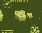
That was fun! The mechanics are solid, and the art and soundtrack contribute to the moody atmosphere. The asteroid proximity indicators were very helpful.
My only note on the gameplay is that, although the camera was highly proficient in terms of showing the most relevant area, it did have a lot of fairly distracting shake to it.
Good job on including volume options! That being said, the default volume (maximum) is a tad loud; the audio regularly peaked above 0.0 dB. Consider setting the default Master Volume three or four notches lower. Also, the "menu back" and "enemy destroyed" sounds are a bit louder than the other sounds.
Great work!
Thanks for your great Feedback. I had a smoother Camera Implemented but that gave me some issues in the browser version of the game so I had to compromise. I will take a look at the volume levels :)
Excellent music and sound effects. Good choice of colors, and nicely-drawn graphics.
The intro story makes me think "Ah, this is Star Wars, from the Empire's perspective." :)
The ship controls are remarkably sophisticated, feeling more like a simulator than an Asteroids-style shooter. Unfortunately I was too clumsy to really be able to get very far.
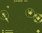
One issue, which is always a problem when depicting ranged combat from a top-down perspective, is that I often could not see my enemies even when they were quite near me. This is partially ameliorated by the little crosses in the HUD that tell you which way your enemies are, but I'd rather be able to see them. On the other hand, zooming out further at this resolution would not be an ideal solution, either. Many difficult choices.
Thanks for your feedback and great that you like the Music, Chaz did excellent work there. The fact that the controls feel simulation-like was my intention I tried to get a balance between Arcade action and Sim. How to handle the camera and how much you can see gave me quite a headache. :)
simple concept well executed, It was a bit laggy for me but that's probably because I'm playing on the laptop equivalent of the actual gameboy lmao, pretty enjoyable experience anyways :>
Thanks for the nice words :) I tried my best to optimize the game. Originally there were way more asteroids and the frames suffered haha
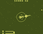
The lock-on mechanic allowed for some intense dogfights, cool!
Thanks for your Feedback :)
I like how you captured the space battle feeling right using original controls.
Also, the xbox controller works in-game, but not properly on menus.
Great that you like it ^^ and thanks for telling me about the controller issue in the UI
The music has that nice nostalgic feel to it! I like the lock on and shoot system! Nice job
(^ ^) Thank yewww.
I'm a big dummy and played for a while *before* reading the instructions, which were helpful. Maybe a little tutorial for dummies like me would be cool. :)
Really liked all the ship thrust animations and the wobbly shield graphics!
Also curious about how you did that opening scroll!
Thanks for your kind words ^^ The opening scroll is nothing special that's actually a 3D Scene where I just let the text fly by a camera that was placed at an angle.