Play game
Broken Reaction(Lost in dimensions)'s itch.io pageResults
| Criteria | Rank | Score* | Raw Score |
| Theme | #96 | 3.036 | 3.143 |
| Originality & Innovation | #120 | 2.691 | 2.786 |
| Graphics | #122 | 2.415 | 2.500 |
| Overall | #130 | 2.415 | 2.500 |
| Audio | #162 | 1.932 | 2.000 |
| Fun & Game Design | #169 | 2.001 | 2.071 |
Ranked from 14 ratings. Score is adjusted from raw score by the median number of ratings per game in the jam.
Leave a comment
Log in with itch.io to leave a comment.


Comments
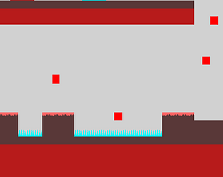
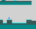
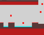
Really hard game IMO. I don't like how it's easy to switch worlds back and forth just by holding the "r" key. You need to make it so that it only changes worlds when the player presses it instead of tapping it very quickly. The power-ups also need some explanation on how they work; the icons alone don't help. I didn't realize I could use the double jump in level 2 until I tried it out for myself. I made it to level 4 and gave when I had to deal with turrets that fired homing projectiles at me.
Very slick version of the "switch platforms on and off" mechanic! Nicely done, thank you for sharing. It is challenging, but not too hard, a good level of difficulty!
And if you get a chance to check out my game Foxy Boom Boxy, I would love any feedback you have, thanks!
I love it is very fun and fit the theme
I would appreciate to see your feedback on my game
Challenging but fun game, a little confusing at first but not too bad, good job! - If you have time we'd love to see if you can beat our game! :)
I thought your game was good! But I found some things that I didn't like very much, I thought the animation of the character was very good! She brings an amazing feeling! But the problem is when pressing the R key, because in the event programming you didn't put it as activating only once. What causes a gameplay issue
I wanted to provide some feedback regarding your game. Overall, it's a nice and engaging experience, but there are a few areas that could use improvement. The main issue lies in the UI design, which currently feels quite lacking. The excessive amount of text used in the tutorial makes it difficult to comprehend the instructions clearly. Simplifying the tutorial text and using concise explanations would greatly enhance the player's understanding of the game mechanics.
While the characters' squash and stretch effects are visually appealing and add a dynamic element to the game, I suggest focusing on refining the main menu and overall UI design. A more polished and user-friendly interface will create a better first impression and enhance the overall player experience.
Controls and level design need improvement
Very good platformer base.
Interesting take on the theme, very well executed simplistic visuals.
Nice Game juice with the character movement.
Only gripe was the controls not being under trigger once so the game decided to switch dimensions several times per keypress.
But any ways, VERY well done, fix the minor bugs and it's a really solid game.
yeah, there was quite a lot of bugs in the game, especially in the last 4-5 levels since I made those in a day and I had about 5 days to make the whole game. For switching dimensions I should've done it so it activates when you release the button instead of when your pressing as it can be registered multiple times as you experienced. After the jam I might update the game but no guarantees. Thanks for the feedback, it'll help with games I make in the future
Good platformer, def challenging tho!, good use of the theme I'd say, unique and original take!
If you could checkout my game, I'd appreciate any feedback greatly!
difficulty is a big problem that I experienced but I didn't have much time to fix it so I added more checkpoints to try remedy the difficulty I'll try check your game tomorrow.
Oof, my ears. The jumping sound is like nails on a chalkboard, I'd 100% change that. It's an interesting idea, kinda tricky to jump and then hit 'R' to swap to the red world. I'd ease the player into the game a bit easier. Great start!
The difficulty of the game was a bit of a problem I even had when testing and especially testing on mobile was a pain.
I might try it tomorrow if I have time
I had fun. It's an OK execution of precision platforming. Flipping dimensions in middair is fun.
The control scheme is a bit strange, and the difficulty was a bit much at times. I'm not sure if keeping the other side hidden adds much; it turns a lot of playing into a memory game. Additionally, the "flippable hazards" looked very similar to solid ground, so it was a bit confusing.
Other than that, good work!
I should've made it that there were outlines of the blocks from the other dimension that you weren't in, so it'd be easier to platform and more fun instead of a memory game since I did feel that while testing but I didn't have much time to make things and only had about 5 full days to do it and I submitted the game a few minutes before the deadline. The controls I didn't give much thought to because I got use to it pretty quickly but I should've made it that you could also use was to move. I should've also added a bit more contrast between everything to make them stand out from each other more.
Hope you enjoy the game:)