Play game
The Other Side's itch.io pageResults
| Criteria | Rank | Score* | Raw Score |
| Geometricness | #29 | 3.834 | 4.200 |
| Theme | #29 | 3.378 | 3.700 |
| Graphics | #31 | 3.195 | 3.500 |
| Music | #37 | 2.830 | 3.100 |
| Overall | #39 | 3.089 | 3.383 |
| Creativity | #47 | 2.830 | 3.100 |
| Gameplay | #49 | 2.465 | 2.700 |
Ranked from 10 ratings. Score is adjusted from raw score by the median number of ratings per game in the jam.
Epicness
Yessir
Leave a comment
Log in with itch.io to leave a comment.


Comments
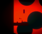
Game looks good with a really strong atmosphere due to the brilliant visuals and great music. But I couldn't find the 5 orbs ! I searched but after too much time on searching my character rotates a bit (I am probably stuck in the ground) and I can no longueur move or jump.
Also got an issue with the 2nd dialogues place : I must have triggered an event twice because it was adding the letter of the same text multiple times. ex: ththee cucriou....
So I must have miss the game...
Thanks for the feedback! I appreciate it.
I think one of the pickups might be a little tricky to find - I may have to change it a little.
I haven't encountered the dialogue bug before - I'll definitely have to look into it.
Cheers!
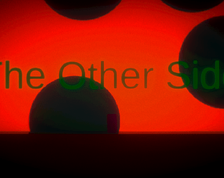
Its good, i dont know why but the resolution of the game is not correct in my game, music was amazing and i like it, the green text i guess it was not in english and it was extremy hard to read. But the graphic is amazing bro i liked it very much 10/10.
I request you to check my game also and give you honest opinion on that.
Bye
Game was great but the problem was that the music was so loud , btw can you rate my game if its okay with you?
This looks great and feels great. There were a few bugs but that's it. The music fitted the game well. Not much to comment on, but the green text was a little too hard to read. Well done.
Thanks very much!
Would you mind elaborating on what the bugs were? I'd like to be able to fix as many issues as I can.
One that I remember actually was that the player is able to rotate if you hit a platform in a specific direction. I guess the problem with that is that you didn't set the rigid body to freeze rotation.
Yep, that text was rough... But seriously, a cool game with nice visuals throughout. Definitely should be proud of what you accomplished in a week!!
Interesting game, with strong visuals. The music is way too loud though :o
very cool, i would only say that the text is a bit hard to read. Maybe try changing the color.
Yeah I'm getting a lot of comments about this, unfortunately due to the post-processing I used, that's actually the easiest color to use!
I'm still trying to find a solution for this, but short of changing the color scheme entirely I'm not sure yet how to fix it.
Thanks for the feedback!
Amazing visuals but text is difficult to read
i forgot, only thing that bother me is the green text, difficult to read.
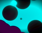
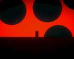
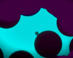
this game is crazy lol , very nice design on the levels and world . and the music goes very well with it. i am impress by the levels and switching sides is cool too.