Play Platformer
Always Day's itch.io pageResults
| Criteria | Rank | Score* | Raw Score |
| Overall | #18 | 3.667 | 3.667 |
| Innovation | #23 | 3.417 | 3.417 |
| Gameplay | #29 | 3.167 | 3.167 |
| Visuals | #30 | 3.583 | 3.583 |
| Use of Audio | #30 | 3.250 | 3.250 |
Ranked from 24 ratings. Score is adjusted from raw score by the median number of ratings per game in the jam.
Number in team
5
Leave a comment
Log in with itch.io to leave a comment.





Comments
Love it very much, think the whole concept is very interesting.
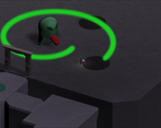
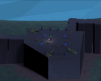
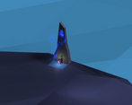
Confusing. Ambitious scope with three paths, which might've been too ambitious for a week long jam. The middle path was nice, but the projectiles aren't a threat once you remember you have the ability to jump over them. I gave up at the platforms of the lava level.
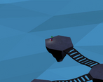
The visuals are neat, but my goodness the isometric perspective had me confused many times on the lava level. My patience for platforming ran out at the lava level's moving platforms. They are... Impossible to navigate. The middle boss was interesting, but once he did a full circly-attack it was incredibly easy to tell where the next attack was, so that I could just sit in safespot and take him down. I thought that I need to defeat him 3 times to kill him, but after 5th stun I realized I just need to take the lantern/gem. I really liked the animations, especially the boss stun, so kudos to whichever of you tackled these. I'm also a little confused with the choice of the game's name, since it's always nighttime in the game. Main takeaway from me - work on game-user communication to reduce confusion.
Thanks for the constructive feedback. Definitely our next jam will be smaller in scope and we'll give ourselves enough time to fine tune the user experience. I agree 100% that you have to communicate to the player what they're supposed to do and there's a lot of nuance to that which just never got addressed in our game.
I'm looking forward to where this might go, it has an old school feel which i miss in games!
Really fun and challenging, would have preferred a less challenging camera angle or maybe so options. Great artwork and a massive world to explore.
Nice concept and choice of theme. I like indie inspired games and this one seems to hit the spot.
I hope to see improvements to this game in the future regarding the already known bugs as they do tend to somewhat break immersion.
Congratulations for the game!! I liked the isometric perspective, but maybe with more lightning would be easier for the player to calculate the depth when jumping. Good job! ;)
I really like the concept! This game combines two elements I'm a huge fan of: isometric perspective and low-poly assets.
I did manage to break the game in a fashionable manner, too! I was fighting the blue slimy-looking boss when I got killed and I was being teleported back to what I believe was the check point (the blue circle). As soon as I reached the check point, I got sent flying across the map, past the boss, and finally off the map at the end of the world.
It was great! XD
I had a bit of a struggle gauging the distance between the moving platforms, although I noticed you could simply wait till one merged into the other and walk across it.
Yeah, it seems like the tornado doesn't stop having its effect after the player dies 👀
Going to add that to the list of bugs to fix..
Thanks for playing!
Hi! I'll be playing Always Day tomorrow on stream along with several others games from the jam at 3:30pm EST. I'll be talking about any interesting design decisions as I play, and suggesting improvements if any come to mind. Please feel free to join me live, it'll be extra fun to chat together about your game while playing it :)
Sure thing, I'll join your stream! Look forward to discussing the game in chat.
The bridges are easier to run over directly rather than jumping on them. The moving platforms need to be re-timed. The way they are set up right now, you might have to wait a long time before you can jump onto the next platform. We're fixing those issues and more. Thanks for playing.
I'm a huge fan of the Isometric look, and the visuals are very characterful. Combined with the music, this makes for a really nice atmosphere. I did have trouble perceiving depth in some places, maybe this could be fixed by giving the character a stronger shadow. Not a huge issue. Overall I really enjoyed this game, I thought the boss mechanics were really cool. Well done!
Nice concept, I liked the small guy art and the lore idea. I suggest you put a bit more effort in the aspects of the game more related to the user: like adding an option menu for lowering the volume, or simply an exit button. That gives the idea of a much more polished game and will never hurt you :)
Keep it up!
Thanks for the feedback, much appreciated!
While we may have over-scoped for this game jam, we could've possibly had a more polished submission if we committed to an idea earlier on in the week and prepared some basic templates in advance (like a proper main menu and in-game pause menu, for example). The bulk of the development occurred only in the last 3-4 days. I'm proud of how much we accomplished considering this was only the second game jam for most of us and our first attempt at a 3D game jam entry with custom art and animations.
Ultimately, we were adding key gameplay features within the last few hours before the deadline, had no opportunity for meaningful playtesting, and the UX/UI was completely neglected and relegated to a simple main menu start button and Alt-F4'ing to exit the game. Hindsight is 20/20 and lessons were learned.
We think this game is a good base to expand upon as a personal project for our portfolios and look forward to polishing it up quite a bit and adding more features. You can follow the progress of our post-jam work here: https://github.com/OmarAlFarajat/Always-Day/projects/1
Well, overscoping is often the main reason behind a personal project failure :) It’s always a good thing to note that you overscoped, so you can adjust accordingly in your next project!
Anyway, if you feel proud of what you’ve accomplished, that’s great! My feedback was meant to convey the message that there’s always room for improvement, and if you give any of your projects enough love it’s going to be a blast!
Interesting characters and concept, I struggled with the first enemy and platforming element. I like the atmospheric elements of music and lighting. Nice environment. Although, I struggled with the platforming element. The player character wouldn't land sometimes. All in all, well done in making this in one week!