Play game
Bearied Treasure's itch.io pageResults
| Criteria | Rank | Score* | Raw Score |
| Design | #598 | 2.479 | 2.479 |
Ranked from 96 ratings. Score is adjusted from raw score by the median number of ratings per game in the jam.
Leave a comment
Log in with itch.io to leave a comment.


Comments
Really enjoyable to play with really nice graphics and polish
Hey everyone! Thank you for all the comments so far. If it's of interest to anyone, we wrote a blog post talking about the game design and the mechanics. :) https://atemly-games.itch.io/bearied-treasure/devlog/47639/bearied-treasure-post...
Doing a metroidvania in 48 hours is ambitious; more so when you have to tweak the proven formula. You made a great attempt, but to me your choices don't really change the genre very much. I'm still fighting enemies and collecting progression items...
Loved the sprite work. I think I could have played for a lot longer if it was slowed down a little bit.
This would've been a 5 if only the movement wasn't so clunky. WHat I mean is that you move too fast, the shield doesn't properly throw but just sort of teleport in front of you, you can hold down the jump button and shield throw button. A little more explanation to what you can actually jump on would've also been handy. Plus I got stuck.
cute but its way too fast and the archers are infuriating
I don't know if this is intentionally super fast or it's just missing a tick rate or something, but it feels like you're totally out of control all the time.
Also not sure how throwing the shield isn't a weapon.
Wow, the little bear is just so adorable! I agree with the other reviewers that throwing the shield feels a bit too similar to actually using a weapon, and it feels a little bit hectic. Also there's some parts where I didn't realize that I would fall into a pit or run into a dead-end, simple graphical representations like spikes or walls could help making those parts a bit clearer.
Love the concept of a passive-mode only Castlevania game! A bit slower paced, focus on blocks, parries, dodge rolls, smoke bombs etc.. Could really be somethin'!
Too fast paced with too little control
good! a few things. cute graphics, of course. the music is also good. the variety in characters to show the options of the shielf is good.
the bear's jump is reeeeal sensitive/just goes really high. i would calm it down. less jump.
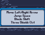
Also, a way to change controls would be nice. i think i would've done a little better if i didn't ahve to use the native controls.
the mechanic for the gmtk game jam was good. i like that you just use a shield. of course you can use the shield as a weapon by throwing, but it's a cute idea nonetheless. making those minor changes above, i think you've got a great game!
In general, I like the concept, but I think the execution is a little lacking. Removing power-ups and replacing them with keys is basically doing the opposite of what Metroidvanias do for games. Also, as has been mentioned before, the shield basically feels like a weapon.
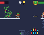
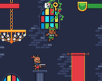
On the other hand, the controls feel decent and the graphics and sound are great. The game feels competently made. I did run into a handful of glitches (dying and restarting causes the music to play over itself a second time; fell off a platform in the chandelier room and it respawned me on top of some brick work where I was effectively stuck).
Solid effort, but a good example that just removing a thing for the sake of simplicity does not always improve an experience.
It's a perfectly adequate game. The movement felt a bit clunky, though and the health regen seemed unnecessary. Also, I would consider the thrown shield to be a weapon, especially since in the game it looks and feels more like a throwing spear.
Good art, needs some time spent on feel but it's cool! I like the idea if you run with it, add tons of ways to defend and it can be just as deep a game as any action game
The game is decent on its own. The art style is solid, the framework is solid, and it overall works as a flash game.
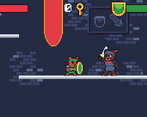
But the player character feels way too fast, the door visuals are unclear, the 'no power-ups' felt irrelevant due to health regen, and it didn't follow the own rules it set (no weapons). So I can't really give this one a pass.
I belive the player should be able to visually distinguish between doors that need keys and doors that don't.
I really enjoyed this game but did not survive long enough to enjoy more of it. archers are boss monsters filling rooms with unblock-able arrows from all directions!
Visually, audibly of a high standard and controls were good (but a bit twitchy). The only "complaint" I have is that if you replace the shield with a weapon graphic, it's just a standard platformer again. The only difference from this to another platformer is the attack animation is a shield and not a weapon.
To use the mechanic of "you dont have a weapon" I think you could (in future, as clearly you are time limited for this jam) have mechanics in the world which you interact with in each level to beat the enemies. For example dropping things on people. A bit like HITMAN but without the weapons/guns/close combat. I feel like there's a solid idea there, just maybe needs a bit more time to develop and some creativity around "not having a weapon".
The art is really good, like how angry the bear gets when he throws his shield
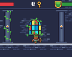
Super fast movement makes this platformer feel very twitchy. Not a ton of distinction between the foreground and background objects -- e.g. you can jump off the pillars that are colored the same as the background. Music and art were interesting, but just felt too twitchy to really be enjoyable.