Play game
Chromata: Color Warrior's itch.io pageResults
| Criteria | Rank | Score* | Raw Score |
| Design | #806 | 3.273 | 3.273 |
| Originality | #854 | 3.545 | 3.545 |
| Overall | #1046 | 3.313 | 3.313 |
| Adherence to the Theme | #1349 | 3.121 | 3.121 |
Ranked from 33 ratings. Score is adjusted from raw score by the median number of ratings per game in the jam.
Leave a comment
Log in with itch.io to leave a comment.


Comments
It's a very cool concept but you didn't do very much with it. This feels like the tutorial to a bigger game. Consider expanding on it when the jam is over! I found some slight problems as well: the character sticks to the wall when you jump into one, and when you jump very high/run very fast the camera struggles to keep up and you can't see what's ahead. Other than that, great game.
Thank you, and yeah, the game is super short, the 15 sec gif I have of it is basically half that game xD
Also, I definitely need to figure out this camera issue, I've been hearing it a couple of times already.
I really liked this game a lot! But as someone mentioned, the camera could be better, as it's getting hard to see, where you are running or jumping at.
Thanks for checking out my game, I should really look into the camera situation. I used Cinemachine so I was thinking the camera bounds would be all good, but I guess not.
I really liked the look and idea to this, it'd be interesting to see you expand on it more in the future! I enjoyed it overall but mostly had issues with the camera where I couldn't always see where I was going, especially for jumps. That entire segment about Going Fast over a large empty area could've probably been shorter, too, unless I was missing something about it. Good work!!
Thanks for the feedback! :) Didn't realize there was an issue with the camera, maybe I didn't see it because of my resolution. And yup, that "Going Fast" segment was pretty long lol. I'm just going to say it was to pay homage to the 2 min long ladder climb in MGS3
Nice idea! I really liked black and white pixel graphics
The paint gun movement sometimes feels a little weird. But overall good job!
Glad you liked it :D
Agreed on the gun movement. There were some wonky stuff happening with the gun shooting and I managed to fix those, but then the gun started moving pretty weirdly after that, and I tried to fix it but couldn't do it before the deadline unfortunately.
These mechanics remind me of the paint section in Portal 2.
Even though the theme is not really obvious at first, your game is not too bad.
Well done.
For sure, this game was def inspired by that mechanic in Portal 2 haha. Wish I had some more time to think of some more interesting uses of the mechanic though
Lovely little game mate! Plays great, could have used some audio design and maybe some combat but I really enjoyed it!
Thanks! The scope of the game was pretty big to begin with, and there was supposed to be combat hence the name "Color Warrior", but didn't even get close to implementing something like that in the time limit.
It's pretty good, I love the way game talks to me, also the art. I loved the background, and the futuristic weapon :D. But the camera is a little weird, sometimes I could not see the ground. Although, pretty good game. I hope that you want to try mine too!:D
https://itch.io/jam/gmtk-2019/rate/462865
Hey, is there any way you can export your game to HTML5 to be able to play in the browser? I'm usually really hesitant with running exe files on my comp unless I know the person at least a little bit.
Yeah, sure. But I need a little time, also the exe you download is an easy installer, completely clean!
I don't think that I can upload a new file while the rating contunies, sorry.
Maybe you can upload it as another game, on its own, and I'll leave the rating on your game jam game. No pressure or anything if it's too much of a hassle, I just try and not insta-download and run exe files I find in the internet wild :p
A few people playde my game and they had no problems, if this makes you feel more comfortable, but I am sorry, I think I can't load it again :/
I liked the idea and the implementation, but I wish there was bit more to it. The player's dialogue was pretty amusing and I did manage to find the ending. If you were to extend on it post-jam, I would love to play it again.
Thanks, glad you found some entertainment value in there :)
I agree that the game is super short, even with that long straight-a-way. Not sure if I'm going to continue with future levels though. Maybe if I randomly think of a new mechanic to implement for a different color, or a level design idea I'll jot it down and implement it later.
Hehe, I found the exit!
Nice concept, too bad the game was so short, I'd love to see those concepts in maybe some puzzle levels. But level design in a jam is hard to create. :) Will you add more in the future?
If it doesn't take much time, consider adding more Controls possibilities, like being able to move with WASD (or ZQSD for frenchies) and jump with Space.
True, the game can probably be speed runned in 30 seconds but I'm not sure how much I'm willing to commit to this game. I'm actually working on a much larger side project and feel like having a side project to my side project, I'd be overwhelmed. But I think there's some potential here for a game, but I'm just going to keep it in the back burner for now.
Also, I didn't know about the ZQSD move scheme, thanks for letting me know! I'll try and remember to implement it for future game jams. :D
Yeah, I know about that, I also have (too) many other side projects, but I always like to work about a week on jam projects to polish them a bit and then be done with it. :)
Good luck on yours!
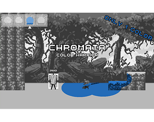
It's like a 2D version of Portal 2 (or Tag: The Power of Paint). Pretty cool, though, since these mechanics seem like they would take a while to code. I feel like the one color limit though didn't matter too much, since it seems like you really only ever had to use one at a time to solve each puzzle.
Can you jump up the wall to the left? I spent my first two minutes trying to do that (without even going right). It might have been cool if there was a secret over there and you used to green to get over there once you figured out what it does.
Obviously you're time limited so you didn't have enough time to make puzzles that combine the elements, but I would have liked to have some puzzles with the green color since that was an interesting idea and its only function it appeared to serve seemed to be the a-ha moment when you found out what it finally does.
Yeah this game was inspired by the paint blob section in Portal 2 haha. You're right though, the colors didn't really matter since there wasn't much interaction between them. I was actually planning on adding some puzzles that combined the speed and jump together, to be able to reach really far distances but didnt have enough time to think of a good idea to combine the 2 together and implement it.
The wall on the left can't be jumped, I made it high enough so the jump ability won't be able to make you go over the wall. But there's probably a way to do it if you combine the speed and jump together some how.
With the green color, it was supposed to actually be used as a sticky color that froze your position immediately. I had no idea how to use that mechanic at all so I opted for what it's used for now. The "None" color was also supposed to be used for combat, but that was when I was over scoping the project like crazy lol
I couldn't get it to work :(
Dam, sucks to hear. What browser are you using btw? I've only tested it with Chrome and it works for me.
I'm using Chrome. My computer is old and weird, so I'm guessing it probs works fine for others. Despite that, it looks super cool!
Interesting concept. At first I didn't realize how it related to theme since there we're multiple colors and everything but then it made more sense once i realized when you change the type of color that you shoot, all of your color splotches change to match that color. Good job!
Thanks :D
Did you get to the end screen by any chance? I feel like it might be too hidden
I did, I'm not sure if is TOO hidden but making it more obvious probably wouldn't hurt haha
I make the speech bubble, "So this is the end of my journey...?", repeatable to try and give a hint. But that's about it lol