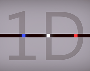
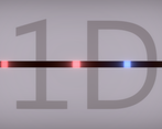
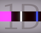
at first I didn't get the game, I keep saying that for all these jam games haha. but once you get it, it's actually fun. I expanded the size to make things easier. I made it to the finish woohoo
Play game
1D's itch.io pageResults
| Criteria | Rank | Score* | Raw Score |
| Adherence to the Theme | #46 | 4.644 | 4.644 |
| Overall | #371 | 3.932 | 3.932 |
| Originality | #594 | 3.797 | 3.797 |
| Design | #742 | 3.356 | 3.356 |
Ranked from 59 ratings. Score is adjusted from raw score by the median number of ratings per game in the jam.
Comments
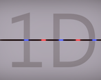
Strong Undertale vibes from that level with the alternating red and blue lasers.
Didn't immediately "get" that it was a mouse game as well as a keyboard game. Might want to signpost that a little.
And when I respawned the first time, I had no idea I had respawned.
So I put all the controls in the description.
It's really interesting that people that played the game before I added that note about controls for dimension's size, did not complain. But all the players after I put it did.
So if I should remember one thing: either I put ALL the controls, or NONE. Because as soon as you put some of it, players will think that there is nothing more. And of course it makes sense that they (and I would too) think that way. Thanks for the feedback !
As many people have already said - Editing the description would help a lot! I went back to the rating page to figure out mouse did something. But I tried resizing and lots of different things.
After I figured out how to change the colors it was go time. I felt like a white ninja square moving quickly between blue and red. I liked being able to resize for my perfect visual sweet spot. This game needs a lot of focus, so it was nice to make it my personal size.
Good work!
Not bad, I had the same problem with the controls not being explained, but over it was pretty good!
Clever twist on the theme, as said previously the controls would need to be explained a bit better.
Great!
Really cool idea! Gives me some nice rhythm game vibes as I'm a big fan of those types of games. This could easily work as an auto-runner too!
Very cool, took me awhile to figure out I had to use the mouse, I would include that in the description. I did enjoy it though!
Definitely a funny take on the theme! Reminds me of the blue fights in Undertale if it were mixed with the On/Off switch from Mario Maker in 1D. I also like the option to resize the dimension for visual clarity. Neat game!
This game is pretty small and simple, but it's quite fun nevertheless. I like how you made the controls simple enough to intuit, even just from messing around for only a few seconds.
Nice little game, i liked the idea. I didn't uderstand the use of the resizing, but it looks really cool, liked the feedback too!
The final level was really rage inducing. I finished it though.
I feel like the exanding screen might have wasted oppertunity, its kinda odd that its there with real purpose. With some brainstorming you could've maybe come up with an interesting addition using that. Maybe that it closes whilst you stand still?
On the other hand. In the current state it was really interesting, and there were no buggs visible to me. Good job!
Thank you.
I though about making it a one button game. But I already done one and this time I wanted the player to have real control.
In one button games generally you loose measure, dexterity, coordination and precision skills. It would basically leave only perception, timing, risk taking and reflexes for my game. That's a bit underwhelming I think.
Clean and solid entry, and also very challenging at later levels, a bit to challenging for me ;D But nevertheless, well done!
Very clean. I also did a 1D puzzle game, but you did a good job at keeping it dead simple. Well done.


Leave a comment
Log in with itch.io to leave a comment.