Play game
Wing It!'s itch.io pageResults
| Criteria | Rank | Score* | Raw Score |
| Originality | #226 | 4.042 | 4.042 |
| Presentation | #329 | 4.070 | 4.070 |
| Overall | #355 | 3.746 | 3.746 |
| Fun | #649 | 3.451 | 3.451 |
Ranked from 71 ratings. Score is adjusted from raw score by the median number of ratings per game in the jam.
How does your game fit the theme?
In the game, you control a plane that's about to crash, but the plane's controls are unknown until reading the manual. The scramble to learn how to pilot the plane before it crashes makes the player feel in an out of control situation.
Did your team create the art for this game during the 48 hour time slot?
Yes
We created all art during the game jam
Did your team create the audio for this game during the 48 hour time slot?
Yes
We created all audio during the game jam
Leave a comment
Log in with itch.io to leave a comment.


Comments
I liked the graphics, but it was super difficult to tell where I was pointed. It would have been nice to get some more dials to show which direction I was pointed. I found it super difficult and out of control when trying to turn!
Pane simulator - crash edition.
Very nice game and art. Also the music was great!
This is an interesting concept, and I loved the art, music and sound effects! This felt really cohesive as a game, all the pieces fit together very nicely, there's some great teamwork behind the scenes!
In terms of design; it seems that by continuously pressing R one's able to read the manual at their leisure, though figuring out that putting the thrusters and pulling the left control a bit buys you more time to read the manual was a nice piece of puzzle solving. The manual is hilarious! I love the little drawings on it.
I liked how the controls work, it feels frenetic trying to get the plane to behave; if there's anything that felt a bit unfair, it was the speed apparently decreasing no matter what (eg couldn't be increased by going down then up). Everything else felt like going out of control as a consequence of what the player did, which was great!
What's most impressive is how there is a strong common vision going from design to art, UI to music, controls to writing; Great teamwork!
probably should make it such that you learn on the way rather than reading a manual
While the figuring out the controls and how the game works felt a bit frustrating, it was incredibly fun to actually fly the plane and see how far you could take it.
Such cool idea! I love it!
I loved the aesthetic of the game. The controls were suitably chaotic and difficult to manage, but it always felt fair. The fact that you can only read the manual while flying also adds to the difficulty. An overall great job.
I like the idea, but echo the others. Maybe if you want to keep the "only read the manual while flying" thing, have everything slow down while in the manual? Definitely was a lot of fun trying not to crash. Definitely love the art :D
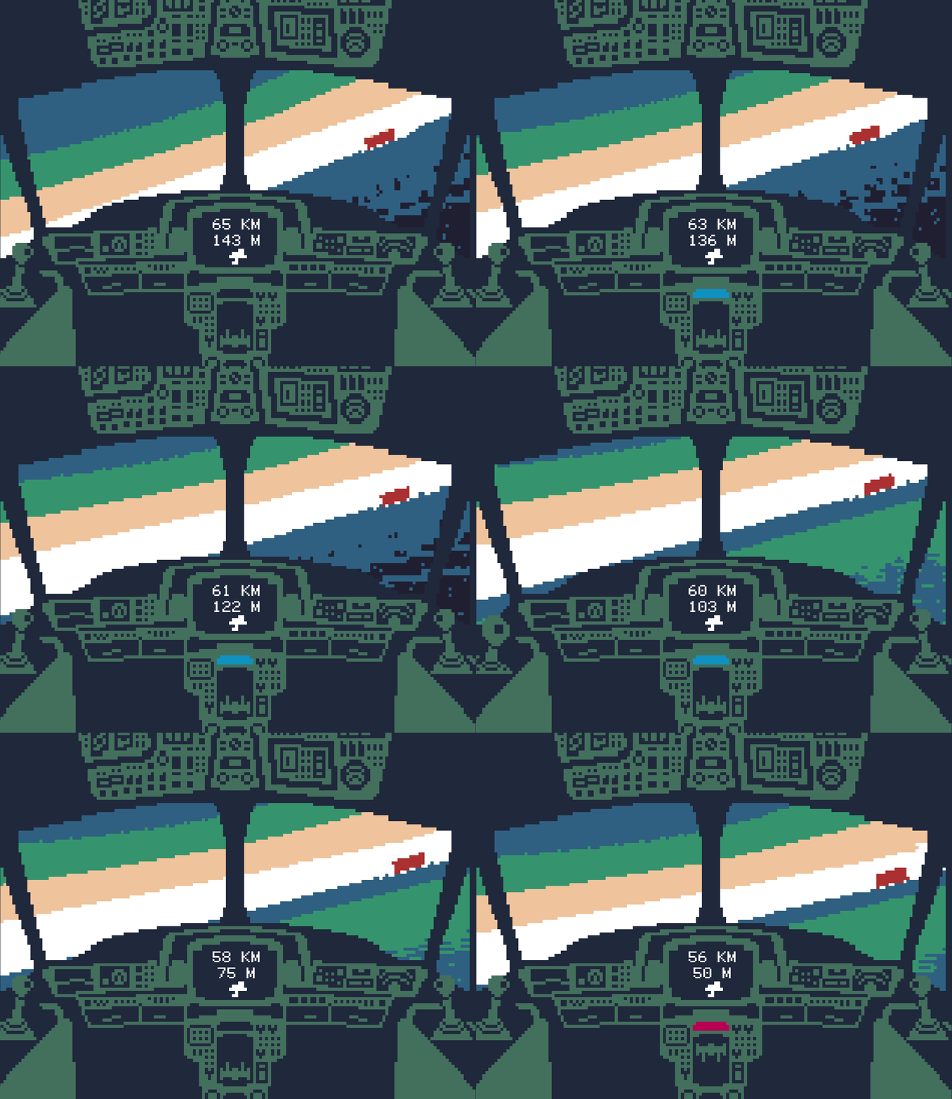
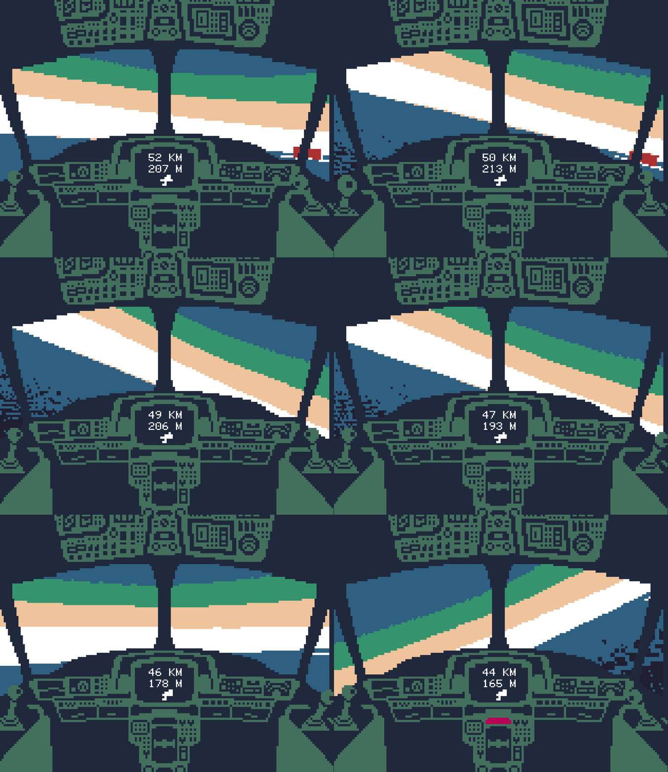
I looooove the art style. Props to however drew all the little details in the cockpit. I also appreciate how you're not afraid to make the game brutally hard. It felt like piloting a real airplane for the first time.
We also made a pixelated game about controlling a vehicle (sorta). Check it out if you get the chance. ;)
I imagine the "you can only read the manual while piloting" thing was also part of how out of control you're supposed to feel? x) If so: clever! The old school art style is really cool, I had fun!
It would have been nice to maybe have an instruction/tutorial just because I had to go to your game page to figure out how to play the game. I mean I could also just be unobservant, but I feel like if the game is a download and not a web browser, its easier to figure out controls in game as opposed to on the game page. It was a challenging and fun game after figuring out what to do though!
I get what you're going for for out of control but I would have liked some more help as to what was click-able or a little more time to read the manual. I just kept crashing and didn't feel like I could make any progress in learning how to play.
very cool and challenging concept! i did notice a bug where i could spam 'R' while in the manual, allowing me to read as long as i liked to understand the controls, but it was overall very clean and pleasant (although chaotic) game to play! ive noticed a few comments regarding blurriness, and as a suggestion i thought i would mention Unity's pixel perfect 2D camera, which ive used on some projects to keep pixel art looking crisp. anyway, great job!
Very true to the title. :) Love the aesthetics and the humor. Nice work!
Nice job! The graphics were really unique and I enjoyed flying the plane. Well done! :D
That really did feel out of control! But was really rewarding starting to piece it all together and gave a unique experience I've not felt on another game this jam
Extremely difficult, but that's not a bad thing, it took me quite a while to get myself out of just tumbling ass over tea kettle, but it was very rewarding when I did. The manual as a seperate PDF for a full release a la Shenzhen IO or Keep Talking and Nobody Explodes. Good concept, well done!
I really like this in principle (and rated it accordingly) but I found it completely unplayable. I couldn't work out what effect my actions were having or even which things onscreen were even interactive. I couldn't read the manual because there was too much information per page and the game didn't pause while you're reading it (I understand this choice in theory, but since I couldn't even work out how to make the plane tilt up, I had about 3 seconds at a time to read the thing before the plane crashed and the game reset). Also, the fullscreen scaling tried to interpolate between pixels which meant the whole thing was blurry and made it even harder to read or look at for extended periods of time.
I'd love to play a slightly more forgiving version of this because I love this sort of game and I adore the art style, but for right now I couldn't get into it at all.
I really appreciate how much feedback you've given us! Things like the manual having filler text and lacking a pause button were, as you mentioned, in by design, but it's understandable how these can be overwhelming to some players. In the future we might look into making the controls stand out more as it's also been something many players mentioned. The fullscreen scaling issue is because Unity automatically applies antialiasing on fullscreen if the window resolution is too low (Wing It runs at a windowed res of 1280x720), so that is also something we might look into fixing in the future.
Again, thank you lots for the feedback, and I'm glad you still enjoyed what the rest the game has to offer!