Play game
Alchemical Intern's itch.io pageResults
| Criteria | Rank | Score* | Raw Score |
| Presentation | #1524 | 3.257 | 3.257 |
| Fun | #1766 | 2.943 | 2.943 |
| Overall | #1922 | 3.048 | 3.048 |
| Originality | #2512 | 2.943 | 2.943 |
Ranked from 35 ratings. Score is adjusted from raw score by the median number of ratings per game in the jam.
How does your game fit the theme?
The game is about joining potion ingredients together.
Did your team create the vast majority of the art during the 48 hours?
Yes
We created the vast majority of the art during the game jam
Did your team create the vast majority of the music during the 48 hours?
Yes
We created the vast majority of the music during the game jam
Leave a comment
Log in with itch.io to leave a comment.


Comments
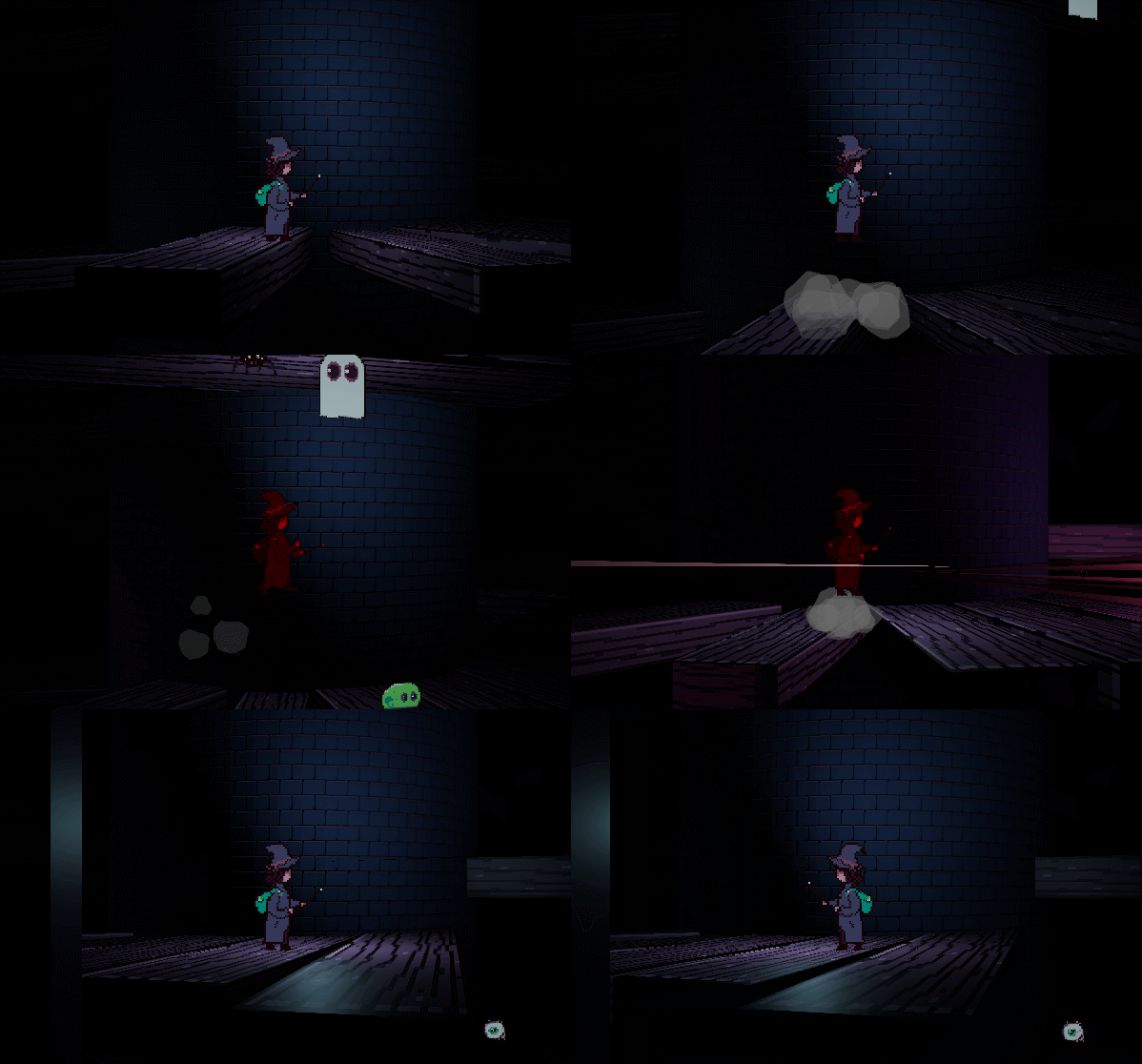
Original graphics design and cool athmosphere! But game is very dark, and some of the jumps are blind, that frustrates a bit)
Really cool concept, art, and atmosphere! Found a few blindspots occasionally but it didn't impact the game too much.
Hey! I loved this so much! The music and 2.5d graphics are stunning! Truly my favourite one in terms of atmosphere. Also liked really much that potions expanded mechanics. It's a shame that, in my opinion, the take on the theme is not the best, I think it barely fits. Good work tho! My favourite one so far :)
Hey! I loved this so much! The music and 2.5d graphics are stunning! Truly my favourite one in terms of atmosphere. Also liked really much that positions expanded mechanics. It's a shame that, in my opinion, the take on the theme is not the best, I think it barely fits. Good work tho! My favourite one so far :)
The sound is great but collecting potion ingredients doesn't fit the theme that well. But all in all it's a fun game with cool ambiance.
LOVE the vibe and the atmosphere!
A fun game to play, cool atmosphere and I really love the art. It's just my of opinion that the camera is a bit jumpy when the player jump. really very interesting. ~Please check mine, when you get time :D
This was a really neat little platforming game, I love the idea of being an intern for a demanding alchemist ha. A couple little landmarks on platforms would have been great for marking certain paths when I found an ingredient, but honestly great job in such a short amount of time.
I like the art, but going around the tower got a bit dizzying to me
I don't really agree on the theme fitting, but the art is very interesting. The game physic is a bit hard to understand, it is easy to fall and you do fall very quickly. But it's a well made game, I like the idea of unlocking powerups to go further
Didn't quite fit the theme, but I like the world building and rogue-like tower mechanic
It can be a little hard to know where to go, since your viewpoint is pretty small relative to how high you can jump. This is the first game I've seen on this jam to use a 3D environment and 2D sprites - which is fairly interesting. It's a fairly good way to go about adding upgrades/game mechanics - chaining it to progression through the game. Decent music and effects.
Ambience and presentation was great! Great job!
The theming was easily my favorite part! The music (seriously, what a great loop for this), darkness, monsters, old wooden planks, etc all add to the mood emphasizing the "dark" in "dark arts". Also, obtaining powers as you progress is a great way to create a feeling of accomplishment throughout the game.
As for feedback, I didn't notice a health bar when I went through it, so it wasn't clear to me if getting damage actually had consequence. Also, I found that even though I could attack, I never felt I needed to, and instead just tried to evade enemies.
Awesome entry!
A fun game to play, cool atmosphere and I really love the art. It's just my of opinion that the camera is a bit jumpy when the player jump.
It's a really interesting game! I'd admit that the game was a bit too dark to correctly know where to go, but I love how it reminds me of the metroidvania genre.
One little thing that could be good to add is an health bar, to know wether getting it will kill us or not.
Either way, good job!
Thank you so much! The heart in the lower right corner of the screen is the health bar (Just not a very good one haha) it darkens and fades as you lose life.
Very nice work with the presentation on this one! Everything looked great! This is just my personal taste and opinion, but it was a little jarring having the 2D pixel art style character model in the higher resolution 3D space, but that's just me being nitpicky. The best part was the gameplay loop, with powerups being unlocked as more ingredients were being delivered, with some more depth and polish, I could see the basic idea of this turning into a really cool vertical metroid-vania!
Nice game! I really like how moody it is, the combination of music and art works really well. Unique graphics too, and very well made sprite art. I sometimes found it a little hard to tell where I was and where I had to go to find the next ingredient, but that was quite minor. Overall a fun experience. :)
Nice little game with beatiful mood! Luckily there is no fall damage, hah!
Wonderful job! I like the sensations portrayed by this game, the gloomy colors in conjunction with the scenery, the shooting and jumping sounds that reverberate and complement the music...
One thing I'd suggest is that despite the player having lights, sometimes I find hard to climb the platforms because it seems way too dark. There are some platforms that when I fall beneath them, I remain trapped to that direction and have to go around to the opposite direction which can be sometimes frustating.
Other than that, good work!