Play game
ControllerBound's itch.io pageResults
| Criteria | Rank | Score* | Raw Score |
| Presentation | #816 | 3.690 | 3.690 |
| Overall | #841 | 3.517 | 3.517 |
| Fun | #938 | 3.345 | 3.345 |
| Originality | #1131 | 3.517 | 3.517 |
Ranked from 29 ratings. Score is adjusted from raw score by the median number of ratings per game in the jam.
How does your game fit the theme?
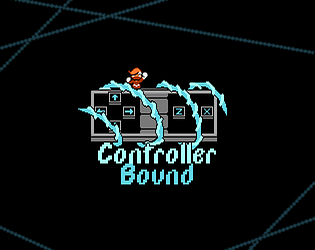
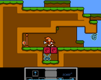
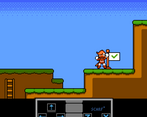
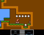
Every level, different buttons have their effects joined together with each other. These can be manipulated in later levels.
Did your team create the vast majority of the art during the 48 hours?
Yes
We created the vast majority of the art during the game jam
Did your team create the vast majority of the music during the 48 hours?
No
We used pre-existing audio
Leave a comment
Log in with itch.io to leave a comment.


Comments
This concept of this game is so brilliant! This is really a unique and clever interpretation of the theme. All the levels are well made and the difficulty curve is just right. Well done! The graphics and the SFX are also pretty good. I really like this game. Nice job for a 48h work! Had a lot of fun!
Cool game, really cohesive art style and feel to the level design--pretty challenging platforming towards the end, hehe:)--and environment. Great interpretation of the theme too.
I really like the idea and the level design, I think the difficulty curve was just right for the first few levels (I was stuck on one of the final levels, which I found to be a large jump in difficulty from the rest). The graphics were good and clear, and I found the graphic at the bottom to be sufficient in helping me understand which buttons were joined. I enjoyed playing overall, well done!
Really nicely designed levels.
Nice idea, and well executed! You found a lot of different variations on the main idea. I think the last few levels were a bit too hard for a jam game - the final level required very precise platforming while the two levels before that required a lot of coordination and timing. The controls and graphics were good though.
Thanks for the review! Yeah, a fair bit of the levels are too brutal, I think, especially the final one. I ran out of time to do levels and had no chance to properly balance them, but I'll see about making them easier if I ever do a post-jam update.
Well made game! I appreciate the idea, nicely done and challenges are great, sometimes miss leading but that's ok :D
Love the concept~ (and the graphics, great spritework!)
Got stuck on a level but that's entirely on me (I'm too used to certain button layouts); honestly the game plays really well and I had a lot of fun working out how to clear the stage under the latest restrictions. Great work!
neat mechanic, great assets. Although it's difficult to pull off some of the jumps together with unlearning muscle memory. Second the comment that the controller key legend could have been more clear
Great art and fun mechanic. Key bindings felt a little awkward but I think that's a me problem. Some one else mentioned it but showing which direction the binding effect is going in would be handy.
Really cool game. Excellent pixel art!
I think showing a bit more clearly which buttons are connected and in which "direction". Otherwise a really well-designed and well-made game.
Thanks for the review! The connection graphic was really hard to balance between blocking the button and showing the connection. I thought it was fine, but I guess not.
Nah, it isn't that bad. I'm just nitpicking at this point. Just wanted to point out something that I think could be improved on :).
I think it would be better if the (Z) and (X) button were a little lower, like between the right and down arrow buttons vertically, which could make lines drawn more clear.
You know, now that I mention it, I should've made the Z and X buttons more diagonal. Something to keep in mind if I do a post-jam update, I guess.