Play game
Dodge-A-Mole's itch.io pageResults
| Criteria | Rank | Score* | Raw Score |
| Enjoyment | #1757 | 3.156 | 3.156 |
| Overall | #1916 | 3.281 | 3.281 |
| Presentation | #2086 | 3.313 | 3.313 |
| Creativity | #2103 | 3.375 | 3.375 |
Ranked from 32 ratings. Score is adjusted from raw score by the median number of ratings per game in the jam.
How does your game fit the theme?
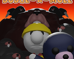
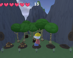
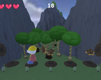
Instead of hitting the moles in Whack-A-Mole they try to hit you in Dodge-A-Mole
Did your team create the vast majority of the art during the 48 hours?
Yes
We created the vast majority of the art during the game jam
Did your team create the vast majority of the music during the 48 hours?
Yes
We created the vast majority of the music during the game jam
Leave a comment
Log in with itch.io to leave a comment.




Comments
Use of theme is great, and use of different types of moles was a great addition - so there's some strategizing there. I had fun!
Great menu system and UI. The game nails the theme, and the gameplay loop is a simple, but thoughtful design. Great job all around, it feels so complete, and that's truly impressive for 48 hours!
Thank you very much for the feedback and playing.
We had a great UI-Artist!
Very cool to see another Whack-a-mole inspired game! I love your take that the moles are getting their revenge hahaha, you took the theme one level further than myself.
I love the modelling and the music, it's very nicely done! Dodging that red mole is super difficult 💀
Would love to see this updated further and see where you can take it with more time!
Very well done :))
Nice! Thanks for your feedback! We're planning to fix/add a few things after the voting period. Glad you enjoyed it!
Thanks a lot!
I'm not very good at this but it was fun. Good concept!
Thanks for playing. Glad you enjoyed it!
Got 107 score. I like a good arcade-style game, and the different types of mole added some intrigue because you weren't dodging all of them, some of them you wanted to get hit by, which is a role reversal in and of itself.
The only thing I wasn't clear on was the dash mechanic, it didn't always work it seems.
Hey, thanks fore playing. I'm not sure if I've gotten over 107 in score, so good job.
The dodging has a cool down, which we sadly haven't been able to add a visual for to make it clear for the player, so yeah that's why it didn't always work.
Glad you enjoyed it!
I liked the design of the characters and enjoyed the music. I thought this was an interesting idea for the jam.
Thanks! Glad you liked the game!
A interesting concept for sure! It took me a while to get an idea of what was going on, but I managed to figure it out. I do think some sound for the warning lights would make it easier to know when to doge and gives you a heads up on what to look out for. Simple buzzers should do the trick. After playing this though, I did start thinking of the other way you could do the idea, but realized that it was a bad idea.
Nice to hear that! Thanks for the feedback!
We're glad you liked the game. We do have some ideas to improve the game later after the voting period and adding warning sounds(sfx in general) is definitely on the top of our list.
i was not great at this. but fun idea.
The baby mole is a nice way to bring variety to an arcade-like game like this one, but I'd like more. Giving the player the option to temporarily seal a hole when they catch the baby mole could be it, maybe? Something like that. On the whole, a fun little game - I particularly liked the UI art.
Thanks! Glad you liked the game. We know there's a lot of things we should add/polish, so thanks for giving us an idea!
Nice game! Liked the idea. I think it might deserve a bit of polish/balancing (moles from the side are really fast for instance). Still nicely done!
Hey! Yes it definitely needs some polish i.e. sfx and visual feedback. Also it is a pretty hard game, which hasn't been balanced that well.
Glad you enjoyed it!
Man this game is so polished for a gamejam. Very cool take on the theme and the gameplay is fun and addictive. I got something like 160. It was also quite challenging as well especially when the side moles started showing up. One thing this game would favor from is some player feedback because at the moment the only thing that indicates got hit is the hearts but a sound or camera shake would add so much more juice to the game. Aside from that the game is pretty cool good job.
Thanks for the feedback! We would've liked to add a few things more, like the screen shake, but we didn't have enough time to add them. Even though, we're very proud of how it turned out. Glad you liked the game!
Good game overall. Graphics and music fit nicely. Also liked that the game included audio settings. Good job.
Thanks for playing our game! We had awesome artists.
Nice concept !
Thank you!
liked playing it! So congrat's! I like that style for the game, i don't really understand why in 3D but it look cool!
Thanks for the feedback! Yeah, We probably should've maked it in 2d, but anyways we did our best to make it look good. Glad you liked it!
Nice game! First off, the gameplay was very enjoyable, the game is really not easy at all lmao. The side moles are way harder to react and respond to than the bottom ones. The reds coming right after another mole, especially from the side, were really hard to react to since I was never looking at the sides after another mole had just shown up, but that might honestly be a good thing.
Thanks for the feedback, glad you liked the game!
Nice approach, had fun playing it
Thanks! Glad you liked the game.
Good idea, I enjoyed a really fun time!
Thanks! Glad you liked the game.
Thanks for the feedback, appreciate it!
Simple Yet Fun! a bit buggy at some points though.
Thanks a lot! The game was a lot buggier, but we managed to fix most of the bugs. Anyways, glad you liked the game.
Thanks for the play. We know some systems don't work without small bugs :)
Was cool, I played several rounds. I liked the art in the menus, was wondering why you went for 3D for the game itself. I wish there was a visual for the dash's cooldown.
Thanks for playing and for the feedback! We had a team with 3D artists and had a UI designer join afterwards. We should‘ve probably just made a 2D game