Play game
PartyPicker's itch.io pageResults
| Criteria | Rank | Score* | Raw Score |
| Creativity | #4057 | 2.813 | 2.813 |
| Overall | #5768 | 2.125 | 2.125 |
| Enjoyment | #6337 | 1.750 | 1.750 |
| Style | #6432 | 1.813 | 1.813 |
Ranked from 16 ratings. Score is adjusted from raw score by the median number of ratings per game in the jam.
How does your game fit the theme?
Your party is build to scale as you progress.
Development Time
48 hours
(Optional) Please credit all assets you've used
All assets were created by team members.
Leave a comment
Log in with itch.io to leave a comment.


Comments
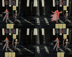
Ohh really interesting game, although a bit difficult to manage. I’d recommend grouping some elements together to keep the focus of the screen on 1 point. For example, put the timer in the middle, and the cards vertically in the middle, that way the player has one line on where to look.
Great job for the 2 day jam!
Thank you for your feedback.
I agree that the bar on the right is a bit tricky as it splits your attention too much. Long term I am not sure if we are going to keep the timer anyway, but if we do, it could be a lot better in the middle or attached to the cursor as a ring indicator.
With the arrangement of cards, it's a bit trickier finding a placement that works for both the vertical and horizontal aspect ratios due to the tiling of the scenes. I will experiment though and see if I can find a better solution.
Thanks!
Cool idea, and I liked that the difficulty scales up because you have to manage everyone at the same time. The differentiation was maybe a bit low between the different classes -- I basically used them all in the same way, and mostly just clicked randomly for what to use on them.
Tooltips would also have been helpful; or at least having the different classes have fewer stats on them (e.g. the bard not having magic abilities and therefore no mana or whatever?), so that you have fewer things to figure out at once?
Thanks so much for your feedback!
I agree the differentiation wasn't there for this release. In the future, we would like to add more cards that differentiate the classes more. We are also adding "class abilities" which activate when they play specific cards.
I would love to add tooltips in the future to help make things more understandable.
Would like to see it grow in to proper game some day :)
Ha, ha. Love to hear it. Keep your eyes peeled for a new release after the jam rating period ends!
Though it's hard to understand what's going on, i really enjoyed it.
Maybe bigger icons and animations could make the game more clear. Also I would put restriction so on new party member selection they would always have different classes. (I had to choose between Cleric and Cleric, having a party of 1 Cleric :D)
Thanks for your feedback.
Regarding the UI, I have added a legend to the Itch page to hopefully mitigate some of the issues you were facing. Ideally, this would have been in the game with Toolips, but unfortunately, we ran out of time to implement it.
Animations were also something we had considered, and are planning to add in the future, to increase visual clarity and help associate the cards with the effects better.
Regarding class member restrictions, I do agree that having all the party the same class is frustrating. In the future, there may be more cards to incentivise certain combinations of specific classes. Also, adding weights to the random options may be beneficial, to increase party variety, and minimise the recurrence of the same characters.
Thanks for your detailed feedback.
No frustration at all! As a fellow developer, i understand completely :D
Really love the idea with weights! <3
I think the time limit does not add really much to the overall gameplay experience. In turn based combat systems, i tend to take my time and think about my next move, especially when having multiple party members. I also think the UI is a bit confusing, where i don't know the meaning of any of the icons. At the end i just spam all my abilities in hope to kill the enemy. Despite that i like the idea to add extra party members to your party. Good job though, keep up!
Thanks for your feedback.
The timing element is definitely divisive. I think if there were more complex cards and more synergy between them, that might be enough to change to a timeless system. Furthermore, the addition of class features, which can affect other characters, would also necessitate more strategy and longer times. I will keep your comment in mind when I release the next version of the game.
Regarding the UI, I have added a legend to the Itch page to hopefully mitigate some of the issues you were facing. Ideally, this would have been in the game with Toolips, but unfortunately, we ran out of time to implement it.
Finally, regarding spamming cards, this wasn't really what I had originally envisioned either, so I am looking to make the game require more thought and strategy in the future (thought, as aforementioned, the timer may have to be changed/removed at that time.
Thanks again for your detailed feedback.
there is a really cool design / concept in here, keep polishing and this will be fun!
Thanks for your comment! We have many ideas for improving the game in the feature, including more cards/classes and enemy types for more varied runs, better balance, bug fixes, and class abilities.
The game lets you control multiple characters at the same time under strict harsh time limit. See if you can beat the boss.