Play game
Zoom-it (Flood-it) GMTK 2024 48h submission's itch.io pageResults
| Criteria | Rank | Score* | Raw Score |
| Enjoyment | #1856 | 3.219 | 3.219 |
| Overall | #2955 | 3.042 | 3.042 |
| Creativity | #3350 | 3.031 | 3.031 |
| Style | #3563 | 2.875 | 2.875 |
Ranked from 32 ratings. Score is adjusted from raw score by the median number of ratings per game in the jam.
How does your game fit the theme?
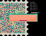
It is educational journey in to world of Scale showing how fast scale changes when multiplication factor is 30, and how few steps there are from 1 mm to Solar System
Development Time
48 hours
(Optional) Please credit all assets you've used
The only 3rd party assets are soundtracks, they are coming from various Humble Bundle GameDev bundles
Leave a comment
Log in with itch.io to leave a comment.



Comments
I had fun with this game even though i was not familiar at all with the main inspiration ! My only complaint is that the colors were not very readable in some levels (like the city and the one just after), while the planet level was the easiest one in this regard !
Every level ended with a little stress since the opponent bot was very close, it was super nice. Congrats for the game !
At some point we got tired making assets so quality went down somehow and we did not had time/energy to make/test variations of design (as we did with first levels we made) and had to stick with first design we make. (assets were made out of order, in case you wondering how last level end-up being nice in that case)
it's absolutely fine, i still finished your game ! I also did 99pct of the art of our game and I absolutely understand the "tired of making art" thing haha. Seriously, congrats again
Just seen your game :) Damn, if only we can draw that nice :)
Very fun to play, was not familiar with how the original game is so I don't know if it is any different, but feels like solid version. The fun facts were very nice and a good visual change from level to level, only complaint is that the game is very confusing at the start, and the colors at the right aren't exactly the same sometimes, but overall really good game.
Happy you enjoyed it :)
Tiles on the right should match game board since same tiles are used in both cases. But crossed-out versions and pressed down versions of buttons on the right do have color difference to indicate state. But yeah... We porbably could make those buttons like twice bigger at least to be more readable.
Reminded me of how Picross is more of a newspaper game with the mix of game and facts. Nice hob!
We had a lot of fun making it :)
This was really fun to play, good job guys !
Thank you!
That's a very creative game!
I must admit I spend the whole first game just anxiously waiting for choosing my opponent color and then filling the whole stamp lol
But once I got the idea for real I really liked it!
Plus, the comments about scale after matches add a neat touch to it
Happy you liked it :)
Nice game, good quality, did not find any bugs and is just a solid game!
We hid our bugs very good :D
It was a little confusing trying to figure out how the game works at the start but after I got the hang of it, the music got got me into the mood of doing a relaxing puzzle.
I think it was a good use of the prompt to go from "pixels" on a stamp to galaxies.
Great Job!
Thank you :)
This game have a fun gameplay loop. I was trying to figure out a strategy to win the bot but lost almost every game.
Which one did you tried to beat? Rand and Norman should be beatable, but to beat Maximus you need to think at least 5 steps ahead :)
A bit confusing at the beginning, but I got the hang of it pretty quickly. gameplay is nice too. well done!
Hey, there is tutorial now on the game page ;)
Now this is nice, the gameplay is really satisfying plus the use of scale is very neat
Thank you :)
Very nice, relaxed and soothing. I dig it, well done!
Most relaxing way to play it is to pit bots against each other and watch them play :)
Haha, I can imagine, didn't think of that
I was definitely confused in the beginning but overall a very neat game
Added tutorial section to game description page, best I can do at te moment to fix lack of ingame tutorial
I loved seeing my colour cascade across the board. Well made game. The only thing I think I would improve on is adding maybe a little note that makes it more obvious that you need to click the squares on the right to play the game. Other than that, great job! :)
Yeah, it lacks tutorial, but I somehow was under impression that everyone know/played Flood-it/Filler before so it does not need any expanation. But soon after release I realised that it was foolish to think so :D
that was pretty enjoyable! simple but engaging. reminded me of othello once i realized what was going on, and i like the scaling concept and overall style of the thing!
Thank you! We are happy you enjoyed it :)
I'd love to play with a smaller board size, or even an adjustable one will do me even better.
Overall it's both fun to play and educational at the same time!
Yeah, that is good idea, we would've done that if scaling by some fixed factor was not main idea. With adjustable board size amount of things represented should've been enormous and making assets for all those things was not on a table :D But yeah, you are giving me ideas for future augmentations now :D
A bit of fun! Reminds me of a lot of the puzzle games I'd play on Miniclip back in the day
Yeah... I played Filler (another version of Flood-it that was popular around here back then) when I was small a lot :)
I'm colorblind and I had NO IDEA of what I have to do xD
Love the music though ♥
Yeah... I knew that it would came up but it is hard to not only make assets for each level but also have those shape differently... You can try "Solar System" level, there are some shape difference but probably not enough
The gameplay felt pretty slow, maybe 30x30 it's a really big board. I understand for what you're going here but with a small window the game is pretty difficult to see.
But, really liked the humor between phases. Good job!
Thank you.
Yeah, it might be a bit too big, original plan was 100x100 but we got it scaled down after all and after 100x100 it felt like nice size )))
100x100? Okay, in perspective 30x30 doesn't feel that bad Xd