Play game
Mecha Master's itch.io pageResults
| Criteria | Rank | Score* | Raw Score |
| Style | #3742 | 2.818 | 2.818 |
| Creativity | #4163 | 2.773 | 2.773 |
| Overall | #4291 | 2.636 | 2.636 |
| Enjoyment | #4747 | 2.318 | 2.318 |
Ranked from 22 ratings. Score is adjusted from raw score by the median number of ratings per game in the jam.
How does your game fit the theme?
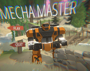
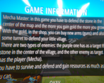
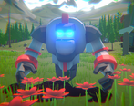
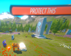
You are a Mecha and your objective is to defend your village, the more you collect gold, the more you grow and the more you become strong. Also the turret will grow.
Development Time
96 hours
(Optional) Please credit all assets you've used
Terrain: PolyartStudio - Dreamscape Nature Mountains - Stylized Open World Environment (Unity asstets store)
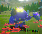
Enemies: RPG Monster BUNDLE Polyart (Unity asstets store)
Sky: Farland Skies - Cloudy Crown (Unity assets store)
Leave a comment
Log in with itch.io to leave a comment.


Comments
Overall I think you did well bringing together these premade assets to make something that looks visually consistent! I think that if you were to just tone down the bloom and chromatic aberration a smidge, as well as reduce the FOV to say ~80 degrees, then the game's style would be able to shine more and be less overwhelmed. I like the choice to place the UI in the 3D space, but typically in other games to maintain readability it's scaled to always take up the same space onscreen. I quite like the visual FX of the shots and their impact, think it's just missing some damage flash on the enemies and maybe a death sound effect. The sound of the shots has good impact, just needs a little variation in volume/pitch to make it sound right in action. I wonder if maybe a better way to present the gameplay, given the 3D cursor and turret defence, would be to use an overhead view that didn't turn with the player character? I do like how the player character feels like a hefty hunk of metal!
I think what's missing in the level design for me are specific entry points / chokepoints for the enemies, so the player would have more decision-making when it came to how to place the turrets to be most effective. In fact if you were to introduce turret repositioning you could use the turret defence antlion level in Half Life 2 as a point of reference for this kind of more action-oriented take on the genre!
WOWW!! Thanks for the long comment, I Like that!
Anyway I'm not English, so I'll probably make mistakes.
I appreciate that you liked the artstyle and yes I know that the bloom and chromatic aberration values are too high, I will definitely decrease those two things. Even if the fov is a little to high I think that when you grow it permits you to see what's going on in the map.
I appreciate also that you liked the 3D UI, and I'll try to add a damage flash to improve the overall game feel. Actually there is a death sound effect, but the volume is probably too low.
As regards the sound of the shots they actually have some variations, but I need to make them more pronounced.
With the camera I had various problems due to fact that I couldn't figure out a proper way to play the game while mantain the player in the screen.
Yeah probably some entry points could definitely make the game easier to understand!
I'll have a look at the turret defence antlion level in Half Life 2!
ANYWAY BRO THANK YOU SO MUCH FOR THE FEEDBACKS AND FOR THE EFFORT THAT YOU PUT TO PLAY AND TO WRITE THIS COMMENT!!!
The game looks and plays good but man, that post-processing and camera angle is OVER THE TOP and is really dizzying. It did lag a little when playing in the browser but I guess it’s more of a WebGL issue or my potato PC. xD
Thanks for playing and for the feedback! I will definitely try to adjust the post-processing as well as the camera angle. As regards lag, the game isn't very performant and WebGL does not help with that!
The game is fun and has a nice premise. The postprocessing tough really made me dizzy
Thanks so much for the feedback! I'll try to adjust the post-processing
Great game, loved it! Bro come fai a dire che non è "niente di che", è una figata!
Grazieee bro!! Ti ringrazio veramente tanto per averci giocato, il tuo gioco si merita il podio!
Firing speed got a little crazy with the powerups but interesting concept and I could see it being expanded upon :)
Thanks you so much for playing the game and for the feedback, I'm glad you liked it!
Nice that you went for 3D. The environment and characters looked cool but the post-processing was a bit excessive. The controls were a bit confusing but the game has potential otherwise.
Yeah, I'll try to correct the post-processing. I'm glad you liked the 3D environment!
Fun game, at the end would be nice to have some enemies that could be some challenge, I was absolute gigant and fending off waves of tiny enemies :) anyway great game :)
Yeah that could be nice! Anyway in the main menu you can choose to play in easy, medium or hard mode! Thanks for playing!!
It's quite a fun game! The mech has some nice animations and IK(?) which looks great, the movement is fun to mess around with, I started bunny hopping and got sent to space lol, overall a great game! Tried showing a screenshot but it won't let me here hmm.
Thanks! I know, with some powerups you can reach the moon. Anyway I'm going to play your game!
The camera gets misaligned with the robot which makes it confusing.
Yeah, I know, I'm sorry. I couldn't figure out a way to fix it but I will surely fix it sooner or later. Anyway thanks for the feedback! Your game looks grate!
Anyway the bullet will always go towards the red sphere that is in the same position as the mouse.