Play game
Moonce's itch.io pageResults
| Criteria | Rank | Score* | Raw Score |
| Style | #2487 | 3.259 | 3.259 |
| Creativity | #2864 | 3.185 | 3.185 |
| Overall | #3562 | 2.864 | 2.864 |
| Enjoyment | #5252 | 2.148 | 2.148 |
Ranked from 27 ratings. Score is adjusted from raw score by the median number of ratings per game in the jam.
How does your game fit the theme?
The character changes size and the world shrinks in scale
Development Time
96 hours
(Optional) Please credit all assets you've used
see description
Leave a comment
Log in with itch.io to leave a comment.


Comments
Wow the tiling in the game gave such a cool effect. Solid style and the gameplay holds up overall I really liked it alot.
Isometric tiling was pretty cool! I got kinda frustrated by not being able to moved freely on to the other tiles (it looked i was a bishop, so i could only stay on one color!) so if you free that up I think it would be more fun!! Good submission! Played at https://twitch.tv/hedge_in <3 vod Day 4 @ 00:10:55
Fun game, enjoyed the jump and smash power-up a lot. I couldn't quite workout what the cat power-up was doing, although maybe it was just making me immune to the enemies? Interesting gameplay, and some nice music to set the mood, very well done!
Funny simple game, interesting mechanics
I'd add more types of enemies
Nice game
Also really appreciate if you check my game
Hi, you queued your game on my stream and I never got to playing it.. Cool game! I had some trouble figuring out movement, which may need a bit of fine tuning or a tutorial would be great! Otherwise it's a nice and fun game! Well done
Wow! The menu page really caught my attention. I wish the entire game had the same style! The mechanics and concept are very solid.
It is a nice and fun game considering the theme of this jam. Well done!
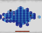
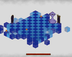
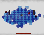
Fun jam entry, and a very creative premise! I think it would have helped out to have the cubes be non-translucent to make it easier to see the holes (though world of mirrors theme may have suffered for it, such are design decisions :shrug:). That aside, had a great time gathering the powerups and fighting the boxes, though I got stuck on level 2 when I couldn't work out how to switch tiles (the first powerup let you do it, but the second didn't seem to). Overall, solid entry to the jam, nice job y'all! :)
I really like the style of this one however I was a bit lost while playing it, probably a tutorial or small instruction texts will be very useful, good job!.
I really like the flavor of this one! The environment and concept has a surprisingly strong vibe to it. What I wouldn't give for the movement to be isometric though... The amount of times I threw myself off the level was frankly embarrassing!
It’s a fun mechanic, I like the overall concept a lot! I think the isometric style hurts the gameplay a little, because it’s kind of hard to see the exact location of things.
Very cool! I think that the menu and cover are gorgeous, but maybe the game could have done with more polish in comparison. A fun mechanic though once you get the hang of it! Some more clear indications of controls in the game would alos have been nice :) Great job!
The cover page is gorgeous and what really drew me to this! I would love to see this with further polish once the game jam is over :)
The cover page is gorgeous and what really drew me to this! I would love to see this with further polish once the game jam is over :)
I like the aesthetic and the design ideas of the game!
I have at least one major qualm though: this is not how a chess pawn moves! Maybe we are a bishop, which is why we are stuck on one colour? Could be a change you can make mid-jam and make it make more sense.
I like the gameplay, but I still don't really understand how to attack without power ups. Maybe it's not possible? I worry it is a me problem haha
The menu page is so beautiful. The game was interesting, i missed the posibility to move in diagonal, most of the cakes were in the lightblue cubes :(
(if it was possible, sorry for being dumb lol)
Thank you very much, we are sorry that we were not able to complete the mechanics that allowed the change of boxes. It will be the first thing to fix in the future
I really like the idea of being limited to specific squares until you do an attack, and thus having to weigh where you land based on which squares you might want to be on later. I don't know if that idea was used to its full effect though, since really the only interesting decision to make there is about mooncakes.
And speaking of mooncakes: because they spawn randomly, you sometimes get stuck just waiting around because all of the mooncakes are on squares you can't get to, and you can't go to a different square because you don't have a mooncake power. Implementing some kind of control of the spawning might be useful here? E.g. maybe when a new one gets spawned and there are no mooncakes on dark squares, it spawns on a dark square?
I'll also note that the squares that get shattered in the middle of the board aren't always super visible; I fell down a hole accidentally more times than I care to admit.
Also, I liked the mask idea -- i.e. changing what your power does. I only ever found the hare mask, and its power was maybe a bit too similar to the default one? (Except I don't think you could switch squares, which turns out to be an issue in terms of collecting stuff.) E.g. something like a straight line across the whole board laser might be a more interesting differentiation? Also, I think just adding randoming between the mask and the mooncake when spawning the power-ups might also add more interesting decisions? That way, you need to choose what kind of attack will be most useful right now, rather than just being stuck on the mask you put on.
Thanks for trying the game! And thank you so much for the detailed feedback, we expected exactly this feedback since the things said were present in the initial idea and not developed due to timing.
Very nice looking game. Especially the chess board itself. Maybe I was missing something, but since I couldn't move diagonally there were a lot of powerups I couldn't pick up.
Thanks for the feedback! About the power up we knew that it needs to be fixed so that the mechanic of switching the boxes to collect the power ups work more clearly.