Play game
Darkness Grows's itch.io pageResults
| Criteria | Rank | Score* | Raw Score |
| Style | #1558 | 3.626 | 3.917 |
| Enjoyment | #2762 | 2.932 | 3.167 |
| Overall | #3069 | 3.009 | 3.250 |
| Creativity | #5091 | 2.469 | 2.667 |
Ranked from 12 ratings. Score is adjusted from raw score by the median number of ratings per game in the jam.
How does your game fit the theme?
Enemies and Resources grow bigger and their stats change in a roguelike game
Development Time
48 hours
Leave a comment
Log in with itch.io to leave a comment.


Comments
I really like colour palette and art style overall
Thanksssss
I had some fun with this; the visuals are great, creating a nice atmosphere, though some spooky music would really have elevated that feeling.
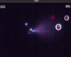
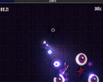
I found the three weapons (that I found) to be pretty useless. By the end there were just thousands of enemies bundled up together because the range of everything but the axe was negligible, so I never really damaged them that much (since getting that close seemed dangerous). Like someone else mentioned, the healthbar for the player isn't super visible -- the colours sort of blend in with the background.
I also would have liked to see some novel attack types that fit this sort of eldritch theme; i.e. some more dark magic sort of stuff, rather than things that are pretty common in these types of games.
Anyway, nice work!
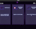
Great ideas on weapons. Yeah we kinda did the balance in the last minutes so after sometime if you dont have the right augments the game gets really hard. Thanks for the comment :)
Good job. Huge eye that’s chasing you is really scary, thanks for the new phobia :)
Thank you :)
Very nice style, couldn't find the control scheme anywhere so I wasn't sure how to attack. Good start though :)
Thanks. You dont have a manual attack, only controls are wasd and mouse
I liked the take on the theme and thought the pixel art was very well done! I do wish there was a background music track as it felt kind of empty without one. I also had it where enemies seemed to spawn directly in front of me as I was walking there.
Agreed on the background music, sorry for the bug :D
Always love the Bullet Heaven survival horde type of game. The vibe was fun and the lighting effects were pretty.
Do wish the health was more visible, would lose track of it on the player and just instantly die without any death animation. Was a bit jarring and confusing. I also noticed that flashlight, was it supposed to do anything other than help me see? Initially thought it had some sort of mechanic but didn't notice anything with it.
Regardless, good stuff and keep it up.
Well it was supposed to slow the enemies movement and growth speed but couldnt make it in time :D, agreed on the death animation and health bar.
I really like the way this game looks! I think a larger health bar for the player would be good and maybe a way to control the weapon instead of it just spinning around the player could make this game more fun.
Thanks :) we were gonna change the health bar but we forgot :D. Controlled weapon could be cool but thats a different design choice
Nice! Would like to see more content
Thankss :) Only if we had more time
Very fun game. I think it fits the theme very well!
Thanks :))